Note: This article is written for web publication and focuses on home propping, interior styling, and the behind-the-scenes magic that makes a real house look magazine-ready without turning it into a furniture showroom wearing too much lip gloss.
What Does “Hot To Prop” Mean?
“Hot To Prop” sounds like a typo, a dance move, or something shouted by a frantic photo assistant holding three throw pillows and a fiddle-leaf fig. But in the world of interiors, the idea is surprisingly useful: it is about learning how to prop, style, accessorize, and polish a home so it looks intentional, inviting, and camera-ready.
In home design, “propping” means using decorative objects, textiles, flowers, books, trays, art, lamps, and small styling details to help a room tell a better visual story. A prop can be as simple as a bowl of lemons on a kitchen island or as dramatic as a sculptural lamp that makes a quiet corner suddenly say, “Yes, I have a personality.”
The best propping does not scream for attention. It supports the space. It adds color, shape, warmth, scale, and texture. When done well, it makes a room feel lived-in but not messy, polished but not stiff, and charming without looking like a catalog swallowed your living room whole.
Why Home Propping Matters
Whether you are preparing for a magazine shoot, photographing your house for a blog, styling a room for real estate photos, or simply trying to make your home feel more finished, propping matters because the camera sees differently than the human eye. A room that feels cozy in person can look flat in a photo. A coffee table that seems “fine” in daily life can look strangely empty on screen. A sofa with too many pillows can look like it is slowly being eaten by marshmallows.
Propping helps solve those problems. It brings balance to awkward surfaces, adds scale to empty walls, softens hard lines, and gives the eye somewhere pleasant to land. A small vase, a stack of books, a textured throw, or a single plant can change the mood of an image and the feel of a room.
But the secret is restraint. Good styling is not about adding everything cute you own. It is about editing until the room looks natural, clear, and emotionally appealing. In other words, the goal is not “more stuff.” The goal is “better story.”
The Behind-the-Scenes Truth About Magazine-Ready Rooms
Here is the tiny scandal of beautiful home photos: most rooms are adjusted before they are photographed. Flowers arrive. Rugs shift. Pillows are fluffed into suspiciously athletic shapes. A tray appears where there was once a remote control, three receipts, and one mystery battery.
This does not mean the home is fake. It means the space is being translated for the camera. Professional stylists know that photos flatten depth, exaggerate clutter, and punish poor lighting. So they tweak, move, remove, and replace items until the room looks balanced from the chosen angle.
A magazine shoot might involve moving a chair six inches, turning a book slightly, replacing a dark vase with a lighter one, or adding flowers to bring life into a frame. These changes are often small, but they can dramatically improve the final image.
Start With Editing Before Adding Props
The first rule of home propping is painfully simple: take something away before you add something new. Clutter is the villain in most room photos. It distracts from architecture, furniture, finishes, and focal points.
Before styling a surface, clear it completely. Then add back only what serves the room. On a coffee table, that might mean a stack of books, a shallow bowl, and a small floral arrangement. On a console table, it might be a lamp, a tray, and one tall object for height. On shelves, it could mean grouping books with ceramics and leaving enough breathing room for each object to matter.
Think of negative space as part of the design. Empty space is not failure. Empty space is where the eye takes a coffee break.
Use the Rule of Three Without Becoming a Robot
The rule of three is a classic styling trick because odd-numbered groupings often feel more natural and dynamic. A trio of objects can create movement without looking overly symmetrical. For example, try a tall vase, a medium stack of books, and a low bowl on a sideboard. Varying height, shape, and texture keeps the arrangement interesting.
However, the rule is not a law enforced by the Decor Police. Sometimes two objects look elegant. Sometimes five small items create a charming collection. The point is to avoid random sprinkling. Objects should look like they belong together, either through color, material, theme, or purpose.
Think in Layers: Height, Texture, Color, and Shape
Great propping is layered. A room needs a mix of heights, textures, colors, and shapes to feel complete. If everything is the same height, the space can look flat. If every surface is smooth, the room can feel cold. If every accessory is the same color, the design may look too cautious.
Try combining hard and soft materials. Pair a ceramic vase with a linen runner. Place a wood bowl on a marble table. Add a woven basket near a sleek cabinet. Mix glossy objects with matte ones. These contrasts give the room depth.
Color should be used with intention. You do not need a rainbow parade on every shelf. A few repeated tones can pull the space together. If your living room has blue art, a blue book spine and a blue-patterned pillow can quietly connect the room without shouting, “I planned this at midnight with a mood board.”
Style the Coffee Table Like It Has a Job
A coffee table is one of the easiest places to practice propping because it is small, visible, and forgiving. Start with a base object like a tray or a stack of books. Then add one natural element, such as flowers, greenery, branches, or a small plant. Finish with a sculptural or useful object, like a candle, bowl, box, or coaster set.
The key is to leave room for real life. A coffee table should not require a five-minute evacuation plan before someone can put down a mug. Keep the arrangement attractive but practical. If you need to move twelve decorative objects to watch a movie, the table is not styled; it is auditioning for a museum.
Use Books as Props With Personality
Books are among the most useful home styling props because they add color, height, shape, and personality. They work on coffee tables, shelves, nightstands, consoles, benches, and even windowsills. But the best book styling feels authentic. Use books you actually like, not random decorative volumes chosen only because the spine matches your curtains.
Stack books horizontally to lift a vase or bowl. Place some vertically on shelves with bookends. Mix books with small objects, framed art, or plants to keep shelves from looking like a storage unit for rectangles.
Bring in Plants and Flowers for Instant Life
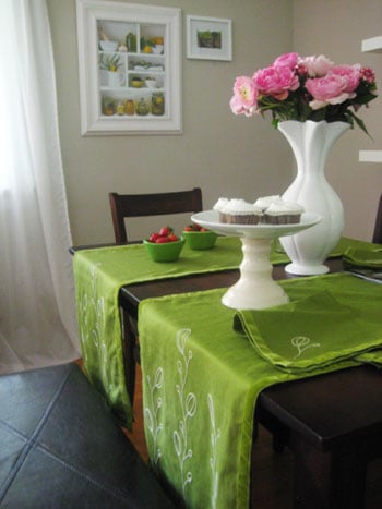
Plants and flowers are the cheat code of interior styling. They add shape, color, movement, and freshness. A vase of branches can give height to a dining table. A trailing plant can soften a shelf. A small pot of herbs can make a kitchen feel warmer and more useful.
Fresh flowers are beautiful, but they are not mandatory. Realistic faux stems, dried branches, or potted greenery can work well, especially for long-term styling. Just keep scale in mind. A tiny bud vase may disappear on a large dining table, while an oversized arrangement may block conversation and make dinner feel like a jungle negotiation.
Master the Pillow Situation
Throw pillows are powerful, but they can turn against you. A few pillows add color and comfort. Too many make a sofa look crowded and impractical. The best pillow styling mixes sizes, patterns, and textures while leaving actual room for humans, which is allegedly why sofas were invented.
For a standard sofa, try two larger pillows at the ends, one or two smaller pillows layered in front, and maybe a lumbar pillow for shape. Mix solids with patterns, but keep a shared color palette so the arrangement feels intentional.
Lighting Is a Prop, Too
Lighting is not just functional. It is one of the strongest styling tools in a room. A good lamp adds height, sculptural shape, warmth, and mood. It can make a corner feel finished and help a room photograph better.
For photos, consistent bulb temperature matters. Mixed lighting can make one side of a room look warm and cozy while the other looks like a dentist’s office. Use warm, consistent bulbs and rely on natural light whenever possible. Open curtains, clean windows, and schedule photos when the room receives its most flattering light.
Use Trays to Control the Chaos
Trays are the quiet heroes of home propping. They corral small objects and make them look deliberate. A tray can hold candles, remotes, coasters, matches, a small vase, or decorative objects. Without a tray, those items may look scattered. With a tray, they look styled.
Use trays on coffee tables, nightstands, bathroom counters, kitchen islands, dressers, and entry consoles. Choose materials that support the room’s mood: wood for warmth, metal for shine, woven fibers for texture, lacquer for polish, or stone for weight.
Make Shelves Look Collected, Not Crowded
Shelf styling is where many good intentions go to become visual traffic jams. The goal is not to fill every inch. The goal is to create rhythm. Mix vertical books, horizontal stacks, framed art, bowls, boxes, plants, and sculptural pieces. Leave open space so the eye can enjoy each grouping.
One helpful method is to style shelves in diagonal balance. If you place a dark object on the upper left, echo a similar visual weight on the lower right. If one shelf has a tall vase, another might have vertical books. This creates movement and avoids the dreaded “stuff lined up at a yard sale” effect.
Style for the Camera, Then Style for Real Life
There is a difference between photo styling and everyday styling. For the camera, you may move a chair, remove a trash can, hide cords, fluff pillows, add flowers, or shift accessories toward the lens. For real life, you need function, comfort, and durability.
The best approach is to find a happy middle. Style your home so it looks good in daily life, then make small temporary adjustments for photos. Remove excess items, straighten textiles, open curtains, and clear surfaces. Add one or two fresh elements, but do not create a room that looks impossible to live in.
Common Propping Mistakes to Avoid
Using Too Many Tiny Objects
Small objects can look cluttered quickly. Instead of scattering mini accessories everywhere, group them on trays or mix them with larger pieces.
Ignoring Scale
A tiny lamp on a large console looks nervous. A huge vase on a narrow shelf looks like it is plotting an escape. Match prop size to the surface and surrounding furniture.
Over-Personalizing for Public Photos
Personal items make a home feel real, but too many family photos, documents, magnets, and private objects can distract in listing photos or editorial-style images. Keep personality, but edit carefully.
Forgetting Texture
A room with only smooth, shiny surfaces can feel cold. Add fabric, wood, woven materials, plants, or ceramics to create warmth.
Decorating Only at Eye Level
Rooms need visual interest high, middle, and low. Use art, curtains, tall branches, floor lamps, rugs, baskets, and furniture to create full-room balance.
A Simple Room-by-Room Propping Guide
Living Room
Focus on the sofa, coffee table, shelves, and lighting. Add pillows in a controlled palette, a throw blanket with texture, a styled coffee table, and one living element such as plants or flowers.
Kitchen
Clear the counters first. Then add only a few useful, attractive items: a wood cutting board, a bowl of fruit, a small plant, or a ceramic utensil holder. Kitchens photograph best when they look clean, bright, and functional.
Bedroom
Make the bed the star. Use layered bedding, pillows in varied sizes, and nightstands with lamps, books, and one small decorative object. Avoid overcrowding the bed unless your goal is to never find your pajamas again.
Bathroom
Use fresh towels, a small plant, a candle, a tray, or attractive soap dispensers. Hide personal products unless they are beautifully packaged and support the look.
Entryway
An entryway should feel welcoming and clear. Try a mirror, lamp, tray, bowl for keys, small vase, or bench with a pillow. Keep shoes and bags controlled.
of Real-World Experience: What “Hot To Prop” Teaches You Fast
The first thing you learn when trying to prop a room is that your house is probably not as messy as you thinkbut your surfaces are probably busier than the camera wants them to be. In real life, a stack of mail, a charging cord, a water bottle, and three remote controls barely register. In a photo, they become the main characters. Suddenly your beautiful living room is not about the sofa, the rug, or the sunlight. It is about the remote control sitting on the coffee table like it owns stock in the property.
One of the best experiences is doing a test photo before changing anything. Stand in the doorway, take a quick picture, and look at it as if it belongs to someone else. The problems become obvious. Maybe the lamp is too small. Maybe the pillows look flat. Maybe the shelf has too many little things. Maybe the room is missing something organic, like flowers or greenery. This test-photo method is brutally honest, but helpful. The camera has no manners, but it does tell the truth.
Another lesson: moving furniture a few inches can matter. Pulling a sofa slightly away from the wall can make the room feel more relaxed. Angling a chair toward a table can create conversation. Removing one side table can open a walkway. A room does not always need new purchases. Sometimes it needs a tiny furniture shuffle and one less basket pretending to be storage.
Propping also teaches you that color repetition is magic. Suppose you have a rust-colored pillow. Add a book with a similar spine on the coffee table or a small ceramic object on the shelf, and suddenly the room feels connected. It is not obvious. It does not look “matchy.” It just feels right. That is the sweet spot.
The funniest part of propping is realizing how temporary some “effortless” styling really is. A throw blanket casually draped over a sofa may require three attempts and a surprising amount of emotional negotiation. A bowl of fruit may be placed, removed, replaced, and rotated until the apples look relaxed. Flowers may need trimming. Books may need stacking. Pillows may need karate chops, though not too aggressive, unless you want every cushion to look personally offended.
But the process is worth it because it trains your eye. You begin to notice balance, scale, texture, and negative space. You stop buying random decor just because it is cute and start asking, “Where will this live, and what will it add?” That question alone can save money, space, and future closet shame.
The best personal takeaway from “Hot To Prop” is that styling should serve the home, not smother it. A well-propped room still feels like people belong there. It has room for coffee cups, books, pets, conversations, and imperfect Tuesday afternoons. The props simply help the room introduce itself at its bestlike putting on a good outfit, brushing its hair, and pretending it did not panic-clean ten minutes before guests arrived.
Conclusion: Propping Is the Art of Making a Room Speak Clearly
“Hot To Prop” is more than a catchy phrase. It is a practical design mindset. It reminds us that the finishing touches matter: the vase on the table, the pillow on the chair, the tray on the counter, the book on the shelf, the lamp in the corner, and the plant that quietly saves the room from looking like a furniture warehouse.
Great home propping is not about perfection. It is about intention. Edit first, then layer. Use texture, height, color, and light. Choose props that support the room’s purpose and personality. Whether you are styling for a magazine-style photo, a real estate listing, a blog post, or your own happiness, the right details can make a space feel polished, warm, and wonderfully alive.
And remember: if the room looks almost right, remove one thing, add one plant, straighten the lamp shade, and take another photo. Congratulations. You are now officially hot to prop.