Some houses arrive with charm. Others arrive with charm, confusing stairs, a kitchen in an inconvenient galaxy, and a floor plan that seems designed by a committee of mildly offended raccoons. The Cambridge 2012 House had all of thatand then became one of the more memorable examples of how an old New England home can be modernized without erasing its identity.
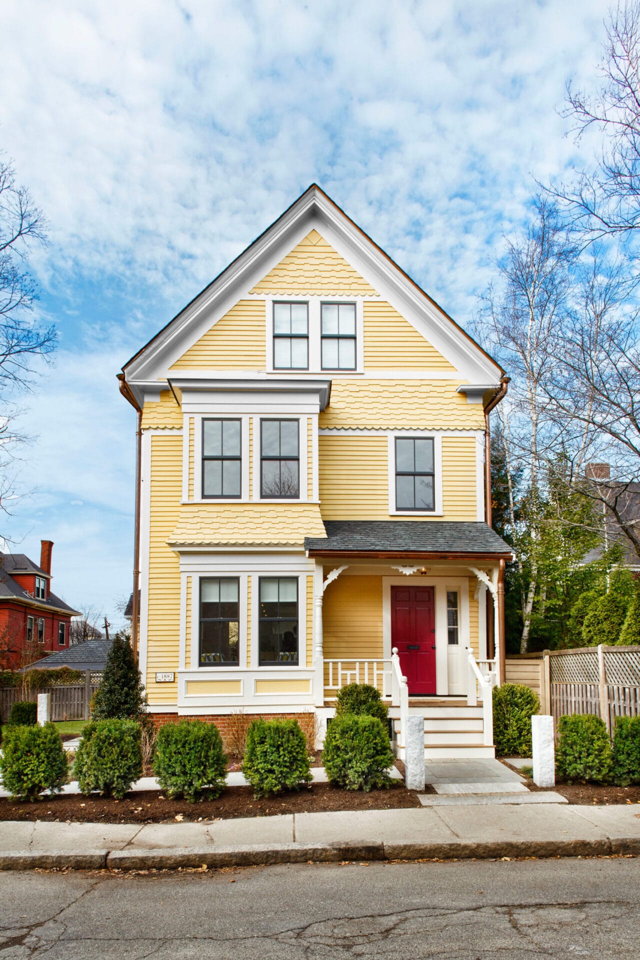
Featured by This Old House, the project centered on an 1887 Queen Anne in Cambridge, Massachusetts. From the sidewalk, it remained an appropriately historic Victorian with repaired siding, period-sensitive windows, and a paint scheme suited to its neighborhood. Inside, however, the house was thoroughly reimagined as a bright, efficient, Scandinavian-inspired family home. That contrast is what makes the Cambridge 2012 House renovation so interesting: it did not choose between preservation and comfort. It chose both.
A Queen Anne House With a Very 20th-Century Problem
The Cambridge 2012 House was not simply “old.” It was old in the way many beloved homes are old: full of good bones, odd compromises, and clues that several generations had attempted to solve different problems without agreeing on a shared floor plan.
Originally built as a two-family residence, the three-story house had later been adapted so that families occupied each floor. By the time homeowners Sally Peterson and John Stone bought it, the roughly 2,400-square-foot house had a kitchen on the second floor, an oversized laundry room swallowing valuable first-floor space, and rooms stripped of much of their original detail during earlier renovations. Grocery day must have felt less like a household errand and more like a stair-climbing tournament.
The structural issues were not merely cosmetic. A first-floor partition wall was not properly supported by the girder beneath it, contributing to sagging floors. That detail is an important reminder for anyone romanticizing a historic-home renovation: charming trim can wait. A stable structure cannot. Before choosing cabinet hardware shaped like tiny seashells, make sure the house is not quietly auditioning for a roller coaster.
The Core Idea: Historic Outside, Modern Inside
The real genius of the Cambridge 2012 House was its clarity of purpose. The renovation did not attempt to pretend that a family in the 2010s lived exactly as a household did in 1887. Instead, it respected what the house contributed to the streetscape while redesigning the interior around how a young family actually cooks, gathers, stores backpacks, does laundry, hosts guests, and occasionally loses a shoe five minutes before leaving.
That approach made particular sense in Cambridge, where historic-district rules can regulate publicly visible exterior changes. Local review focuses on the architectural value, design, materials, color, and relationship of exterior work to the surrounding district. Interior changes, by contrast, are generally treated differently from alterations visible from public ways.
For the Cambridge house, the exterior strategy was disciplined rather than flashy. The original siding was repaired, sanded, and repainted. Replacement windows were installed within existing openings, helping the home retain a period-appropriate appearance. The front façade continued to read as a Queen Anne, even though the interior no longer behaved like one.
This is a powerful lesson for historic home renovation: preservation does not require freezing every awkward decision in time. It means identifying what carries the building’s character and treating those elements with care. A home can preserve its silhouette, proportion, siding pattern, window rhythm, and neighborhood presence while receiving a completely different interior life.
Scandinavian Design Was More Than White Paint
The Scandinavian influence in the Cambridge 2012 House was not a quick dip into the “paint it white and add one birch branch” school of decorating. It was a practical design system built around daylight, clean lines, natural materials, visual calm, and useful storage.
Scandinavian interiors are often associated with pale woods, neutral backdrops, uncluttered spaces, and furnishings that earn their keep. The style values function as much as appearance, which made it especially suitable for a compact historic house where every wall and hallway had to work harder than a coffee maker during finals week.
The homeowners wanted an airy, sunny atmosphere with a relaxed, almost beach-house feeling. The finished design used white surfaces warmed by maple floors and whitewashed southern yellow pine. Rather than relying on one decorative statement piece, the renovation repeated this wood motif throughout the house: on the kitchen hood, family-room ceiling inset, shelving, stair rails, dining-area details, and bathroom accents.
That repetition gave the house visual continuity. In a renovation with a major floor-plan change, repeating a limited number of materials can prevent the final result from feeling like several unrelated Pinterest boards collided in the hallway. The Cambridge house remained cohesive because the design language traveled with the family from room to room.
How the Cambridge 2012 House Rebuilt the Floor Plan
A First Floor Designed for Daily Life
The first floor became the social engine of the house. What had been an awkward sequence of disconnected rooms was transformed into a continuous kitchen, dining, and family area extending from the front of the house to the rear.
The old front parlor, previously used as a bedroom, became the kitchen. Nearby space was opened into a dining area, while the giant laundry room was converted into a family room. This reorganization placed everyday living where it belongs for most families: on the level closest to the entry, the yard, the mail, the muddy boots, and the person who has just announced, “I’m starving,” despite eating a snack six minutes ago.
At the center of the new kitchen stood an 11½-foot island with a maple butcher-block top, white flat-panel cabinetry, and a whitewashed southern yellow pine vent hood. The island was large enough to handle food preparation, homework, casual dining, and the mysterious collection of objects that always appears on a kitchen counter no matter how many organizers a person buys.
The new family room reinforced the same philosophy. It included built-in storage niches for firewood and media equipment, a cast-iron fireplace, and new maple flooring. The room was not merely “open concept”; it was organized open concept. That distinction matters. An open room without storage quickly becomes a large, bright place to store chaos.
Second-Floor Bedrooms That Made Better Sense
Once the kitchen moved downstairs, the second floor could become what a second floor often wants to be: a quieter zone for bedrooms and bathrooms. The revised layout included bedrooms for the homeowners’ daughters, a shared bathroom, and more orderly circulation.
Built-ins helped the bedrooms stay compact without feeling deprived. The children did not need freestanding dressers because storage was integrated into the architecture. One window seat even doubled as a sleepover berth, which is a much more charming use of square footage than a giant dresser that slowly turns into a clothing mountain.
The bathroom stayed visually simple, using familiar materials such as penny tile, subway tile, double sinks, and a restrained white palette accented with blue tile. These choices were not trying to imitate the Victorian past. They were fresh, durable, and comfortable for family use.
A Third Floor Turned Into a Retreat
The attic level became a primary suite, giving the homeowners a private area away from the family activity below. Skylights and a small outdoor space gave the top floor a tree-house-like quality, while knee-wall cupboards with touch-latch beadboard doors made use of those famously awkward attic edges.
The primary bath fit a tub and shower beneath the sloped ceiling, proving that difficult rooflines are not always dead space. Sometimes they simply need a clever plan, a patient contractor, and a willingness to measure the same angle roughly nine thousand times.
The Details That Made the House Feel Personal
The Cambridge 2012 House did not treat history as a decorative costume. Instead, it retained a few meaningful artifacts while avoiding the temptation to rebuild an imaginary Victorian interior that no longer existed.
One of the most memorable surviving details was the original mechanical doorbell. Pulling a bronze knob near the front door activated a pulley system and rang a bell inside the house. The renovation also reused decorative brackets from the old side porch as supports for a wall shelf in the foyer.
These gestures matter because they give a contemporary home a connection to its earlier life. They are modest, useful, and honest. The mechanical doorbell was not preserved because every visitor needs a history lesson before entering. It was preserved because it still worked, it was charming, and it gave the home one little surprise that a smart doorbell probably cannot replicate without demanding a software update.
Historic Windows, Comfort, and Common Sense
Windows are often one of the hardest decisions in an old-house renovation. Homeowners want better comfort, lower energy bills, and less winter draft. Preservation advocates want the proportions, profiles, muntins, and visual rhythm that make old buildings recognizable. The best answer is rarely “replace everything immediately” or “never touch a window under any circumstances.”
In the Cambridge house, period-appropriate replacement windows were chosen to help preserve the exterior character while improving the interior environment. The National Park Service advises that historic windows should be carefully evaluated before replacement because repair, weatherization, and selective upgrades can often preserve both appearance and performance.
For homeowners, the practical takeaway is straightforward: begin with a condition assessment. Determine whether the existing windows can be repaired, weather-stripped, fitted with storms, reglazed, or selectively replaced. Then coordinate that decision with local historic review requirements, insulation strategy, ventilation needs, and the desired appearance of the façade.
Energy Efficiency Without Turning an Old House Into a Science Experiment
The Cambridge 2012 House included radiant heat and a small-duct heating and cooling system, helping the renovated interior feel comfortable without requiring enormous ducts to dominate every ceiling. The larger lesson is that historic renovations work best when mechanical upgrades are planned early, not squeezed in after the finishes have been selected.
Air sealing and insulation can improve comfort, durability, and energy performance, but an older home must be treated as a connected system. Tightening the building enclosure without considering ventilation, combustion safety, and moisture movement can create problems instead of solving them. Federal energy guidance recommends coordinating air sealing, insulation, ventilation, and heating-and-cooling design rather than treating them as separate weekend projects.
There is also a major safety issue for homes built before 1978: lead paint. Any renovation that disturbs painted surfaces in older housing may trigger federal lead-safe work-practice requirements, especially where children are present. A beautiful renovation is not a success if the dust-control plan is basically “open a window and hope for the best.”
What the Cambridge 2012 House Still Teaches Homeowners
The Cambridge 2012 House remains a useful renovation case study because it avoided easy clichés. It did not preserve every old room merely because it was old. It did not erase the building’s exterior identity in the name of modernity. It did not confuse minimalism with emptiness. And it did not treat storage as an optional luxury.
Its success came from a simple sequence of decisions: stabilize the structure, respect the exterior, create a logical floor plan, use materials consistently, build storage into the architecture, and preserve only the historic details that added real character. The result was a house that looked right in its Cambridge neighborhood while functioning for a contemporary family.
That is the sweet spot for any old-house renovation. A historic home should not feel like a museum with better Wi-Fi. It should feel alive, useful, comfortable, and unmistakably itself.
Experiences Inspired by the Cambridge 2012 House
The most relatable part of the Cambridge 2012 House is not the butcher-block island, the restored bell, or even the beautifully organized attic suite. It is the experience behind the transformation: living in a home that is technically full of rooms but somehow has nowhere to put real life.
Anyone who has spent time in an older home recognizes the front-door test. You come in carrying groceries, a bag, maybe a wet umbrella, and perhaps a child who is suddenly moving with the speed of a small comet. In a poorly planned house, there is no obvious landing place. Shoes spread across the hall. Coats migrate to chairs. Mail colonizes the counter. The Cambridge renovation answered that problem with built-in cubbies, a hall closet, and intentional entry storage. It sounds ordinary, but ordinary convenience is often what makes a home feel luxurious.
Then there is the cooking test. A kitchen on the second floor may have seemed perfectly reasonable at some point in the house’s long history, but carrying grocery bags upstairs every week turns the simple act of buying pasta into a cardio program. Moving the kitchen to the first floor made the house work with daily routines instead of against them. It also allowed the cook to stay connected to family activity, conversation, and the inevitable question of who touched the good cheese.
The Cambridge 2012 House also captures the experience of discovering that storage can change your mood. A built-in drawer under a window seat, cabinets tucked into knee walls, hidden desk space, and shelves sized for actual household objects may not look dramatic in a before-and-after photo. Yet these features reduce the small daily annoyances that make homes feel messy, crowded, and harder to enjoy. Good storage does not scream for attention. It quietly prevents an avalanche of backpacks.
There is a winter experience here, too. In New England, comfort is not merely a matter of choosing soft throw blankets and pretending the thermostat is a personality trait. A house needs thoughtful heating, sound windows, insulation, controlled airflow, and rooms that do not feel like different climate zones. The project’s radiant heat and updated mechanical systems show how an old home can become more comfortable without losing its historic presence.
Finally, the project speaks to the emotional experience of renovation. Homeowners often feel pressure to preserve every old detail, even when earlier remodels have already removed the best ones. The Cambridge house offered a healthier approach: keep the meaningful pieces, respect the exterior, and do not force a family to live around bad decisions from 1968. The restored mechanical doorbell and reused porch brackets carry memory. The new floor plan carries life forward.
That is why the Cambridge 2012 House feels more enduring than a simple makeover. It is a reminder that the best renovations are not about making a house look new. They are about making a house make sense.
Note: This article is intended for design inspiration and general educational purposes. Historic-district approvals, structural work, energy retrofits, and lead-safe renovation requirements vary by property and location; consult qualified local professionals before beginning work.