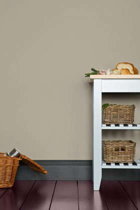
Some paint colors enter a room quietly, straighten the pillows, improve the lighting, and somehow make everyone believe the homeowner has excellent taste. Pavilion Gray No. 242 Paint by Farrow & Ball is one of those colors. It is not a shouty gray, not a muddy greige, and definitely not the gloomy “office cubicle at 4:52 p.m.” kind of gray. Pavilion Gray is a cool, classic mid-gray with subtle blue undertones, designed to feel crisp, elegant, and spacious without looking icy or sterile.
For homeowners, decorators, and serial paint-swatch collectors who have lost entire weekends to comparing sixteen nearly identical grays, Pavilion Gray No. 242 offers a refined middle path. It has enough depth to feel intentional, enough softness to behave like a neutral, and enough coolness to keep a space looking fresh. Whether you are refreshing a living room, painting kitchen cabinets, upgrading a hallway, or giving furniture a tailored new personality, this Farrow & Ball gray deserves a spot on the shortlist.
What Is Pavilion Gray No. 242?
Pavilion Gray No. 242 is a Farrow & Ball paint color described as a classic cool mid-gray. It was originally created for a bespoke pavilion and is inspired by the elegant gray tones associated with 18th-century Swedish interiors. That heritage matters because this color does not feel randomly mixed by a machine having a complicated Tuesday. It has the composed, architectural quality that makes a room look finished even before the artwork goes up.
Farrow & Ball places Pavilion Gray among its Architectural Neutrals, a group of shades known for working beautifully in layered, modern interiors. The key personality trait of Pavilion Gray is its subtle blue undertone. That undertone gives it a cooler, cleaner appearance than warm greiges, while its mid-gray body prevents it from feeling too pale or washed out.
In practical terms, Pavilion Gray sits in the sweet spot between “barely there” and “dramatic statement.” It is not as light as a whispery off-white gray, and it is not as deep as a charcoal. It has presence, but it does not demand that the sofa ask permission before entering the room.
Pavilion Gray Undertones: Cool, Blue, and Very Polite
Undertones are where gray paint gets sneaky. One gray can turn purple, another can go green, and another can look like wet cement under the wrong bulb. Pavilion Gray No. 242 leans cool because of its blue undertones, but the blue is restrained. You should not expect a blue wall unless the room lighting strongly pulls it in that direction. Instead, the undertone gives the color a crisp, airy edge.
In a north-facing room, Pavilion Gray can look cooler and more silvery. In a south-facing room, it may appear softer and more balanced because warm natural light rounds off the blue-gray character. In east-facing rooms, it can feel fresh in the morning and calmer later in the day. In west-facing rooms, late-afternoon light may bring out a gentler, slightly warmer side.
This is why testing is not optional. Paint chips are helpful, but they are not fortune tellers. A large sample, viewed in morning light, afternoon light, evening lamp light, and “I forgot to buy bulbs so this room is chaos” light, will tell you whether Pavilion Gray belongs in your space.
Why Pavilion Gray Works So Well in Modern Homes
Pavilion Gray has a rare ability to look traditional and contemporary at the same time. The Swedish-inspired origin gives it historical grace, while the cool blue-gray undertone gives it a modern edge. That combination makes it useful in homes that mix old and new: original trim with modern furniture, antique rugs with sleek lighting, or a classic fireplace beside a suspiciously expensive minimalist chair.
It also creates a sense of spaciousness. Cool grays tend to visually recede, which can make walls feel slightly farther away. In small rooms, narrow hallways, or compact kitchens, Pavilion Gray can help the space feel more open without resorting to plain white. White walls are lovely, of course, but sometimes they behave like a blank spreadsheet. Pavilion Gray gives you atmosphere.
Best Rooms for Pavilion Gray No. 242 Paint
Living Rooms
In a living room, Pavilion Gray creates a calm and sophisticated backdrop. It works especially well with linen upholstery, pale oak floors, black metal lighting, and layered textiles. If your living room has large windows, this color can look crisp and elegant throughout the day. If the room is darker, pair it with warm textures so it does not feel too cool.
Try Pavilion Gray walls with a cream sofa, charcoal accent chairs, a natural jute rug, and brass or bronze table lamps. The result feels relaxed but pulled together. Basically, the room starts giving “adult who owns coasters” energy.
Bedrooms
Pavilion Gray is an excellent bedroom color for people who want calm without sweetness. It is cooler than beige, softer than stark white, and more interesting than a basic gray. It pairs beautifully with white bedding, pale blue throws, oatmeal linen, and dark wood furniture.
For a serene bedroom palette, combine Pavilion Gray walls with warm white trim, natural cotton bedding, and a few muted blue or taupe accents. If you want more drama, use darker gray or navy accessories. The room will still feel restful, but with enough depth to avoid looking like a rental listing photo.
Kitchens and Cabinets
Pavilion Gray can be especially handsome on kitchen cabinetry. Its blue undertone gives cabinets a clean, tailored look, while the mid-gray depth prevents them from disappearing into the background. It is a strong choice for Shaker cabinets, built-ins, pantry doors, or an island that needs to look polished without screaming for attention.
Pair Pavilion Gray cabinets with white or softly veined stone countertops, brushed nickel hardware, aged brass pulls, or black fixtures. For walls, consider a pale complementary neutral to keep the kitchen bright. If you use Pavilion Gray on walls and cabinets together, choose the right finish for each surface so the room has practical durability as well as visual unity.
Bathrooms
In bathrooms, Pavilion Gray can feel fresh, spa-like, and quietly luxurious. Because it has a cool undertone, it works well with marble, white tile, polished nickel, chrome, and pale stone. It can also make a small bathroom feel more considered than plain white, especially when used with crisp trim and simple lighting.
For moisture-prone spaces, choose a finish designed for durability and washability. A beautiful color is wonderful, but a bathroom is still a bathroom. Steam has no respect for your mood board.
Hallways and Entryways
Hallways often need a color that can handle shadows, traffic, artwork, and the occasional backpack collision. Pavilion Gray gives entryways a composed, architectural look. It works nicely with white trim, black stair rails, framed prints, mirrors, and natural runners.
If your hallway is narrow or lacks natural light, test carefully. Pavilion Gray can look cooler in dim spaces, so warm bulbs and lighter trim can help maintain balance.
Exterior Accents
Pavilion Gray can also work outdoors, particularly on shutters, doors, garden structures, or exterior woodwork when used in the appropriate exterior finish. Its name alone makes it feel destined for garden architecture. On exteriors, natural daylight often makes colors appear lighter, so Pavilion Gray may look softer outside than it does indoors.
Best Color Pairings for Pavilion Gray
One reason Pavilion Gray No. 242 is so useful is that it plays nicely with a wide range of colors and materials. It is neutral enough to support a room, but distinctive enough to shape the mood.
Whites and Off-Whites
Farrow & Ball recommends Blackened as a complementary white for Pavilion Gray. Blackened is a cool white with a hint of gray, which means it supports Pavilion Gray’s undertone instead of fighting it. The combination feels clean, modern, and quietly elegant.
For trim, ceilings, and doors, a cool white creates crisp contrast. If your home has warmer floors or antique furniture, you may want to test warmer whites too, but avoid anything too creamy or yellow. A very warm white can make Pavilion Gray look colder by comparison.
Other Grays
Pavilion Gray pairs well with other refined grays such as Dimpse, Blackened, and Manor House Gray. A layered gray scheme can be beautiful when each shade has a clear role. Use the lightest gray for ceilings or trim, Pavilion Gray for walls or cabinetry, and a deeper gray for doors, furniture, or accent details.
The trick is contrast. If all the grays are too similar, the room can look accidental, like you painted in stages and forgot where you started.
Natural Wood
Wood is one of Pavilion Gray’s best friends. Pale oak makes it look Scandinavian and airy. Walnut adds richness. Reclaimed wood gives it rustic balance. Even orange-toned floors can work if the rest of the palette includes soft whites, black accents, and natural textures.
Because Pavilion Gray is cool, wood adds warmth and keeps the room from feeling too crisp. Think of wood as the cozy cardigan thrown over the shoulders of a very stylish gray suit.
Metals
Pavilion Gray works with chrome, polished nickel, aged brass, bronze, and black metal. Chrome and nickel emphasize its cool, clean side. Brass and bronze add warmth and contrast. Black hardware creates a sharper modern look, especially on cabinets, doors, and lighting.
Accent Colors
For a calm palette, pair Pavilion Gray with dusty blue, slate, cream, ivory, taupe, or pale sage. For a richer look, try navy, charcoal, olive green, burgundy, or muted terracotta. Because Pavilion Gray is restrained, it can support stronger colors without turning the room into a circus tent with crown molding.
Choosing the Right Finish
Color is only half the decision. Finish affects how Pavilion Gray looks, performs, and reflects light. A matte finish makes the color look softer and more velvety. A higher-sheen finish reflects more light and can make the color appear slightly sharper.
Dead Flat is Farrow & Ball’s ultra-matte, multi-surface finish for walls, woodwork, and metal. It has a very low sheen and is designed to create a rich, soft look. This can be beautiful for color-drenched rooms, where walls, trim, and even radiators are painted in the same shade.
Modern Emulsion is a durable matte finish for interior walls and ceilings, especially useful in busy areas such as kitchens, bathrooms, and hallways. It has more practical washability than a delicate flat wall paint, which is useful if your household includes children, pets, or adults who somehow touch walls while eating chips.
For cabinetry, trim, furniture, and doors, choose a finish designed for woodwork and higher contact surfaces. The exact finish depends on the level of sheen and durability you want. Lower sheen feels softer and more traditional; higher sheen is easier to wipe and can look more tailored.
How to Test Pavilion Gray Before Painting
Testing Pavilion Gray is essential because its blue undertones respond to light. Use a large sample rather than relying on a tiny chip. Move it around the room. Put it beside trim, flooring, countertops, fabric, tile, and furniture. Look at it during the day and at night.
Here is a simple testing method:
- Place a large sample on at least two walls.
- Check it in natural daylight and artificial light.
- Compare it against trim, flooring, and major furniture pieces.
- Observe whether it reads gray, blue-gray, or too cool for your taste.
- Test your chosen white trim color beside it before committing.
Remember that digital screens are unreliable for paint decisions. Your phone can make a color look perfect while quietly lying to your face. Real paint in your real room is the only honest judge.
Pavilion Gray vs. Other Popular Gray Paint Colors
Pavilion Gray is cooler and cleaner than many popular greiges. If you like warm gray-beige colors, Pavilion Gray may feel more refined but also less cozy. If you love crisp, contemporary interiors, that coolness is part of the appeal.
Compared with very pale grays, Pavilion Gray has more body. It will show up clearly on the wall and provide contrast with white trim. Compared with darker grays, it feels more open and livable. This makes it a versatile middle gray for homeowners who want sophistication without gloom.
It is also useful for people who like Scandinavian, transitional, coastal, modern farmhouse, or classic European-inspired interiors. The color adapts well because it does not lean too trendy. It has enough heritage to feel timeless and enough coolness to feel current.
Common Mistakes to Avoid
Using It in a Cold Room Without Warmth
If your room has cool northern light, cool flooring, cool furniture, and cool bulbs, Pavilion Gray may feel chilly. Add warmth through wood, woven shades, warm white textiles, brass accents, or warmer lighting.
Pairing It With the Wrong White
A very creamy white can make Pavilion Gray look bluer. A cool white or soft gray-white often creates a cleaner relationship. Always test trim and wall colors together.
Skipping Primer
Primer helps with depth, evenness, and durability. Farrow & Ball recommends Mid Tones Primer & Undercoat for Pavilion Gray. Skipping this step may save time in the short term, but it can lead to uneven results, especially over strong existing colors.
Expecting It to Look the Same Everywhere
Pavilion Gray changes with light. That is not a flaw; it is part of the charm. But it does mean you should not choose it based on one photo, one showroom wall, or one aggressively filtered social media post.
Real-World Experience With Pavilion Gray No. 242 Paint
Living with Pavilion Gray No. 242 is a little different from simply admiring it on a paint card. On the card, it looks like a composed, classic gray. On the wall, it becomes more interactive. It responds to the hour, the furniture, the flooring, and even the mood of the weather. On a bright morning, it can look clean and quietly uplifting. On a rainy afternoon, it may deepen into a more serious blue-gray. At night, under warm lamps, it softens and becomes more intimate.
One of the best experiences with Pavilion Gray is using it in a room that already has architectural detail. Crown molding, paneled doors, built-in bookcases, old fireplaces, and tall baseboards all benefit from its tailored quality. The color gives those details definition without making them look heavy. In older homes, it feels respectful rather than fake-historic. In newer homes, it adds character where the builder may have supplied enthusiasm but not much personality.
On cabinetry, Pavilion Gray is especially satisfying. It has enough depth to make cabinets feel custom, but it is not so dark that fingerprints, dust, and cooking evidence immediately become part of the decor. In a kitchen with white counters and nickel hardware, it can feel crisp and polished. With brass hardware and wood shelves, it becomes warmer and more layered. This flexibility is one reason many homeowners consider it when they want a cabinet color that is more interesting than white but safer than navy or green.
Another strong experience is using Pavilion Gray in a bedroom. It creates a peaceful backdrop, especially when paired with white bedding, linen curtains, and natural textures. The room feels calm but not sleepy in a dull way. It has that boutique-hotel feeling where everything looks intentional, even if there is a laundry basket hiding just outside the photo.
However, Pavilion Gray is not magic paint. In a room with weak lighting, gray carpet, and cool LED bulbs, it can become too cold. The fix is usually not complicated: warmer lamps, wood tones, cream textiles, or artwork with warmer colors can bring the balance back. It is also wise to sample it near flooring. Floors influence paint dramatically, especially red oak, yellow pine, dark espresso stains, or gray vinyl planks.
The most practical lesson is this: Pavilion Gray rewards thoughtful styling. It looks best when the room includes contrast and texture. Add soft fabrics, natural materials, black accents, framed art, baskets, stone, wood, or metal. Without those layers, any gray can feel flat. With them, Pavilion Gray becomes elegant, calm, and quietly expensive-looking. Not “private island” expensive, thankfully. More like “I know what a good lampshade is” expensive.
Final Thoughts
Pavilion Gray No. 242 Paint is a refined cool mid-gray that brings structure, calm, and understated sophistication to interiors. Its subtle blue undertones make it feel fresh and spacious, while its classic character keeps it from becoming trendy or disposable. It works beautifully on walls, cabinetry, trim, furniture, bathrooms, bedrooms, hallways, and even selected exterior details when paired with the right finish.
The secret to success is balance. Test the color in your own light, choose the proper primer and finish, pair it with compatible whites, and warm it up with wood, texture, and thoughtful lighting. Do that, and Pavilion Gray can turn a plain room into a polished one without behaving like it needs applause.
Note: This article is written for web publishing and is based on current product information, paint-finish guidance, color data, and real-world interior design use cases. Always test Pavilion Gray No. 242 in your own space before painting a full room.