A YouTube thumbnail is the tiny billboard standing between your video and the endless scroll. It has one job: convince a real human with a distracted thumb to stop, look, and think, “Okay, I need to see what this is about.” No pressure, right?
The good news is that you do not need to be a Hollywood poster designer to create a thumbnail that looks sharp, clickable, and professional. Adobe Photoshop gives you the tools to control every pixel: layout, color, cutouts, text, shadows, lighting, and export quality. The even better news is that a strong thumbnail usually follows a simple formula: one clear idea, one strong visual, a few readable words, and enough contrast to survive on a phone screen at 1 a.m.
In this guide, you will learn how to make a YouTube thumbnail in Photoshop in six practical steps. We will cover the right canvas size, how to choose your image, how to cut out a subject, how to add bold text, how to polish the design, and how to export it correctly for YouTube. Along the way, we will also look at real creator-friendly tips that can help improve click-through rate without turning your thumbnail into a visual circus wearing neon shoes.
Why YouTube Thumbnails Matter
Before opening Photoshop, it helps to understand why thumbnails matter so much. On YouTube, people often decide whether to watch a video before they read the full title. The thumbnail creates the first impression, sets the emotional tone, and communicates the promise of the video. A tutorial thumbnail might say, “This is easy.” A review thumbnail might say, “This product surprised me.” A storytime thumbnail might say, “Something dramatic happened, and yes, there may be tea.”
A good YouTube thumbnail should be clear at small sizes, visually different from nearby videos, and honest about the content. Clickable does not mean misleading. If your thumbnail screams “I BUILT A ROCKET” and the video is actually about organizing browser bookmarks, viewers will leave faster than Photoshop crashes when you forgot to save. The best thumbnails create curiosity while still matching the video.
For most long-form YouTube videos, designers commonly use a 16:9 thumbnail layout. Many creators work at 1280 x 720 pixels because it is simple, lightweight, and widely supported. However, current YouTube guidance recommends uploading large, high-quality 16:9 thumbnails when possible, with a minimum width of 640 pixels and supported formats such as JPG, GIF, and PNG. In Photoshop, you can safely design at 1280 x 720 for speed or create a larger 3840 x 2160 version if your source images are high resolution and your workflow supports it.
How to Make a YouTube Thumbnail in Photoshop: 6 Steps
Step 1: Create the Right Photoshop Canvas
Open Photoshop and create a new document. For a practical YouTube thumbnail template, use:
- Width: 1280 pixels
- Height: 720 pixels
- Resolution: 72 or 144 pixels per inch
- Color Mode: RGB Color
- Background: White, black, or transparent
If you want to design at a higher resolution, use 3840 x 2160 pixels, then export a compressed JPG or PNG that stays within YouTube’s upload limits. The aspect ratio matters more than the resolution number because YouTube displays thumbnails in many places: search results, suggested videos, channel pages, embeds, mobile feeds, and TV screens. A 16:9 design helps your image avoid awkward cropping.
Next, turn on helpful layout guides. Go to View > New Guide Layout and create a simple grid, or use View > Rulers and drag guides from the rulers. Keep important text away from the edges, especially the bottom-right corner, where YouTube often places the video duration badge. Your masterpiece should not end with the word “SECRET” becoming “SEC12:43.” That is not mystery; that is bad spacing.
Name your file clearly, such as youtube-thumbnail-template.psd. Saving a reusable PSD template will save time later. Keep folders for background, subject, text, effects, and branding so your Layers panel does not become a digital junk drawer.
Step 2: Choose One Clear Thumbnail Idea
The biggest beginner mistake is trying to put the entire video into one thumbnail. A thumbnail is not a movie poster, a résumé, a group chat screenshot, and a weather map all at once. It should communicate one main idea.
Ask yourself these questions before designing:
- What is the main promise of the video?
- What emotion should the viewer feel?
- What single visual would explain the topic quickly?
- What two to four words would make the idea stronger?
For example, if your video is titled “I Tried Editing Videos for 30 Days,” your thumbnail could show your face looking exhausted, a messy timeline screenshot, and the text “30 DAYS LATER.” If your video is “Best Budget Camera for YouTube,” the thumbnail might show the camera, a price tag, and the text “WORTH IT?” If your video is “How to Fix Bad Lighting,” you could split the image into a dull “before” side and a bright “after” side.
This is where strong thumbnails become strategic. The title and thumbnail should work together, not repeat each other word for word. If the title says “How to Make a YouTube Thumbnail in Photoshop,” the thumbnail text could say “6 EASY STEPS” or “CLICKABLE DESIGN.” The title gives detail; the thumbnail creates instant visual interest.
Step 3: Add a Strong Background and Main Subject
Now bring your main image into Photoshop. This might be a frame from your video, a product photo, a portrait, a screenshot, or a custom graphic. Drag it into the canvas and convert it to a Smart Object by right-clicking the layer and selecting Convert to Smart Object. Smart Objects let you resize and transform images without permanently damaging the original image data, which is very helpful when you are still experimenting.
Use Ctrl + T on Windows or Command + T on Mac to resize and position the image. Place the subject using the rule of thirds: imagine the canvas divided into three columns and three rows, then position the face, product, or key object near one of the intersections. Centered designs can work, but slightly off-center compositions often feel more dynamic.
If you have a person in the thumbnail, use a close-up face with a clear expression. Surprise, curiosity, joy, concern, or concentration can all work, depending on the video. A blank expression can look like someone waiting for their printer to connect to Wi-Fi, which is not usually the emotion we want.
To cut out a subject, select the image layer and use Photoshop’s Remove Background feature from the Properties panel or Quick Actions. Photoshop will create a mask that isolates the subject. If the edges are not perfect, click the mask and use a soft Brush tool: paint with black to hide unwanted areas and white to reveal areas you want back. For hair, fur, or complicated edges, use Select and Mask or the Refine Edge Brush.
Once your subject is isolated, add a background that supports the topic. This could be a blurred screenshot, a gradient, a color block, a room photo, or a dramatic texture. Keep the background simple. If your background competes with the subject, blur it slightly with Filter > Blur > Gaussian Blur or darken it with an adjustment layer.
Step 4: Add Bold, Readable Text
Thumbnail text should be short enough to read at a glance. Aim for two to five words. Use the Type Tool, choose a bold font, and make the words large. If you need a magnifying glass to read your thumbnail, the text is too small. If your text has seven fonts, three outlines, two gradients, and a shadow that looks like it has its own zip code, simplify it.
Good thumbnail text examples include:
- “6 EASY STEPS”
- “BEFORE / AFTER”
- “BIG MISTAKE”
- “WORTH IT?”
- “NO DESIGN SKILLS”
- “PHOTOSHOP TRICK”
Choose text that adds curiosity or clarity. If the video title already explains the topic, the thumbnail text can emphasize the result. For this article’s topic, a strong thumbnail might show a Photoshop interface, a colorful finished thumbnail, and the text “MAKE IT POP.” Another version could show a dull thumbnail transforming into a bold one with “6 STEPS” in large type.
To make text readable, use contrast. White text on a dark background is classic for a reason. Yellow text with a black stroke can also work. Red can create urgency, blue can feel clean and tech-friendly, and green can suggest growth, money, or improvement. Do not choose colors only because they look pretty in Photoshop at 200% zoom. Zoom out to 25% and check whether the words still read clearly.
Use layer styles to improve legibility. Select the text layer, click the fx icon, and try:
- Stroke: Adds an outline around text
- Drop Shadow: Separates text from the background
- Outer Glow: Creates a subtle highlight
- Color Overlay: Keeps brand colors consistent
The key word is subtle. Layer effects should help viewers read, not announce that you discovered the effects menu and immediately lost adult supervision.
Step 5: Improve Contrast, Color, and Visual Hierarchy
Visual hierarchy simply means the viewer knows what to look at first, second, and third. In a strong YouTube thumbnail, the main subject usually comes first, the text comes second, and supporting details come third. If everything shouts at the same volume, the viewer hears nothing.
Use adjustment layers to polish the thumbnail. Try Brightness/Contrast, Curves, Hue/Saturation, or Color Balance. Adjustment layers are better than destructive edits because you can change them later. Increase contrast enough to make the subject pop, but avoid crushing details until skin, products, or screenshots look unnatural.
For a subject cutout, add a subtle outline or glow behind the person or product. Duplicate the subject layer, place the copy underneath, fill it with a bright color, and nudge or blur it slightly. This creates separation from the background and gives the thumbnail that energetic YouTube look. You can also add a simple shape behind the subject, such as a circle, rectangle, arrow, or burst, as long as it supports the design.
Use arrows and circles carefully. They can direct attention, but too many arrows make the thumbnail look like a crime scene investigation conducted by a very enthusiastic graphic designer. One arrow pointing to a key feature is useful. Six arrows pointing at everything is visual panic.
Also consider brand consistency. If you publish regularly, build a small thumbnail system: two or three brand colors, one or two fonts, a consistent placement for your face or logo, and a repeatable text style. Consistency helps viewers recognize your videos in busy feeds. However, do not make every thumbnail identical. Think “same family,” not “copy-paste with a different facial expression.”
Step 6: Export and Upload Your YouTube Thumbnail
Once the design looks good, zoom out and test it. In Photoshop, view it at 25% or even smaller. This simulates how it may appear on mobile. Ask yourself:
- Can I understand the topic in one second?
- Is the text readable on a small screen?
- Does the subject stand out from the background?
- Is anything important hidden near the bottom-right corner?
- Does it match the video honestly?
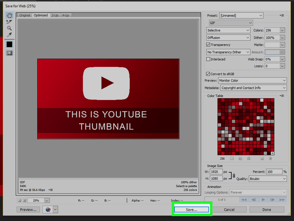
Save the layered file first as a PSD. Then export a web-ready version. Go to File > Export > Export As and choose JPG or PNG. JPG is usually best for photographic thumbnails because it creates smaller file sizes. PNG can be useful for graphics, sharp text, or designs with flat colors. Keep the file size within YouTube’s current limits for the upload method you plan to use.
After exporting, upload the thumbnail in YouTube Studio. For long-form videos, custom thumbnails are available when your account is verified and your thumbnail follows YouTube’s policies. After uploading, preview the video on desktop and mobile. If the thumbnail looks muddy, text-heavy, or too similar to competing videos, revise it before publishing.
Do not be afraid to test new thumbnail versions. YouTube offers tools such as test-and-compare features for eligible creators, and even without formal testing, you can review performance in YouTube Analytics. Watch for click-through rate, average view duration, impressions, and audience retention. A thumbnail that gets clicks but attracts the wrong viewers can hurt performance because people leave quickly. The best thumbnail is not just clickable; it attracts the right audience.
Best Practices for Clickable YouTube Thumbnails
Use Fewer Elements
Most winning thumbnails are simple. They do not show ten objects, five text blocks, and a background busier than a discount store on Black Friday. Choose one subject, one message, and one supporting visual. Simplicity is not boring; it is readable.
Design for Mobile First
Many viewers will see your thumbnail on a phone. That means tiny text, low contrast, and crowded details will fail. Design big. Use fewer words. Leave breathing room around the subject. If it works on mobile, it will usually work on desktop.
Match the Viewer’s Search Intent
If your video is a tutorial, make the result obvious. If your video is a review, show the product and the emotional verdict. If your video is entertainment, emphasize the moment, conflict, or surprise. A good thumbnail answers the silent viewer question: “Why should I watch this one?”
Avoid Misleading Clickbait
Curiosity is good. Deception is not. You can use expressive faces, dramatic contrast, and punchy text, but the content must deliver on the promise. Misleading thumbnails may win the click and lose the viewer, which is like catching a fish and immediately apologizing to it while it jumps back into the lake.
Make a Reusable Photoshop Template
Once you create a thumbnail style you like, save it as a reusable template. Keep editable text layers, color swatches, subject placement guides, and export settings. For a channel that posts weekly, templates can save hours while keeping your brand recognizable.
Common Photoshop Thumbnail Mistakes to Avoid
Using too much text: A thumbnail is not a paragraph. Let the video title do the heavy lifting and let the image create emotion.
Ignoring contrast: If your subject blends into the background, viewers will keep scrolling. Use brightness, blur, stroke, shadow, and color separation.
Exporting blurry images: Start with high-resolution assets. Do not enlarge tiny screenshots or low-quality photos and expect Photoshop to perform wizardry. It is powerful, not magical.
Forgetting the duration badge: Keep key text away from the bottom-right corner. That little time stamp has ruined many otherwise heroic designs.
Copying another creator too closely: Learn from successful thumbnails, but build your own visual identity. Inspiration is useful; cloning is awkward.
Example Thumbnail Workflow
Imagine you are creating a thumbnail for a video titled “How I Edit YouTube Thumbnails in Photoshop.” Here is a practical workflow:
- Create a 1280 x 720 canvas in RGB color.
- Add a blurred screenshot of Photoshop as the background.
- Place a cutout of yourself on the left side with a surprised or focused expression.
- Add the finished thumbnail mockup on the right side.
- Add large text: “MAKE IT POP.”
- Use a yellow text fill with a black stroke for readability.
- Add a soft glow behind the subject and a subtle vignette around the edges.
- Export as JPG and check the file size.
This design works because it quickly communicates the topic, shows a human face, includes a visual result, and uses short text. It does not require viewers to solve a puzzle. It gives them a clear reason to click.
Creator Experience: What I Learned Making YouTube Thumbnails in Photoshop
After making a lot of YouTube-style thumbnails in Photoshop, one lesson becomes obvious: the design that looks impressive on a giant monitor is not always the design that wins in the feed. Photoshop tempts you to zoom in, tweak tiny details, add texture, adjust shadows, refine edges, and polish pixels that no viewer will ever notice. There is nothing wrong with craftsmanship, but thumbnail design rewards clarity more than complexity.
The first practical experience is that starting with the title is not enough. You need the emotional hook. A title like “Photoshop Thumbnail Tutorial” is useful, but the thumbnail needs to show the result. When I compare a plain screenshot-based thumbnail with one that shows a before-and-after transformation, the second version usually feels stronger. Viewers do not just want to know what the video is about; they want to know what they will gain.
The second lesson is that faces are powerful, but only when they make sense. A face with a clear expression can add emotion and personality, especially for tutorials, reactions, reviews, and personal stories. But forcing a shocked face into every thumbnail can become ridiculous. If the video is about organizing layers in Photoshop, an expression of mild professional confidence may be better than looking like you just discovered a raccoon in your keyboard.
The third lesson is that text must earn its place. I used to add clever phrases because they sounded fun. Then I would zoom out and realize nobody could read them. Now I treat thumbnail text like a road sign. It should be short, bold, and impossible to misunderstand. Words like “EASY,” “FAST,” “FIXED,” “BEFORE,” “AFTER,” and “MISTAKE” work because they communicate quickly. Decorative text that does not add meaning should be removed, no matter how proud you are of the font choice.
The fourth lesson is to save versions. Photoshop makes experimentation easy, but it also makes it easy to wander into chaos. I like saving several versions: one with a face, one without, one with large text, one with minimal text, and one with a more dramatic color treatment. Seeing them side by side makes the best option obvious. The winning thumbnail is usually the one that communicates the idea fastest, not the one with the most effects.
The fifth lesson is that templates are a creator’s best friend. A reusable Photoshop thumbnail template with guides, text styles, color palettes, subject effects, and export settings can turn a one-hour job into a 15-minute job. Templates also help your channel look consistent. Viewers may not consciously notice your brand colors or layout, but they will start recognizing your videos faster.
Finally, the most important experience is this: do not design thumbnails only for yourself. Design for the viewer who has never heard of you, does not know why your video matters, and is scrolling past dozens of alternatives. That viewer needs clarity, curiosity, and trust. If your Photoshop thumbnail delivers all three, it has done its job beautifully.
Conclusion
Learning how to make a YouTube thumbnail in Photoshop is not just about creating a pretty image. It is about packaging your video idea in a way that is fast, honest, and visually irresistible. Start with the right 16:9 canvas, choose one clear idea, use a strong subject, add short readable text, improve contrast, and export the file correctly. Once you build a repeatable workflow, thumbnail creation becomes less stressful and much more strategic.
Think of your thumbnail as a promise. It should tell viewers what they will get, why they should care, and why your video is worth choosing right now. Photoshop gives you the control to make that promise look polished. Your job is to keep it clear enough for a tiny screen and interesting enough for a busy human. Do that, and your thumbnail will not just look good; it will work.
Note: This article is written for web publication in standard American English and is based on current YouTube thumbnail requirements, common creator design practices, and practical Photoshop workflows for layout, masking, typography, color correction, and export.