If Excel had a personality, PivotTables would be that one coworker who looks mysterious at first, then ends up saving everyone’s afternoon. They can summarize mountains of data in seconds, but one question trips up a lot of people: how do you add rows to a PivotTable?
The answer depends on what you mean by “rows.” If you want to add row labels inside the PivotTable, you do that by moving fields into the Rows area. If you want newly entered records from your source data to show up, you usually need to refresh the PivotTable and sometimes expand or change the data source. That little distinction is where most confusion begins.
This guide breaks the whole process into nine clear steps, with examples, practical tips, and a few “don’t throw your laptop yet” moments along the way. Whether you’re building a sales report, organizing inventory, or trying to make sense of a giant export that looks like it was assembled by raccoons, this walkthrough will help.
What “Adding Rows” Actually Means in a PivotTable
Before we jump in, let’s clear up the Excel vocabulary. In a normal worksheet, adding rows means inserting new spreadsheet rows. In a PivotTable, adding rows usually means one of two things:
- Adding a field to the Rows area so the PivotTable displays another row category
- Adding new source-data records and then updating the PivotTable so those records appear in the summary
That’s why some people say, “I added rows and nothing happened.” Excel is not broken. It is just waiting for you to either place a field in the right area or refresh the data source. Very on-brand behavior, honestly.
Step 1: Make Sure Your Source Data Is Clean
Start with the data behind your PivotTable. For a PivotTable to behave nicely, your source range should have:
- One header row at the top
- No completely blank rows inside the dataset
- No blank columns breaking up the table
- Consistent data types in each column whenever possible
For example, if you have sales data, your columns might be Date, Region, Product, Sales Rep, and Revenue. Each row should represent one record. Think of each row as one little fact. If the dataset has merged cells, random subtotals, or mystery columns named “Stuff,” your PivotTable may still work, but it will act like it resents you.
Clean source data makes it easier to add row labels, reorder categories, and refresh without weird surprises.
Step 2: Convert the Source Range to an Excel Table
This step is not always required, but it is one of the smartest things you can do. Select your source data, then turn it into an Excel Table. This helps because tables automatically expand when you add new records at the bottom.
Why does that matter? Because if your PivotTable is based on an Excel Table instead of a fixed cell range, new source rows are much more likely to be included after a refresh. That means less manual fixing and fewer dramatic sighs.
To do this:
- Select any cell in your dataset.
- Go to the Insert tab.
- Choose Table.
- Confirm that your table has headers.
Give the table a meaningful name if you want, such as SalesData or Inventory2026. Future you will appreciate that small act of kindness.
Step 3: Create a New PivotTable or Click Inside the Existing One
If you are starting from scratch, select your data or table, go to Insert > PivotTable, and choose where the PivotTable should be placed. A new worksheet is usually the cleanest choice, especially if your workbook already looks like a digital garage.
If the PivotTable already exists, simply click anywhere inside it. This is important because Excel needs to know which PivotTable you’re working on before it shows the related tools and field options.
Once selected, Excel will display the PivotTable interface, including the field list or field pane. That’s where the real row-adding magic happens.
Step 4: Open the PivotTable Fields Pane
When you click inside a PivotTable, Excel usually shows the PivotTable Fields pane automatically. If it doesn’t appear, do not panic and do not assume Excel has vanished into another dimension.
Look for the option to show the field list from the PivotTable tools on the ribbon. Once open, you’ll see two main sections:
- A list of available fields from your source data
- Four drop zones: Filters, Columns, Rows, and Values
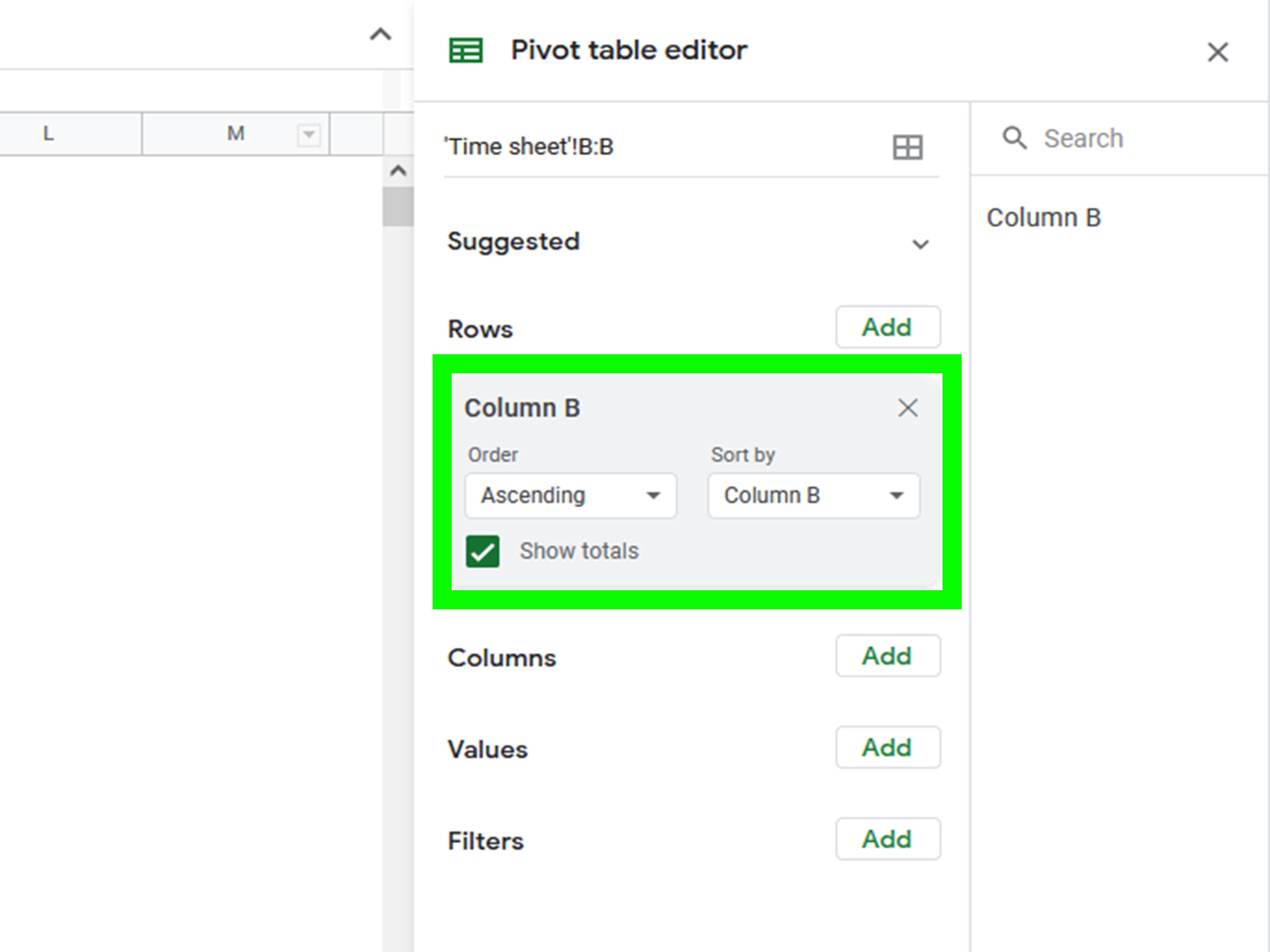
This pane is the control center. The Rows area is what determines the row labels shown down the left side of the PivotTable. If you want to add rows to the report layout, this is your destination.
Step 5: Drag the Field You Want into the Rows Area
Now for the step people usually mean when they ask how to add rows to a PivotTable.
From the field list, drag a category field into the Rows area. For example:
- Drag Region into Rows to show East, West, North, and South down the side
- Drag Product into Rows to list each product as a row label
- Drag Sales Rep into Rows to organize the report by person
You can also check a field’s box, and Excel may place it automatically. In many cases, non-numeric fields go to the Rows area by default. Still, drag-and-drop gives you more control, which is useful when Excel makes an “interesting” decision on your behalf.
At this point, your PivotTable will update immediately. Congratulations: you have added rows.
Step 6: Add Additional Row Fields for Nested Row Levels
Want more than one row category? Add another field to the Rows area. This creates a hierarchy, or nested row structure.
For example, if you place Region first and Product second, your PivotTable might show this structure:
- East
- Widgets
- Gadgets
- West
- Widgets
- Gadgets
This is one of the best ways to make a PivotTable more useful. Instead of a giant flat list, you get layers of meaning. It is basically Excel’s version of getting your closet organized by season and color instead of tossing everything into one chair pile.
You can keep adding row fields as needed, but use restraint. A PivotTable with six nested row levels is technically impressive and emotionally exhausting.
Step 7: Reorder the Row Fields to Change the Report Structure
The order of fields in the Rows area matters. A lot.
If Region is above Product, the PivotTable groups products within each region. If you move Product above Region, Excel flips the structure so regions appear within each product.
That means you can “add rows” and reshape the entire report without touching the source data. Just drag the fields up or down inside the Rows area until the layout tells the story you want.
Use this trick when:
- You want a manager-level summary first, with details underneath
- You need a cleaner presentation for a meeting
- You are trying to stop the report from looking like a wall of alphabet soup
If the layout feels cramped, experiment with Compact, Outline, or Tabular form from the PivotTable design options. Tabular form is often easier to read when you have multiple row fields.
Step 8: Refresh the PivotTable After Adding New Source Rows
Here is the second meaning of “adding rows”: you added new records to your original data and want them to appear in the PivotTable.
In that case, you need to refresh the PivotTable. Right-click anywhere inside the PivotTable and choose Refresh, or use the refresh command from the PivotTable tools on the ribbon.
This step updates the summary based on the latest data. If you changed a value, added transactions, or filled in missing records, refreshing tells Excel to rebuild the PivotTable view.
Example: suppose your sales table originally had January through March data, and you add April rows at the bottom. After refreshing, those new rows can be included in the PivotTable summary, provided the source data range actually covers them.
If your PivotTable is based on an Excel Table, this usually works beautifully. If it is based on a fixed range, keep reading.
Step 9: Change the Data Source If New Rows Fall Outside the Original Range
Sometimes you refresh and still do not see the new data. That usually means the PivotTable is still pointing to the old source range.
When that happens:
- Click inside the PivotTable.
- Open the PivotTable tools on the ribbon.
- Choose Change Data Source.
- Select the updated table or a larger cell range.
- Confirm the change and refresh again.
This is especially common when someone created the PivotTable from a simple range like A1:E200, and the dataset has now grown to row 450. Excel is not ignoring the new data out of spite. It just cannot summarize what it was never told to watch.
Once the source is corrected, your new rows should flow into the PivotTable properly.
Best Practices for Adding Rows to a PivotTable
Use text fields in the Rows area
Text or category-based fields usually make the most sense as row labels. Examples include department names, cities, products, customer segments, and employee names.
Use numeric fields in the Values area
If you drop a number field into Rows, Excel may list every unique number as its own label. Sometimes that is useful, but often it turns your PivotTable into a very strange census.
Keep the source data dynamic
If the report changes often, build the PivotTable from an Excel Table. It makes ongoing updates smoother and reduces manual maintenance.
Refresh often
A PivotTable is a summary, not a live mind reader. If your source changes, refresh before assuming the report is wrong.
Common Problems and Quick Fixes
Problem: The field I need is missing.
Fix: Refresh the PivotTable. If the field was added as a new source-data column, make sure the source range includes it.
Problem: My new records are not showing up.
Fix: Refresh first. If that fails, change the data source or rebuild the PivotTable from an Excel Table.
Problem: My row labels look squished together.
Fix: Switch the layout to Tabular form or Outline form for better readability.
Problem: I dragged the wrong field into Rows.
Fix: Remove it from the Rows area and drag in the correct field. PivotTables are forgiving, unlike some spreadsheet formulas.
Real-World Experiences With Adding Rows to a PivotTable
One of the most common real-world experiences with PivotTables is thinking you have done something wrong when the issue is actually just a missing refresh. You add a few new transactions to the bottom of your dataset, stare at the PivotTable, and wonder why Excel is acting like those rows do not exist. Then you hit Refresh, and suddenly the report wakes up like it just had coffee. That small moment is practically a rite of passage for Excel users.
Another very normal experience is dragging the wrong field into the Rows area and accidentally creating a monster report. Maybe you meant to group sales by Region, but instead you dragged Order ID. Suddenly the PivotTable explodes into hundreds of tiny row labels, and your clean summary turns into a scroll marathon. The good news is that this is not a disaster. It is just Excel reminding you that field choice matters.
Many beginners also discover that adding a second row field is the moment PivotTables finally click. The first row field is useful, sure. But when you add another one and see a neat hierarchy appear, the report starts to feel powerful. For example, grouping by Department and then by Employee can instantly turn a messy sheet into a report that actually tells a story. That is often the point where people stop fearing PivotTables and start using them on purpose.
There is also the surprisingly common experience of inheriting someone else’s workbook. The PivotTable works, sort of, but nobody knows where the source data begins or ends. You add new rows, refresh, nothing changes, and then you discover the PivotTable is pointing to a range that ends 300 rows ago. At that point, converting the source to an Excel Table feels less like a formatting choice and more like emotional self-defense.
In office settings, adding rows to a PivotTable often becomes part of a weekly routine. A manager drops in fresh numbers every Monday, refreshes the report, adjusts a few row fields, and sends out the latest summary before the second cup of coffee gets cold. Once the setup is right, the process becomes fast, repeatable, and oddly satisfying. It is one of those Excel skills that looks small until it saves you time over and over again.
Students and freelance workers run into similar situations. A student tracking survey responses may add rows every day and refresh the PivotTable to see trends by age group or major. A freelancer might organize invoices by client and month. In both cases, the ability to add row labels and update source records turns a basic spreadsheet into a practical reporting tool.
The biggest lesson from real experience is this: PivotTables are less about memorizing buttons and more about understanding structure. Once you know the difference between row labels, source rows, refresh, and data source range, Excel stops feeling confusing and starts feeling predictable. And predictable is exactly what you want from a spreadsheet that holds your deadlines, budgets, or quarterly numbers.
Conclusion
If you want to add rows to a PivotTable, the fastest route is to drag a field into the Rows area of the PivotTable Fields pane. If you want newly entered records to appear, refresh the PivotTable and, when needed, update the data source. That is the whole secret.
Once you understand that one idea, PivotTables become much easier to control. You can build nested row levels, rearrange categories, clean up the layout, and keep reports updated without rebuilding everything from scratch. In other words, you go from “Why is this not working?” to “I have conquered the spreadsheet.”