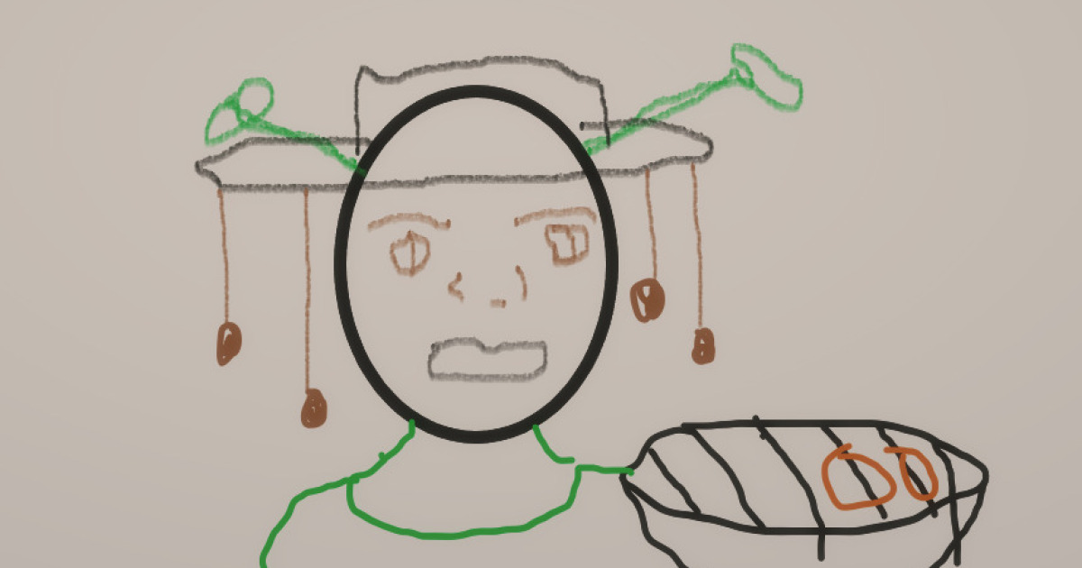
If your sketchbook has been feeling a little too serious lately, this is your sign to fix it with one word: Shrek. More specifically, international Shrek. This challenge is exactly what it sounds like: take one of the most recognizable cartoon ogres ever made, then reimagine him as if he stepped out of different countries, cultures, and design traditions around the world.
It’s goofy. It’s creative. It’s surprisingly educational. And yes, it can also become a genuinely strong character-design exercise if you do it right.
In this guide, we’ll turn the “Hey Pandas” style prompt into a full-on art challenge with structure: how to choose references, how to make your version feel respectful (not random), how to keep Shrek recognizable, and how to use silhouette, gesture, costume, and color to build country-inspired fan art that looks intentional instead of “green guy with a hat.”
Why This Drawing Challenge Works So Well
Shrek is a goldmine for stylized art because his design is instantly readable. Even in a rough sketch, you can usually identify him by a few features: broad body shape, round head, tube-like ogre ears, and that grumpy-but-soft expression that says, “I want peace, but chaos keeps finding me.”
That clear recognizability is exactly why this challenge is fun. You’re not inventing a character from scratch. You’re remixing a familiar one. That gives you room to experiment with:
- National dress and regional fashion influences
- Different color palettes and textures
- Props, patterns, and materials
- Visual storytelling and humor
- Parody and personality
In other words, you’re practicing character design, cultural research, and visual communication without the pressure of building a brand-new character universe. It’s a low-stress challenge with high creative payoff.
Before You Draw: 5 Smart Rules for Country-Inspired Shrek Fan Art
1) Start with real references, not stereotypes
This is the big one. “Shrek from different countries” can be hilarious and brilliant, but only if your design choices come from real visual research. That means looking at actual textiles, silhouettes, regional garments, color palettes, materials, and everyday objectsnot just grabbing a random flag and calling it done.
A better approach: choose one country, then pick a specific lane:
- Traditional clothing
- Street style
- Festival attire
- Historical workwear
- Regional embroidery or weaving patterns
The more specific you get, the stronger your drawing becomes.
2) Keep Shrek recognizable
This isn’t a “draw a random person from Country X” challenge. It’s still Shrek. Your job is to keep the core visual identity while changing the cultural styling. If people need a caption to know it’s Shrek, you may have wandered too far into “mystery green uncle.”
Keep at least three anchor traits consistent, such as:
- Ogre ears
- Large rounded torso
- Heavy boots or sturdy feet
- Slightly slouched posture
- Dry, unimpressed facial expression
3) Use parody, not mockery
The challenge works best when it feels playful and affectionate. Lean into exaggeration, visual jokes, and dramatic styling, but avoid turning cultural elements into punchlines. The joke should be the creative mashup, not the culture itself.
4) Build the design around personality
One of the easiest mistakes in fan art is decorating the character without changing how they “feel.” Ask yourself: What version of Shrek is this? Is he a sleepy fisherman? A loud street-food legend? A mountain shepherd? A polished wedding guest who clearly hates formalwear?
Once you answer that, your clothing, props, and pose become much easier to choose.
5) Treat fan art as creative practice, not legal certainty
Parody and commentary can fall under fair use in the U.S., but copyright issues are always case-by-case. So if you’re posting this challenge online, keep it clearly transformative, credit the inspiration, and avoid treating fan art like official merch or commercial branding unless you have permission.
How to Design a Country-Inspired Shrek That Actually Looks Good
Step 1: Block the silhouette first
Before details, do tiny silhouette thumbnails. This is where your design either lives or dies. A strong silhouette makes the character readable from across the room (or across a scrolling feed). Start with Shrek’s base shape, then modify the outer shape with a jacket cut, hat shape, draped fabric, shoulder profile, or boots.
Pro tip: if your silhouette still reads as Shrek in solid black, you’re winning.
Step 2: Add gesture and attitude
Don’t just pose him standing like a potato. Gesture gives your version personality. A slight lean, hand placement, chest angle, and head tilt can communicate a lot. Think “Shrek but…”:
- …running a market stall
- …performing at a festival
- …commuting in a packed city
- …cooking outdoors
- …posing like he knows he looks incredible (he does)
Step 3: Exaggerate with purpose
Great cartoon design exaggerates what matters. Push proportions, but do it intentionally. Make the coat broader, the hat taller, the sleeves puffier, the boots chunkier, or the scarf more dramatic. Exaggeration is what makes the design memorable, especially in a comedic challenge like this.
Step 4: Use color like a storyteller
Color is not just decoration. It tells mood, setting, and cultural influence. Instead of randomly assigning colors, pick a palette inspired by real references: textiles, ceramics, regional architecture, festival garments, or landscapes.
Also pay attention to:
- Value: light vs. dark contrast for readability
- Saturation: muted earthy tones vs. bright celebratory colors
- Accent colors: one bold color to draw the eye
Step 5: Use line weight to separate forms
Thick-to-thin line work helps you organize the drawing. Use heavier line weight on the outer silhouette and foreground shapes, then lighter lines for textures, folds, and pattern details. It keeps the character readable even when the outfit gets complex.
10 Fun Country-Inspired Shrek Concepts to Try
Here’s where the challenge gets deliciously chaotic. These prompts are meant to inspire your own interpretations, not lock you into one “correct” version.
1) Shrek in Japan (Festival Night Version)
Think summer matsuri energy: patterned happi coat, lantern glow, sandals, and a slightly annoyed expression while holding a snack he definitely pretends not to enjoy. Use indigo, cream, and a punchy red accent. Add a fan, paper lanterns, or a festival banner in the background for instant context.
2) Shrek in Scotland (Highland Wind Mode)
This one is pure silhouette gold. Build around layered tartan shapes, a heavy coat, and strong boots. Let the fabric structure do the visual work. A blustery pose sells it: one hand gripping his cloak, ears tilted into the wind, expression saying, “I should have stayed in the swamp.”
3) Shrek in India (Wedding Guest, Slightly Overdressed)
Go for rich textiles, embroidered borders, and saturated jewel tones. Keep the design respectful by studying real garment cuts, drape behavior, and ornament placement. The funniest version is not a costume overloadit’s a polished, elegant look with Shrek’s deeply unimpressed face.
4) Shrek in Mexico (Market Morning Sketch)
Focus on texture and everyday visual storytelling: woven bag, embroidered shirt details, practical sandals or boots, produce basket, and warm sunlight colors. Add Donkey as the most overexcited shopping buddy in human history if you want bonus chaos.
5) Shrek in Nigeria (Celebration Style)
This is a fantastic chance to explore bold shape language and fabric presence. Build the design around strong drape, headwear, and confident posture. Let the clothing volume expand his silhouette. Make the pose proud and groundedthis one should feel powerful, not just funny.
6) Shrek in France (Countryside Chef Energy)
Picture Shrek in a rustic apron, striped shirt, sturdy clogs, and a baguette he claims is “just bread” while guarding it with his life. Use soft neutrals and muted blues. Add flour on the apron for character. The key here is charm through restraint.
7) Shrek in South Korea (Street Style Version)
Modern streetwear gives you huge room for shape exploration: oversized jacket, layered tops, chunky sneakers, crossbody bag. Keep Shrek’s body proportions but update the styling language. This concept works especially well if you focus on silhouette and clean color blocking.
8) Shrek in Morocco (Market Traveler Look)
Use layered fabrics, practical travel details, and warm earth tones with a few cool accents. A strong robe silhouette or jacket cut can make the whole design feel distinct. Props like a tea tray, lantern, or woven basket can add story without overloading the drawing.
9) Shrek in Peru (Mountain Village Version)
Build the design around warmth and altitude: layered knits, woven textures, sturdy boots, and practical accessories. This is a texture-forward concept, so have fun with pattern rhythm. Make the color palette feel connected to landscapedeep reds, browns, sky blues, and natural wool tones.
10) Shrek in the United States (Road Trip Swamp-Core)
This one can go full comedy. Give him a thrifted flannel, trucker cap, oversized coffee cup, and a bumper sticker situation nobody asked for. Or go regional: desert Southwest, New York commuter, Gulf Coast fisherman, Midwest county-fair dad. “USA Shrek” is really ten sub-challenges in one.
How to Turn This Into a Viral “Hey Pandas” Community Prompt
If you’re publishing this as a blog post, social challenge, or community activity, structure matters. A good prompt gets more entries because it reduces confusion.
Use a clear challenge format
Try this prompt:
“Hey Pandas, let’s try to draw Shrek as if he was in different countries. Pick one country, use real visual references, keep him recognizable, and share your drawing + one sentence about your inspiration.”
Set simple submission rules
- One drawing per country
- No AI filters over existing copyrighted frames
- Use your own drawing or painting
- Add a short note about your references
- Keep the humor friendly and respectful
Encourage process shots
People love seeing thumbnails, rough sketches, and color tests. It also nudges participants toward better design decisions, because they think through silhouette and palette before rendering.
Add categories for engagement
- Funniest Design
- Best Color Palette
- Most Readable Silhouette
- Best Cultural Research
- Most Unexpected Country Choice
Make it accessible
If the article is going on the web, invite alt text for each drawing. It helps more people enjoy the challenge and makes your content more user-friendly overall.
Common Mistakes to Avoid (So Your Shrek Doesn’t Look Like a Green Tourist)
- Using only a flag palette: Flags are not a full design system.
- Over-detailing too early: Start with shape and silhouette first.
- Ignoring body language: Clothing alone won’t sell the concept.
- Mixing unrelated references: Pick one clear style direction.
- Going “costume” instead of “character”: Ask what this version of Shrek actually does all day.
- Making culture the joke: Make the mashup the joke, not the people.
Conclusion: Why This Challenge Is More Than a Meme
“Hey Pandas, Let’s Try To Draw Shrek As If He Was In Different Countries” sounds like a silly internet promptand it isbut it’s also one of those rare creative exercises that sneaks real skill-building into the fun.
You practice character design. You learn how to use silhouette and gesture. You get better at color and line weight. You train yourself to research real visual traditions instead of guessing. And if you run it as a community challenge, you get a gallery of wildly different interpretations from the same core character, which is basically a masterclass in visual storytelling.
So yes, absolutely draw Shrek in different countries. Draw ten versions. Draw fifty. Draw one that looks majestic and one that looks like he got lost on vacation and is pretending everything is fine. The point is to have fun and level up your art at the same time.
Ogres, it turns out, are excellent teachers.
Extra Experiences: What Happens When People Actually Try This Challenge
One of the best things about this challenge is how quickly it turns from “haha, funny idea” into “wait, this is actually making me a better artist.” A lot of people start with a joke conceptsomething like “Shrek in Paris with a baguette” or “Shrek in Tokyo at a vending machine”and then realize halfway through the sketch that they need better references to make it work. That moment is the secret sauce. Suddenly, the challenge becomes less about drawing a meme and more about studying clothing shapes, props, posture, and design language.
I’ve seen artists describe this kind of prompt as a confidence-builder because the character is already familiar. You don’t have to invent a face from zero. You already know the basic proportions, the ears, the body shape, and the expression range. That frees up your brain to focus on the parts that usually feel hard: fabric folds, pattern placement, color harmony, or storytelling props. It’s like using training wheels, except the training wheels are a grumpy green icon from a fairy-tale swamp.
Another common experience: people think they’ll make one drawing, then end up making a full series. Why? Because once you crack the first version, your brain starts seeing possibilities everywhere. “What would Shrek wear in a rainy city?” “What would wedding Shrek look like?” “What would Fiona’s matching outfit be?” “What country-inspired version would Donkey absolutely ruin by being too excited?” The prompt expands naturally, which makes it perfect for social media carousels, blog galleries, or community contests.
This challenge also creates really fun conversations in art communities. Participants often share not only the finished drawing but the research behind itfabric references, traditional patterns, local architecture, or color palettes from street photos. That makes the comments section way more interesting than a normal fan art post. Instead of only “Looks cool!”, you get “I love how you used the shoulder shape from that regional jacket,” or “The color palette feels like the landscape.” It becomes a mini critique session in the best possible way.
And yes, there are hilarious fails, too. People over-render the outfit and forget Shrek’s face. People accidentally design “green human man with accessories.” People choose fifteen colors and create visual chaos. But even those versions are useful, because the mistakes are obvious and fixable. Usually the solution is simple: stronger silhouette, fewer details, clearer focal point, and a better gesture.
If you’re a blogger, this is the kind of topic that keeps readers engaged because it combines humor, fandom, and practical art education. If you’re an artist, it’s a low-pressure way to practice skills that transfer to everything else you draw. And if you’re part of an online community, it’s one of those rare prompts where beginners and advanced artists can join the same challenge and both have a great time.
Basically, the experience is this: you show up for the ogre, and you stay for the design practice.