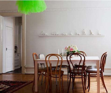
The Green Liv Light by Jonas Bohlin is the kind of design object that behaves politely from a distance and then, once you notice it, refuses to leave your brain. It is part pendant lamp, part floating skirt, part Scandinavian design wink. In a neutral dining room, it does not merely hang from the ceiling; it hovers like a neon-green thought bubble saying, “Yes, minimalism can have a sense of humor.”
Originally designed in 1997 for Klong, the Liv lamp is a smart example of what happens when a serious Swedish designer decides that softness can be architectural. Its shade is made from tulle, the airy netting more commonly associated with ballet, veils, and dramatic entrances. But in Bohlin’s hands, tulle becomes a light diffuser, a sculptural shell, and a surprisingly practical way to bring color into a room without painting a wall the shade of electric limeade.
This article takes a closer look at the Green Liv Light by Jonas Bohlin: its origin, materials, visual impact, styling potential, and why it still feels fresh years after it first caught the eye of design lovers. Consider it a design detective case, except the suspect is adorable, green, and probably better lit than the rest of us.
Who Is Jonas Bohlin?
Jonas Bohlin is one of Sweden’s most respected interior architects and designers, known for furniture, lighting, interiors, tableware, textiles, and objects that often blur the line between function and art. Born in Stockholm in 1953, he became widely known after his 1981 graduation project at Konstfack: the now-famous Concrete chair. That chair, made from iron and concrete, was not exactly the item you would casually drag to the breakfast table, but it sparked a major conversation about what furniture should be.
That questionshould design be practical, poetic, provocative, or all three before coffee?runs through much of Bohlin’s work. The Liv Light is far gentler than the Concrete chair, yet it belongs to the same creative universe. It challenges expectations. Instead of a hard metal shade, it uses soft tulle. Instead of disappearing into a ceiling, it announces itself. Instead of relying only on the usual Scandinavian palette of white, gray, black, and wood, the green version adds a vivid jolt of life.
What Is the Liv Light?
The Liv Light is a lamp series designed by Jonas Bohlin for Klong. Product listings identify the Liv pendant lamp as a 1997 design with a tulle shade and steel structure. The large pendant version is listed with a total height of about 70 centimeters and a 50-centimeter shade, while the smaller pendant has a total height of about 60 centimeters and a 40-centimeter shade. The larger shade has appeared in several colors, including white, red, green, and blue.
There are also table and floor versions of the Liv lamp. The floor lamp reaches about 185 centimeters high, giving the same airy tulle effect a more upright, almost figure-like presence. But the green pendant remains especially memorable because it combines three ingredients that rarely sit together quietly: a theatrical material, a saturated color, and a clean Scandinavian frame.
Why the Green Version Works So Well
Green can be a tricky color in interiors. Choose the wrong shade and suddenly your dining room feels like a smoothie bar, a tennis court, or a science experiment with excellent overhead lighting. The Green Liv Light avoids that trap because the color is filtered through layers of tulle. It reads as vivid, but not flat. It glows rather than shouts. The netted textile gives the color movement and depth, so the green changes slightly depending on the light, the time of day, and the surrounding palette.
That is why the Green Liv Light works beautifully in neutral rooms. Against white walls, pale wood, stone floors, linen curtains, or simple black chairs, it becomes the one confident gesture. The room does not need five accent colors, three patterned rugs, and a sofa that looks like it escaped from a modern art museum. One green tulle pendant can do the work of an entire mood board.
A Soft Material with Architectural Presence
Tulle is usually associated with softness, transparency, and movement. In the Liv lamp, those qualities become structural. The layered shade gives the lamp volume without heaviness. It occupies space but does not block it. That is a clever design move, especially for dining rooms, small apartments, children’s rooms, studios, and airy kitchens where a solid pendant might feel too bulky.
Because the shade is translucent, the lamp has a cloudlike quality. It can be dramatic without becoming visually dense. Imagine a chandelier that went to ballet school, studied Swedish restraint, then came home with a green streak in its hair. That is the Liv Light.
Design Analysis: Scandinavian, But Not Predictable
Scandinavian design is often summarized as clean, functional, bright, and simple. That is mostly true, but it can also be unfairly reduced to beige sweaters, pale wood, and rooms where even the dust looks curated. The Green Liv Light reminds us that Scandinavian design has always had room for experimentation, craft, color, and personality.
The lamp follows several classic Nordic principles. It is functional. It uses a clear structure. It is not overloaded with ornament. Its form is understandable at a glance. Yet it also introduces surprise through material and color. That balance is what makes the piece more than a decorative novelty. It is not green for the sake of being green; it uses green to sharpen the room’s emotional temperature.
The Beauty of Contrast
One of the reasons the Green Liv Light feels compelling is contrast. The steel support is firm and linear. The tulle is soft and layered. The Scandinavian design language is restrained. The neon-like green is playful. The object is light in weight but strong in personality. In interior design, contrast creates memory. A room full of similar textures can feel tasteful but forgettable. Add one unexpected piece, and suddenly the space has a pulse.
How to Style the Green Liv Light
The Green Liv Light by Jonas Bohlin is not a background lamp. It wants a role. The trick is to let it star without turning the room into a one-lamp musical.
1. Keep the Surroundings Calm
Pair the lamp with neutral walls, matte finishes, pale woods, black metal, white ceramics, and natural textiles. The green shade will stand out more clearly if the surrounding palette is quiet. Think of it as giving the lamp breathing room. Even divas need negative space.
2. Use It Over a Dining Table
A pendant light above a dining table naturally creates a focal point. The Liv Light works well here because the tulle shade feels festive without being formal. It adds a little ceremony to everyday meals. Toast becomes more interesting. Soup becomes suspiciously elegant.
3. Try It in a Child’s Room
The lamp’s soft silhouette and playful color can work beautifully in a child’s bedroom or playroom, especially when the rest of the space is simple. It feels whimsical without relying on cartoon themes. That means it can grow with the room instead of becoming embarrassing the moment the child decides dinosaurs are “for babies.”
4. Let It Warm Up a Minimal Kitchen
In a white or wood-toned kitchen, the green Liv pendant can act like a fresh herb dropped into a clean recipe. It adds energy, but not clutter. It is especially effective over a breakfast nook, island, or small café table.
5. Avoid Too Many Competing Colors
If the room already includes red chairs, blue cabinets, patterned wallpaper, and a rug with five opinions, the green Liv lamp may have to compete for attention. It is strongest when it is the main chromatic statement. Pair it with one or two subtle green accents elsewhereperhaps a plant, vase, or artworkbut resist the urge to match everything. Matching too much can make a room look less designed and more like it lost a bet with a paint fan deck.
Lighting Performance: What to Expect
The Liv Light is best understood as an atmospheric and decorative fixture rather than a hard-working task lamp. Tulle diffuses light softly, which helps reduce visual harshness and creates a gentle glow. That makes the lamp ideal for dining, lounging, and mood-setting. It is not the best single source for chopping vegetables, reading tiny print, or finding a dropped earring in a rug with the texture of a sheepdog.
For a practical lighting scheme, pair the Liv Light with other layers: ambient lighting for general brightness, task lighting for work surfaces, and accent lighting for artwork or shelves. This layered approach prevents the room from depending on one fixture to do everything. The Liv can be the personality; recessed lights, sconces, or table lamps can handle the paperwork.
Authentic Design vs. DIY Inspiration
One reason the Green Liv Light gained online attention is that its basic visual ideatulle wrapped into a shadeinvites DIY curiosity. A resourceful person can imagine creating a tulle pendant with affordable components and fabric. That is part of the design’s charm: it looks magical, but the material is familiar.
However, there is a difference between being inspired by a design and owning the original. Bohlin’s version has the proportions, structure, and refinement of a professional object. The tension between the steel frame and the airy tulle is not accidental. The lamp’s success depends on scale, density, suspension, and the way the shade holds its volume. A DIY version may capture the spirit, but the original Liv Light has the clarity of a finished design.
Why This Lamp Still Feels Relevant
The Green Liv Light remains interesting because it fits several current interior design desires at once. People want rooms that feel personal, not generic. They want color, but often in a controlled way. They want softness after years of hard minimalism. They want objects with a story. The Liv Light checks all those boxes without looking like it is trying to win a trend report.
It also offers a lesson in restraint. A single expressive fixture can transform a room more effectively than a dozen small accessories. Instead of scattering green cushions, green candles, green bowls, and green “Live Laugh Lamp” signs around the house, choose one sculptural green light and let it do the heavy lifting. Your shelves will thank you.
Buying and Collecting Notes
Because the Liv Light is a design piece with vintage and collectible appeal, availability may vary. Older product listings and auction records show pendant, table, and floor versions, but current stock, pricing, color options, and electrical compatibility can change. Anyone sourcing one should confirm dimensions, condition, wiring, shade color, and whether the fixture meets local electrical standards.
For vintage examples, inspect the tulle carefully. Textile shades can yellow, stretch, tear, collect dust, or lose tension over time. That does not mean a used Liv lamp should be avoided, but it does mean condition matters. A little patina may be charming; a drooping shade that looks like it survived a raccoon incident is another matter entirely.
Best Rooms for the Green Liv Light
The Green Liv Light works especially well in interiors that need a focal point but not a heavy fixture. It suits Scandinavian modern homes, eclectic apartments, creative studios, minimalist dining rooms, and interiors with pale wood or white walls. It can also soften industrial spaces with concrete floors, exposed brick, or black metal shelving.
In a small room, use the lamp as the main decorative feature and keep other elements simple. In a larger room, repeat the green subtly through plants, art, or glassware. The goal is conversation, not chorus. The lamp should feel connected to the space, not stranded like a fashionable visitor who arrived at the wrong party.
A 500-Word Experience Note: Living With a Green Tulle Lamp
Experiencing the Green Liv Light is different from simply looking at it in a product photo. In a photograph, the lamp reads as an object: green, round, soft, a little theatrical. In a room, it becomes more atmospheric. During the day, when natural light filters through the space, the tulle shade can appear almost weightless. It adds a transparent wash of color rather than a solid block. This is especially noticeable in rooms with white walls or pale wood floors, where the green seems to float rather than sit.
At night, the mood changes. The shade becomes warmer, deeper, and more sculptural. The layered tulle catches light in a way that makes the lamp feel handmade, even when the structure is carefully designed. Guests tend to notice it quickly, but not in the way they notice a television mounted too high or a chair no one is allowed to sit in. They notice it because it feels unexpected. It raises the room’s charm level without demanding that everyone discuss “important design” before dessert.
The most successful experience comes when the lamp is given a simple setting. Over a wooden dining table, it can make weekday dinners feel a little more composed. Above a small round table, it creates intimacy. In a reading corner, it becomes decorative rather than task-oriented, so it should be paired with a proper reading lamp. In a child’s room, it feels playful but not childish. That is a rare and useful quality.
There is also a practical emotional effect. Green brings associations of leaves, freshness, spring, and energy. But because the Liv Light uses tulle, the color is softened. It avoids the intensity of a solid green metal shade. The result is cheerful without becoming loud. It is the difference between someone wearing a beautiful green scarf and someone entering the room dressed as a traffic signal.
Maintenance is part of the experience, too. Tulle can gather dust, so gentle cleaning matters. It is not the kind of shade to attack with a wet cloth or aggressive vacuum attachment. A soft duster, careful handling, and respect for the textile will go a long way. If sourcing vintage, buyers should check whether the shade still holds its shape and whether the tulle has discoloration or damage.
The biggest design lesson from living with a lamp like this is confidence. Many people decorate safely and then wonder why the room feels flat. The Green Liv Light proves that one bold object can make a space feel more finished, more personal, and more alive. It does not require maximalism. It requires the courage to let one piece be memorable.
Conclusion
The Green Liv Light by Jonas Bohlin is a small design mystery with a satisfying answer: it works because it combines opposites. It is soft but structured, playful but disciplined, colorful but elegant, Scandinavian but not predictable. Its tulle shade gives it motion and delicacy, while its green color adds a lively spark to quiet interiors.
For anyone studying pendant lighting, Scandinavian design, or the art of choosing one unforgettable focal point, the Liv Light offers a valuable lesson. A room does not always need more things. Sometimes it needs one brave thing in the right place. In this case, that thing happens to be green, gauzy, and charming enough to make your ceiling look like it has excellent taste.
Note: This article is an original editorial synthesis prepared for web publication. Product availability, pricing, condition, and electrical specifications should be confirmed with the seller before purchase.