Neon signs are supposed to do one simple job: glow beautifully and tell people where to spend their money. Easy, right? A diner wants to say “Open.” A hotel wants to say “Vacancy.” A shop wants to say “Fresh Coffee.” Then one tiny tube burns out, and suddenly the sign is no longer marketingit is public comedy with electricity.
That is the magic behind 93 of the worst neon sign fails ever. These glowing disasters prove that even a carefully designed sign can turn into a punchline after one missing letter, one bad installation, one weak transformer, or one unfortunate design choice. A neon sign can make a business look stylish, nostalgic, and unforgettable. It can also make a perfectly normal storefront look like it lost a spelling bee during a thunderstorm.
From restaurants accidentally advertising mystery food to motels sending the wrong message at midnight, neon sign fails are funny because they are so public. A typo in an email can be deleted. A typo in a glowing red window sign becomes a neighborhood landmark. Worse, people take photos. Then the internet arrives wearing roller skates.
Why Neon Sign Fails Are So Funny
The best neon sign fails usually happen for a painfully simple reason: one letter stops working. Unlike a printed banner, a neon sign is made of separate illuminated sections. When one tube burns out, cracks, flickers, or loses power, the remaining letters keep shining with full confidence. That confidence is the problem.
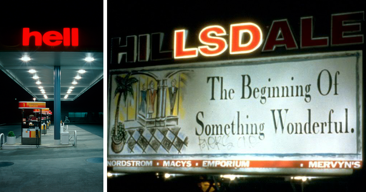
A sign that once said “Shell” can become “Hell.” A sign that once promised “Fresh Donuts” may suddenly offer something much less appetizing. A restaurant sign can lose two letters and create a brand-new business model nobody approved. The comedy comes from the gap between what the owner meant and what the sign now says.
Neon also has personality. It glows warmly, buzzes softly, and feels more alive than a flat printed sign. So when it fails, it fails dramatically. A dead bulb in a supermarket aisle is boring. A broken neon sign over a hotel entrance looks like the building is sending secret messages to passing traffic.
A Brief Glow-Up: How Neon Became Iconic
Neon signs became popular because they were impossible to ignore. Modern neon lighting traces back to early 20th-century experiments with glowing gases, and by the 1920s neon advertising had begun appearing in American cities. Over time, neon became part of the visual language of diners, theaters, motels, bars, drugstores, bowling alleys, and downtown streets.
For decades, neon was not just signage. It was atmosphere. A red neon “Open” sign could make a rainy street feel cinematic. A motel sign shaped like an arrow could turn a highway exit into a small adventure. A theater marquee could make an ordinary evening feel like an event. Neon did not whisper, “We exist.” It shouted, “Pull over, you hungry legend.”
That nostalgic charm is exactly why neon sign fails get so much attention. When a bright, retro, carefully crafted sign goes wrong, the mistake feels larger than life. It is not just an error. It is a glowing error with mood lighting.
The Most Common Types of Neon Sign Fails
1. The Missing Letter Disaster
This is the classic. One letter burns out, and the entire meaning changes. A business can spend thousands of dollars on branding, only for one tired tube to rewrite the message overnight. The missing letter fail is especially dangerous when a short word is involved. With only four or five letters, every letter is doing heavy lifting. Remove one, and chaos enters through the front door.
Examples include gas stations, hotels, diners, and retail shops whose signs accidentally form embarrassing or confusing new words. The owner may not even notice at first because the sign often fails after dark. Unfortunately, that is exactly when neon is most visible. By breakfast, the internet may already have the evidence.
2. The Flickering Letter Mystery
Sometimes the sign does not fully fail. It flickers. This creates a special kind of suspense. The word appears, disappears, reappears, and then briefly becomes a different word. For drivers passing by at 35 miles per hour, the result is a glowing riddle.
Flickering letters can be caused by aging components, loose connections, moisture, damaged tubing, or power issues. For customers, however, the technical explanation matters less than the public performance. A flickering sign says, “We are open,” then “We are pen,” then “We are possibly haunted.”
3. The Bad Spacing Fail
Not every neon sign fail comes from broken equipment. Some are born during design. Poor spacing can make innocent words run together in unfortunate ways. A sign designer may understand the intended phrase perfectly, but customers read signs quickly. If the spacing is awkward, the brain guessesand the brain is not always polite.
This is why professional sign design focuses so much on readability. A good sign must work from a distance, at speed, in bad weather, and under different lighting conditions. If customers need to slow down and decode the message like ancient ruins, the sign has already lost the game.
4. The Overloaded Message
Some neon signs try to say everything at once: business name, slogan, hours, menu item, special offer, phone number, emotional backstory, and maybe a small glowing arrow for drama. The result is visual traffic. Instead of reading the sign, people stare at it like it is a math problem with fries.
Neon works best when the message is short and clear. “Open.” “Coffee.” “Tacos.” “Motel.” “Pizza.” These words do not need a committee meeting. When a sign becomes crowded, small details become hard to read, and the chance of a funny misread increases.
5. The Wrong Color Combination
Neon signs depend on contrast. Bright letters against a dark background usually work beautifully. But when colors are too similar, too dim, or placed against a busy window display, the message can vanish. At night, reflections on glass can make letters appear doubled, broken, or rearranged.
A gorgeous sign that nobody can read is basically expensive wall jewelry. It may look artistic in a photo shoot, but customers need clarity. Neon should glow with purpose, not make people squint like they are trying to read a secret menu from space.
Why Businesses Should Take Neon Sign Fails Seriously
It is easy to laugh at neon sign failsand honestly, we should. They are funny. But for business owners, a broken sign can do real damage. A storefront sign is often the first thing a potential customer sees. If the sign looks neglected, people may assume the business is neglected too.
That assumption may be unfair, but customers make quick decisions. A dirty, broken, flickering, or confusing sign can suggest poor maintenance, low quality, or lack of attention. Meanwhile, a clean and readable sign makes a business look active, organized, and trustworthy.
Signage also works around the clock. Unlike an online ad campaign, a storefront sign does not sleep. It advertises in the morning, during lunch, at sunset, and at 1:17 a.m. when someone is wandering around looking for tacos. If that sign is broken, it is not just a decoration problem. It is a marketing problem wearing a glowing hat.
What Makes a Neon Sign Fail Go Viral?
Not every broken sign becomes famous. The funniest neon sign fails usually have three ingredients: surprise, readability, and accidental meaning. If a sign simply goes dark, nobody cares. If one missing letter creates a strange new phrase, people grab their phones.
Viral neon fails are also easy to understand instantly. The viewer sees the intended word, sees the broken version, and laughs within two seconds. That speed matters. Online humor moves quickly, and the best sign fails deliver the joke without explanation. They are visual one-liners.
Another reason these fails spread is that they feel harmless. Nobody needs a complicated backstory. A glowing sign made a silly mistake, and now everyone gets to enjoy it. It is public comedy without a ticket price.
93 Neon Sign Fails: What They Usually Teach Us
A collection of 93 neon sign fails might look like pure entertainment, but it also reveals patterns. The same mistakes appear again and again across restaurants, gas stations, hotels, salons, repair shops, theaters, and convenience stores.
Short Words Are Risky
The shorter the sign, the more dangerous each letter becomes. If a six-letter sign loses one letter, the word may still be understandable. If a four-letter sign loses one letter, the whole message can collapse. This is why small business names and short service words need extra maintenance attention.
Vertical Signs Can Create Weird Readings
Vertical neon signs look fantastic, especially on old hotels and theaters. But if one letter goes out, the remaining letters may form strange fragments. People may read from top to bottom, bottom to top, or diagonally depending on what is glowing. A vertical sign can become an accidental word puzzle.
Window Reflections Can Betray You
Neon signs placed behind glass can reflect off windows, cars, or shiny interior surfaces. At the wrong angle, the reflection may overlap with the original sign and create visual nonsense. This is especially common in busy streets where lights, traffic, and storefront displays compete for attention.
Maintenance Is Not Optional
Many sign fails are preventable. Regular inspections can catch dim tubes, buzzing transformers, cracked glass, loose wiring, and weather damage before the sign becomes a meme. A neon sign is not a “set it and forget it” object. It is more like a pet dragon: beautiful, attention-grabbing, and occasionally demanding.
How to Avoid Becoming the Next Neon Sign Fail
Check the Sign at Night
This sounds obvious, but many business owners only see their sign during the day. Neon problems reveal themselves after dark. Walk outside after sunset and view the sign from across the street, from the parking lot, and from the direction customers approach. If a letter is dim, flickering, or unreadable, fix it before strangers fix your reputation with a viral photo.
Read It Like a Stranger
You know what your sign is supposed to say. That knowledge can make you blind to problems. Ask someone unfamiliar with the business to read the sign quickly. If they pause, squint, laugh, or ask, “Was that on purpose?” you have your answer.
Keep the Message Simple
A great neon sign should be understood in seconds. Use fewer words, strong spacing, readable fonts, and clear contrast. The goal is not to squeeze your entire business plan into glowing tubing. The goal is to make people notice, understand, and remember.
Inspect Electrical Components Safely
Neon signs involve electrical systems and fragile glass tubing, so repairs should be handled by qualified professionals. A funny sign fail is one thing. A safety hazard is another. Professional maintenance protects customers, employees, property, and the sign itself.
Use Quality Materials
Cheap signs may save money upfront but cost more later in repairs, poor visibility, and public embarrassment. Whether a business chooses traditional glass neon or LED neon-style signage, quality matters. A sign is often the face of the business. Do not give that face a flickering eyebrow.
The Strange Charm of Broken Neon
Here is the funny thing: even failed neon signs can be beautiful. A broken sign on an old roadside motel may look cinematic. A half-lit diner sign can feel nostalgic. A flickering theater marquee can look like a scene from a classic movie. Neon has character, even when it is misbehaving.
That does not mean businesses should leave broken signs unrepaired. But it explains why people love photographing them. Failed neon combines humor, design, nostalgia, and accidental poetry. Sometimes the mistake is funnier than anything a marketing team could write on purpose.
The best neon sign fails remind us that public spaces are full of tiny surprises. Cities are not perfect. Storefronts age. Letters burn out. Rain gets into places it should not. Someone forgets to schedule maintenance. And suddenly, a regular Tuesday night gives the neighborhood a glowing joke.
Experiences and Lessons From the World of Neon Sign Fails
If you have ever walked through a city at night, you have probably seen at least one neon sign fail in the wild. Maybe it was a restaurant sign missing a letter. Maybe it was a motel sign flickering so dramatically it looked like it was trying to communicate with aliens. Maybe it was an “Open” sign that had given up on the “O,” leaving the business proudly “pen” for the evening.
The first lesson from these experiences is that people notice details faster than businesses think. A shop owner may walk under the same sign every day and stop seeing it. Customers, however, see it fresh. They notice the flicker. They notice the missing letter. They notice when a cheerful sign now says something strange, awkward, or unintentionally hilarious. In the age of smartphones, noticing can become posting in less than ten seconds.
The second lesson is that humor can be good for attention but bad for trust. A funny neon fail might bring online views, but it does not always bring customers. People may laugh at the photo without ever visiting the business. Worse, they may remember the fail instead of the brand. If the sign makes the business look careless, the joke has a cost.
The third lesson is that maintenance is part of branding. Many business owners think branding means logos, colors, slogans, and social media. But a sign with one dead letter is also branding. A cracked tube is branding. A buzzing transformer is branding. The physical condition of a sign tells customers whether the business pays attention. A clean, bright, readable sign says, “We are ready for you.” A broken sign says, “We might be open, but we are also fighting electricity.”
The fourth lesson is that simple signs age better. A short, bold, well-spaced neon sign is easier to maintain and easier to read. Complicated signs may look impressive at first, but they create more opportunities for failure. More letters mean more tubes. More colors mean more components. More tiny details mean more things that can stop working at the worst possible time.
The fifth lesson is that neon sign fails are part of modern folklore. People remember them because they turn ordinary places into stories. A gas station becomes “that place with the broken sign.” A diner becomes “the one that accidentally changed its name for a week.” A hotel becomes a running joke among locals. These moments become part of how people experience a neighborhood.
For writers, designers, marketers, and small business owners, the experience is a reminder that communication is fragile. A message can change when one letter disappears. A brand can shift when spacing goes wrong. A serious business can become a comedy landmark because nobody checked the sign after sunset.
So yes, the worst neon sign fails ever are hilarious. They deserve the laughs, the screenshots, and the group chats. But behind every glowing mistake is a useful warning: your sign is speaking even when you are not. Make sure it is saying what you think it is saying.
Conclusion
Neon signs are bold, nostalgic, and wonderfully dramatic. They can make a business unforgettable in the best way. But when letters burn out, spacing goes wrong, or maintenance gets ignored, they can become unforgettable for completely different reasons.
93 of the worst neon sign fails ever is more than a collection of funny glowing mistakes. It is a reminder that signage matters. A sign is often the first handshake between a business and the public. When it works, it attracts attention, builds trust, and adds character. When it fails, it may still attract attentionbut usually while everyone is laughing.
The good news is that most neon disasters are preventable. Keep the design simple. Use readable letters. Check the sign at night. Schedule regular maintenance. Hire professionals for repairs. And most importantly, never underestimate the comic power of one missing letter.