Drawing Mario characters is a little like playing a platform game: the first attempt may send you straight into a pit, but every retry teaches you where the tricky parts are. The good news is that the Mushroom Kingdom is built from wonderfully readable shapes. Mario has a round nose, a cap, a compact body, and bold color blocks. Goombas are basically grumpy mushrooms with feet. Toad looks complicated until you realize that most of him can be organized around a large rounded cap and a tiny body.
This guide explains five practical ways to draw Mario characters, from loose pencil construction to polished digital art. Each method develops a different skill, so beginners can start simple while more experienced artists can practice action poses, cleaner line work, or stylized fan art. You do not need magical power-upsjust paper, patience, and an eraser that is prepared for overtime.
Before You Begin: Choose a Clear Reference
Use official character artwork or a clear in-game image as your reference. Pick one image with a readable pose instead of trying to combine five screenshots from different angles. Study the large shapes first: head size, body height, direction of the face, position of the hands, and overall silhouette. Small details such as seams, buttons, teeth, and shoe highlights come later.
For traditional drawing, gather a pencil, eraser, black fineliner, and colored pencils or markers. For digital drawing, use any program with layers, an adjustable brush, and a transform tool. A ruler or grid is helpful for pixel art, but perfection is not required. Mario has survived lava, haunted mansions, and blue shells; your slightly uneven circle will not defeat him.
1. Draw Mario or Luigi With Basic Construction Shapes
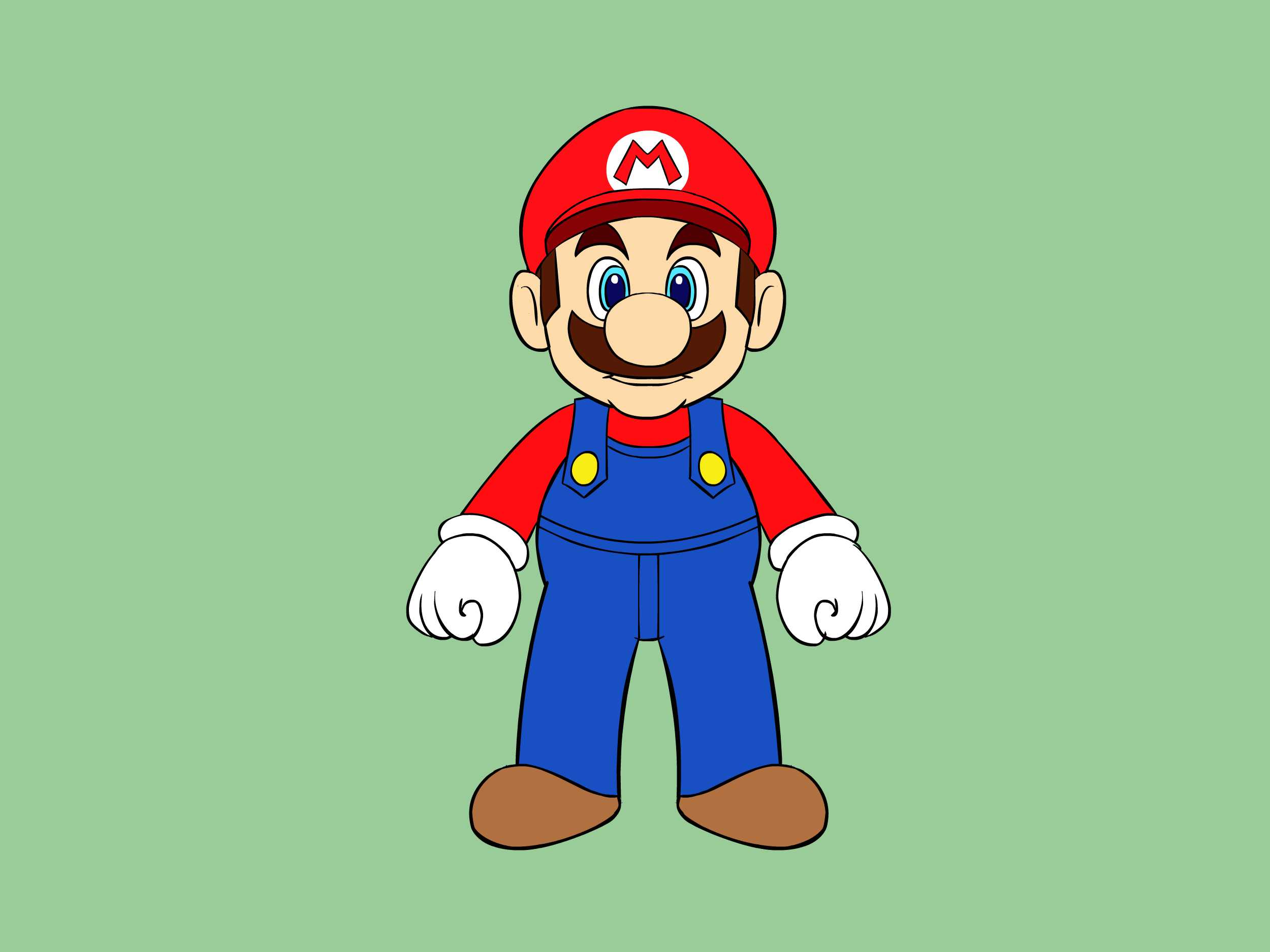
The construction-shape method is the most flexible way to draw Mario characters. It works especially well for Mario and Luigi because their designs can be divided into circles, ovals, cylinders, and rounded blocks. The goal is not to create a finished drawing immediately. First, build a simple mannequin that controls proportion and pose.
Step 1: Establish the Head and Body
Lightly draw a circle or slightly squashed oval for the head. Add a vertical centerline that curves with the direction of the face, then place a horizontal guide for the eyes. Under the head, sketch a compact bean shape for Mario’s torso. For Luigi, make the torso a little taller and narrower. Keep the first lines faint so they can be adjusted without leaving a graphite battlefield behind.
Step 2: Add the Signature Facial Forms
Place a large oval for the nose near the centerline. Add two tall oval eyes behind and above it. Sketch the mustache as a broad curved mass rather than drawing every bump immediately. The ears sit roughly beside the eye-and-nose area, and the cap wraps around the top of the skull instead of floating above it like a red serving tray.
Step 3: Build the Arms, Legs, Gloves, and Shoes
Use curved tubes for the limbs. Draw mitten shapes for the gloves and rounded wedges for the shoes. Check the pose before adding clothing details. Are both feet supporting the character? Does the raised hand connect naturally to the shoulder? Can you understand the action from across the room? Fix the mannequin now if something feels wrong. Buttons and shoelaces cannot rescue a confused pose.
Step 4: Refine the Outline
Draw the cap brim, hair, sideburns, overalls, shirt sleeves, glove cuffs, and shoe soles over the construction. Use thicker curves around the outside silhouette and lighter interior lines for folds and facial features. Once the final drawing feels balanced, erase the guidelines and add color. Mario’s familiar red-and-blue palette creates strong contrast, while Luigi’s green instantly separates him from his brother.
Best for: Portraits, full-body poses, custom outfits, and artists who want to understand character structure.
2. Use a Shape-First Method for Goomba, Toad, and Shy Guy
Some Mario characters are ideal for beginners because their entire design is organized around one dominant shape. This method reduces the subject to a clear outer form, then places facial features and accessories inside it. It is fast, friendly, and excellent for younger artists or anyone who becomes suspicious when a tutorial begins with, “First, draw a perfect human skeleton.”
Drawing a Goomba
Start with a wide mushroom-cap or rounded triangle shape. Add two short feet underneath. Place the heavy eyebrows at a downward angle to create the classic irritated expression, then add oval eyes, small pupils, and a frowning mouth with two teeth.
The eyebrows carry most of the personality, so test their angle before inking. Raise them slightly and your Goomba may look less like an enemy and more like someone whose food delivery is late.
Drawing Toad
Begin with a large rounded cap that is wider than the body. Draw the face as a small oval beneath it, then attach a tiny vest-shaped torso, simple arms, and short legs. Add the large circular spots after the cap is established.
Because the cap dominates the design, compare its width to the face before refining. If it is too small, Toad loses his instantly recognizable mushroom silhouette.
Drawing Shy Guy
Draw an oval mask first, followed by the two eye holes and small mouth opening. Wrap a hood around the mask, then place a compact robe beneath it. Add a belt, simple arms, and rounded shoes.
The mask should remain centered and clean; even minor asymmetry can change the expression. Shy Guy is an excellent character for practicing smooth line work because the design uses broad, uncomplicated curves.
Best for: Quick sketches, classroom projects, stickers, greeting cards, and first-time character drawing.
3. Draw Mario Characters as Pixel Art on a Grid
Pixel art replaces flowing curves with small square units. It is one of the easiest ways to study proportion because every decision becomes countable. Instead of wondering whether Mario’s hat is “a little too wide,” you can compare the number of squares across the hat, face, torso, and legs.
Step 1: Select a Manageable Canvas
Use graph paper or create a digital grid. Beginners should choose a small canvas, such as 16 by 16 or 32 by 32 squares. A smaller grid forces you to simplify. A larger grid permits more detail but also creates more opportunities to spend twenty minutes debating one brown square in the mustache.
Step 2: Block the Silhouette
Choose one dark color and map the outer contour first. Focus on the cap, nose, hands, overalls, and feet. Do not begin with the eyes or buttons. A strong pixel-art character should remain recognizable as a solid silhouette before interior colors are added.
Step 3: Add Flat Colors and Pixel Clusters
Fill the major regions with limited colors: hat and shirt, skin, hair and shoes, overalls, gloves, and outline. Keep neighboring pixels grouped into deliberate clusters. Random isolated squares often look like visual crumbs.
Use one lighter shade for highlights and one darker shade for shadows if the grid is large enough. On a tiny canvas, a single well-placed light pixel may describe the nose or glove more effectively than a complicated gradient.
Step 4: Test the Drawing at Actual Size
Zoom out frequently. Pixel art may look impressive at 800 percent magnification and turn into vegetable soup at normal size. Check whether the face, pose, and clothing remain readable without the grid. Simplify unclear clusters rather than adding more noise.
Best for: Retro posters, cross-stitch patterns, bead art, icons, game-inspired crafts, and artists who enjoy precise visual puzzles.
4. Capture Action With Gesture and Silhouette
Mario characters rarely stand around politely for a portrait. They jump, run, drift, stomp, throw, fly, and occasionally fall off a rainbow-colored road at terrible speed. Gesture drawing helps you capture that energy before details stiffen the pose.
Start With a Line of Action
Draw one sweeping curve through the pose. For a jumping Mario, the curve may run from the cap through the spine to the trailing foot. For Yoshi, it may travel from the nose through the back and into the tail. For Bowser, a strong forward curve can make the body feel heavy and aggressive.
Place the Major Masses
Add simple shapes around the gesture: an oval rib cage, a pelvis block, a head shape, and limb cylinders. Exaggerate the difference between the leading and trailing parts of the pose. A forward fist can be slightly larger, while the rear foot can be smaller. This creates depth without requiring complicated perspective calculations.
Check the Silhouette
Imagine filling the entire character with black. Can you still tell where the arms, legs, head, and accessories are? Separate overlapping limbs when necessary. Mario’s glove should not disappear into his cap, and Yoshi’s arm should not merge with his body.
A readable silhouette makes the final drawing feel clear even when viewed as a small thumbnail. It is especially important in racing, jumping, fighting, and sports poses where several limbs may overlap.
Match the Expression to the Movement
Tilt the eyebrows, open the mouth, angle the eyes, and squash or stretch the cheeks to support the action. A running pose with a sleepy neutral face creates mixed signals unless the joke is intentional. Facial expression and body language should tell the same story.
Best for: Dynamic fan art, comics, posters, sports scenes, racing scenes, and anyone whose characters currently look as if they are waiting at the Department of Motor Vehicles.
5. Create Clean Digital Mario Fan Art With Layers
Digital drawing does not replace fundamental skills, but it makes experimentation easier. Layers let you separate the rough sketch, clean line art, flat colors, shadows, highlights, and background. Transform tools help correct proportions without redrawing the entire character, while symmetry and shape tools can support front-facing designs.
Build a Simple Layer Stack
Create a rough-sketch layer at low opacity. Add a clean-line layer above it, then place flat colors beneath the line work. Add separate clipping layers for shadows and highlights. Keep the background on its own layer so you can change it without accidentally painting a cloud across Mario’s mustache.
Use Brush Stabilization Carefully
Brush stabilization can smooth shaky curves, especially around caps, gloves, shells, and mushroom spots. Too much stabilization, however, may make the drawing feel mechanical. Use it as a helper, not a remote-control driver.
Vary line weight by making the outer contour thicker and small interior details thinner. A heavier silhouette helps the character stand apart from the background, while lighter facial lines prevent the expression from becoming harsh.
Color With a Limited Plan
Begin with flat local colors. Next, choose a single light direction and apply one main shadow family. Add highlights only where they improve form, such as the cap brim, nose, gloves, shell, or polished shoes. Avoid airbrushing every edge. Mario-inspired artwork usually benefits from crisp, graphic color separation.
Finish With a Themed Background
Use recognizable environment shapes without overcrowding the character: pipes, bricks, clouds, hills, coins, stars, racing curves, or castle silhouettes. Repeat a few colors from the character in the background to unify the image. Keep the strongest contrast near the face so the viewer knows where to look first.
Best for: Polished illustrations, profile art, printable posters, digital coloring, and noncommercial fan projects.
Experience Notes: What Actually Helped While Practicing Mario Characters
The most useful lesson from repeated Mario-character practice is that recognition depends more on proportion and silhouette than on tiny details. During early attempts, it is tempting to focus on the “M” emblem, glove seams, overall buttons, and exact mustache bumps. Those details are satisfying, but they do not fix a head that is too small or a nose placed too far from the eyes. The better routine is to pause after the construction sketch, view it from a distance, and ask whether the character is recognizable before adding anything decorative.
Drawing the same character with different methods also reveals different weaknesses. A normal pencil sketch may hide proportion errors under loose lines, while a pixel-art version exposes them immediately because each square has a fixed position. Gesture drawing reveals stiffness. A digital layer workflow reveals whether the line art is genuinely clean or merely disguised by sketchy texture. Rotating among these methods keeps practice interesting and prevents one technique from becoming a comfortable hiding place.
Another practical discovery is that comparison works better when it is specific. Saying “my Mario looks wrong” does not provide a useful correction. Saying “the cap occupies too little of the head,” “the nose is not overlapping the far eye,” or “the shoes point in unrelated directions” creates an action you can take. Marking three corrections on a duplicate sketch is often more productive than erasing the original drawing until the paper develops emotional damage.
Coloring also becomes easier when the palette is planned before shading. On one practice drawing, adding shadows color by color produced a muddy result because every area received a different kind of gray. A cleaner approach is to choose one shadow color family, apply it consistently, and reserve the brightest highlight for the face or focal point. Even a simple drawing looks more professional when the lighting follows one rule.
For action poses, acting out the movement helps more than expected. Raising an arm, leaning forward, or pretending to jump makes it easier to notice which shoulder rises, where the spine bends, and how the opposite leg balances the body. The pose does not need realistic anatomy, but it needs believable direction. Exaggeration can then be added on purpose instead of by accident.
Finally, saving imperfect drawings is surprisingly valuable. A folder of dated sketches shows recurring problems and measurable progress. The first Goomba may look like an angry dinner roll; the fifth usually has a stronger silhouette, cleaner eyebrows, and better feet. The goal is not to produce official-looking artwork on the first attempt. It is to train your eyes to simplify, compare, correct, and finish. That process is the real power-up, and unlike an invincibility star, it does not disappear after a few seconds.
Conclusion
There is no single correct way to draw Mario characters. Construction shapes teach structure, shape-first drawing builds confidence, pixel art sharpens proportion, gesture drawing creates energy, and digital layers support polished results. Choose the method that matches your current goal, use a clear reference, and fix the large forms before chasing small details.
With regular practice, your drawings will become more recognizable, expressive, and personalone cap, shell, mushroom, and heroic mustache at a time.
Note: This tutorial is intended for educational drawing practice and personal, noncommercial fan art. Mario and related characters are trademarks and copyrighted properties of Nintendo.