A tri fold brochure looks innocent enough: one sheet of paper, two folds, six neat panels, and suddenly your business, event, school project, restaurant menu, or product pitch has a little pocket-sized stage. Simple, right? Mostly. Until one panel refuses to tuck in, your headline lands directly on a crease, and the finished brochure opens like it just lost an argument with a backpack.
The good news is that learning how to fold paper for tri fold brochures is not difficult. The secret is understanding that “tri fold” does not mean every panel always behaves the same way. Different fold styles create different reading experiences. The classic letter fold feels polished and traditional. The Z fold opens like an accordion and is great for step-by-step information. The gate-style fold creates a dramatic reveal and works beautifully when you want the reader to open the brochure like tiny paper theater curtains.
In this guide, we will explore three practical ways to fold paper for tri fold brochures, including when to use each fold, how to measure your panels, what paper works best, and how to avoid the little mistakes that make brochures look homemade in the “oops, the printer was hungry” sense.
Why Tri Fold Brochures Still Work
In a world full of pop-ups, notifications, and emails that begin with “Just circling back,” printed brochures still have a quiet superpower: people can hold them. A tri fold brochure turns one standard sheet into a compact, organized marketing piece. It gives readers a front cover, inside panels, supporting details, and a back panel for contact information, all without demanding Wi-Fi or asking anyone to accept cookies.
The most common U.S. tri fold brochure starts with a standard 8.5 x 11 inch sheet. When folded, it becomes roughly 3.67 x 8.5 inches, depending on the folding method and printer specifications. That slim finished size is why tri fold brochures fit nicely in brochure racks, event bags, counter displays, envelopes, and human hands.
Before You Fold: Set Yourself Up for Success
Choose the Right Paper
Regular copy paper can work for practice, drafts, school handouts, or quick internal use. For a brochure that represents a business or event, use brochure paper or a heavier text-weight stock. Matte paper is easier to read under bright lights and feels clean and professional. Gloss paper makes photos and colors pop, although it can show fingerprints more easily. If your brochure has lots of images, gloss may help. If it has lots of text, matte may be kinder to tired eyeballs.
Paper weight matters too. Very thin paper can feel flimsy and may allow printing to show through from the other side. Very thick paper can crack at the fold unless it is scored first. For home or office folding, a medium-weight brochure paper usually gives the best balance of polish and foldability.
Understand Panels Before You Design
A tri fold brochure has six panels: three on the outside and three on the inside. Here is where many beginners get tricked. On a classic roll or letter fold, the panel that folds inside should be slightly narrower than the other panels. If all three panels are exactly equal, the tucked-in panel may buckle, bulge, or create awkward “dog ears” at the corners. Paper has thickness, and thickness needs room.
For an 11-inch-wide sheet, many printers use two wider panels and one slightly narrower inside panel. The exact measurements vary by printer, paper weight, and template, but the principle remains the same: the panel that folds in first should be a little smaller. It is a tiny adjustment with a very grown-up impact.
Use a Bone Folder or Ruler
You do not need fancy equipment to fold a brochure neatly, but a bone folder, ruler, or the back of a butter knife can help create crisp folds. If you use a knife, use the dull back edge only, not the sharp side. We are folding brochures, not auditioning for a cooking show with paper casualties.
For best results, fold slowly, align edges carefully, then press the crease from the center outward. This reduces wrinkles and keeps the fold straight.
Way 1: The Classic Letter Fold
The classic letter fold, also called a roll fold or C fold, is the brochure style most people picture when they hear “tri fold brochure.” One side folds inward, and the other side folds over it. The finished piece opens in a smooth sequence, making it perfect for business brochures, service menus, travel guides, product introductions, school programs, and nonprofit handouts.
Best For
The classic letter fold works best when your information has a natural order. For example, a landscaping company might use the front cover to introduce the brand, the first inside panel to explain services, the large interior spread to highlight benefits, and the back panel for contact details. It is also ideal when you want a polished, familiar layout that readers understand instantly.
How to Fold It
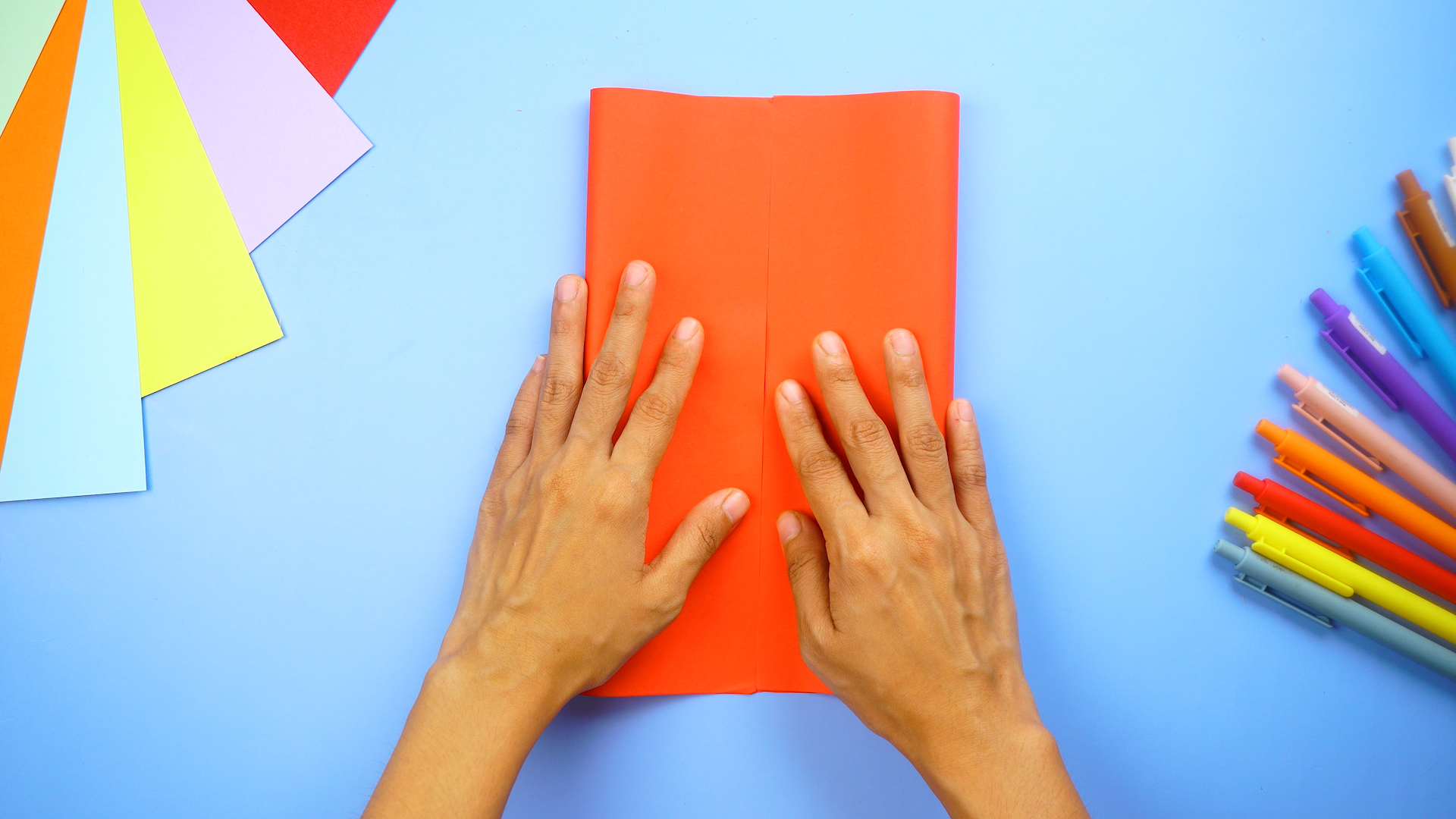
Start with the printed side facing down if you are making a standard outside cover. Imagine the paper divided into three vertical panels. The right panel usually folds inward first. Then the left panel folds over it, creating a compact brochure with the front cover on top.
If you are folding blank paper for practice, place the sheet horizontally in front of you. Bring the right edge toward the left, stopping slightly before the far third of the page. Press the crease. Then bring the left edge over the folded section so it aligns neatly with the new right edge. Press again. Open it back up and you will see three panels.
The key detail is panel size. The inside flap should be slightly smaller, especially if the brochure is professionally printed. If you are designing the file yourself, use a tri fold template from your printer or design software instead of guessing equal thirds. Equal thirds look logical on screen but can become surprisingly dramatic in real life, like a folding soap opera.
Design Tips for the Letter Fold
Place the strongest headline and image on the front cover. Use the first opening panel for a hook, question, or short introduction. Keep the main details inside, where readers have more space. Put contact information, a QR code, address, website, social media handles, or a small map on the back panel.
Avoid placing important text directly on fold lines. Leave safe margins near the edges and creases so your brochure does not slice a phone number in half or turn a logo into modern art. Use short paragraphs, bullets, icons, and clear headings. A brochure is not a novel wearing a paper costume.
Way 2: The Z Fold or Accordion Fold
The Z fold is another popular way to fold paper for tri fold brochures. Instead of one panel tucking inside another, the panels fold in opposite directions, forming a “Z” shape when viewed from above. This style opens easily and lays out information in a more continuous flow.
Best For
The Z fold is excellent for step-by-step guides, maps, timelines, menus, event schedules, educational handouts, and comparison charts. Because the panels open like an accordion, readers can move through the content from left to right without the hidden-panel effect of a letter fold.
For example, a museum could use a Z fold brochure to show a walking route. A fitness studio could use it for class packages. A teacher could use it for a project guide. A restaurant could use each panel for a different menu category. The Z fold says, “Please proceed in order,” but politely, without wearing a whistle.
How to Fold It
Place your paper horizontally in front of you. Fold the right third of the paper backward, away from you. Then fold the left third forward, toward you. When finished, the paper should zigzag. From the side, it should look like the letter Z.
Unlike the classic letter fold, Z fold panels are often closer to equal size because no panel has to tuck inside another. Still, printer templates are helpful, especially if the piece will be printed professionally or trimmed after printing.
Design Tips for the Z Fold
The Z fold is great for designs that stretch across panels. A landscape image, timeline, or large graphic can run across the inside spread because the brochure opens into a broad visual area. However, you still need to respect the folds. Keep small text away from creases and avoid placing faces, prices, or key calls to action directly on fold lines.
Because both sides of a Z fold can be read in sequences, plan the reader’s path before designing. Decide which panel is the cover, which panel comes next, and how the brochure should unfold in someone’s hands. Print a rough draft, fold it, and check the order. This one test can save you from publishing a brochure that begins with “Call us today” and ends with the introduction. Bold choice, but confusing.
Way 3: The Gate-Style Tri Fold
A gate-style fold creates a reveal effect. The two outer panels fold inward toward the center, like doors opening to show the main message inside. While traditional gate folds can involve different panel structures, a simple gate-style tri fold can be adapted for brochures where the outside panels act like flaps and the center panel carries the main visual or message.
Best For
This fold works best when presentation matters. Use it for invitations, premium product announcements, real estate features, boutique menus, event promotions, portfolio pieces, or any brochure where you want the reader to feel like they are opening something special.
The gate-style tri fold is less common than the classic letter fold, which can be an advantage. It feels intentional. It creates a moment. It is the paper version of saying, “Wait until you see what is inside,” but without using glitter, which everyone’s carpet appreciates.
How to Fold It
Place the paper horizontally in front of you. Fold the left side inward toward the center. Then fold the right side inward toward the center so both outer edges meet neatly in the middle or slightly overlap, depending on your design. Press both creases firmly.
For this method, measuring is especially important. The two outer panels should align cleanly. If they overlap unintentionally, the brochure may look bulky. If they leave a large gap, the center reveal may appear sloppy. Practice on plain paper before folding the final printed version.
Design Tips for the Gate-Style Fold
Use the outside panels as a teaser. A short headline split across both flaps can work well if it remains readable. Inside, place your strongest image, offer, message, or story. This fold rewards visual planning, so avoid overcrowding the gate panels with too much copy.
For a dramatic effect, place a question on the outside and the answer inside. A wedding vendor might write, “Planning the perfect day?” on the closed brochure, then reveal packages and portfolio images inside. A bakery could show a beautiful cake detail on the outside and the full dessert menu inside. That is not just folding; that is snack-based suspense.
Common Mistakes When Folding Tri Fold Brochures
Mistake 1: Using Equal Panels for Every Fold
Equal panels are not always wrong, but they are not always right. Z folds often work well with nearly equal panels. Letter folds usually need a slightly narrower tucked panel. Before designing, know your fold style.
Mistake 2: Forgetting the Reading Order
A brochure is interactive. People open it panel by panel. If you design only by looking at the flat layout, you may accidentally put your content in the wrong order. Print a mockup and fold it before finalizing. Your future self will send you a thank-you card.
Mistake 3: Crowding the Fold Lines
Fold lines are not prime real estate. They are danger zones for tiny text, thin lines, faces, QR codes, and important details. Give folds breathing room. White space is not wasted space; it is the brochure taking a civilized breath.
Mistake 4: Choosing the Wrong Paper
Thin paper can look cheap. Heavy paper can fold poorly without scoring. Glossy paper can look beautiful but may glare under bright lighting. Matte paper reads nicely but may not make photos look as vivid. Match paper to purpose.
Mistake 5: Skipping a Test Print
Never trust the screen completely. Colors, margins, fold positions, and panel order can all surprise you after printing. A test print is the cheapest quality control department you will ever hire.
Practical Example: Folding an 8.5 x 11 Brochure
Suppose you are creating a brochure for a local dog grooming business. The front cover might show a clean, happy dog and the headline “Fresh Fur, Happy Pup.” The first inside panel could introduce the groomer. The interior spread could explain services such as bathing, nail trimming, brushing, and breed-specific grooming. The back panel could include pricing notes, booking information, address, hours, and a QR code.
For a classic letter fold, the booking panel may become the back cover. For a Z fold, the services might flow from basic bath to full grooming package to add-ons. For a gate-style fold, the outside could tease “Before the Zoomies, Book the Groomies,” while the inside reveals packages and photos. Same paper, same business, three very different experiences.
How to Make Your Tri Fold Brochure Look Professional
Start with one clear goal. Do you want people to call, visit, scan a QR code, attend an event, request a quote, or understand a process? Every panel should support that goal. A brochure with too many goals becomes a paper committee meeting, and nobody asked for that.
Use a strong visual hierarchy. The title should be obvious. Headings should guide the reader. Body copy should be short and useful. Calls to action should stand out. Use consistent fonts and colors, and do not mix every design trend you have ever liked. Your brochure does not need to be a font buffet.
Keep images high resolution for print. Blurry images may look acceptable on a screen but disappointing on paper. If printing professionally, use the printer’s preferred file settings, including bleed, trim, and safe zones. If printing at home, check printer margins because many home printers cannot print edge to edge.
Finally, fold with patience. Align corners before creasing. Press folds cleanly. Stack finished brochures under a heavy book for a few minutes if they puff open. A neat fold tells readers that you care about details before they even read a word.
Mailing Tri Fold Brochures
If your tri fold brochure will be mailed without an envelope, check current mailing rules before printing a large batch. Folded self-mailers may need tabs, glue, tape, minimum paper weight, and specific fold orientation depending on size and mailing class. Requirements can change, and postal rules are not known for their beach-vacation simplicity.
For direct mail, leave space for the address block, postage area, barcode clear zone, and return address. Do not place important promotional text where postal markings may cover it. When in doubt, ask your printer or mailing service before printing thousands of brochures. It is much cheaper to adjust a file than to learn that your beautiful mailer has become a very expensive stack of “almost.”
Experience Notes: Real-World Lessons From Folding Tri Fold Brochures
After working with tri fold brochure layouts, one lesson becomes obvious very quickly: the fold is part of the design, not something that happens after the design. Beginners often treat folding as the final chore, like putting a lid on a storage box. In reality, the folds control how the message is revealed. A brochure can have gorgeous colors, clever copy, and perfect photos, but if the first panel opens to the wrong section, the reader feels lost before the sales pitch even gets its shoes on.
The most useful habit is making a blank folding dummy before designing. Take a plain sheet, fold it in the style you plan to use, then write “front cover,” “first inside panel,” “inside left,” “inside center,” “inside right,” and “back cover” directly on the panels. Open and close it several times. This low-tech step feels almost too simple, but it prevents a surprising number of layout mistakes. It is like GPS for paper.
Another experience-based tip is to test the brochure with someone who has not seen the design. Hand it to them without explaining anything. Watch how they open it. Notice which panel they read first, where they pause, and whether they understand the call to action. If they flip it around three times and squint, the design may need clearer visual cues. This test is especially helpful for Z folds and gate-style folds, where the opening order may be less familiar than a classic letter fold.
Paper choice also teaches lessons fast. Lightweight copy paper is forgiving when folding by hand, but it rarely feels impressive. Heavy glossy stock looks professional, but if it is not scored, the crease may crack or resist staying flat. For small batches, a slightly heavier matte brochure paper is often the friendliest option. It folds cleanly, reads well, and does not glare like it is trying to signal aircraft.
Finally, never underestimate the value of quiet space. Many people try to fill every panel because blank areas feel “unused.” But white space makes a brochure easier to read and more expensive-looking. A clean panel with one strong message often performs better than a crowded panel with five competing ideas. Good folding gets the brochure into shape; good editing keeps it from turning into a tiny encyclopedia.
The best tri fold brochures feel effortless because the planning is hidden. The panels open in a logical order, the folds are crisp, the message is clear, and the reader knows exactly what to do next. That is the real craft: not just folding paper, but folding information into a shape people actually want to open.
Conclusion
Learning the three main ways to fold paper for tri fold brochures gives you more control over how your message is seen, read, and remembered. The classic letter fold is reliable and professional. The Z fold is energetic and perfect for sequential information. The gate-style fold adds drama and makes the reveal feel special.
Whichever method you choose, remember the basics: plan the reading order, measure the panels correctly, protect the fold lines, choose suitable paper, and always make a test print. A tri fold brochure may be small, but when it is folded well, it can carry a surprisingly big message.