Choosing a WordPress featured image size sounds like one of those tiny website decisions that should take three minutes and one sip of coffee. Then you open your theme preview, share the post on Facebook, check it on mobile, inspect Google Discover eligibility, and suddenly you are having a staring contest with a JPEG at 1:17 a.m.
So, is 1200x628px good for WordPress featured image size? Yes. It is a very practical, widely used size. It fits the familiar wide social-sharing shape, keeps images crisp on many screens, and works nicely for blog cards, post headers, and Open Graph previews. Butand this is the important little “but” hiding behind the curtain with a pair of scissors1200x628px is not automatically perfect for every WordPress site.
The best WordPress featured image size depends on your theme, layout, social media needs, performance goals, cropping behavior, and whether the image is meant to work as a hero banner, archive thumbnail, Google Discover image, or all of the above. One size can do a lot, but it cannot do magic. Sadly, pixels still refuse to attend project meetings.
Why 1200x628px Became So Popular
The main reason 1200x628px is popular is simple: it sits close to the 1.91:1 aspect ratio used by many social preview formats. In everyday terms, that means the image is wide enough to look professional when your WordPress post is shared across platforms such as Facebook, LinkedIn, X, messaging apps, and other places where link previews appear.
Many publishers also use the nearby size 1200x630px, which is commonly recommended for Open Graph images. The difference between 628px and 630px in height is tiny. Your visitors will not gather in the comments section demanding those two missing pixels be returned to their rightful home. However, platforms and themes sometimes calculate ratios strictly, so consistency matters.
For most WordPress blogs, 1200x628px gives you a strong starting point because it is large enough for sharp display, not so huge that it destroys page speed by default, and flexible enough for common blog layouts. It also gives designers room for a title overlay, a product shot, a person, or a visual concept without making the featured image feel cramped.
The Big “But”: WordPress Featured Images Are Theme-Dependent
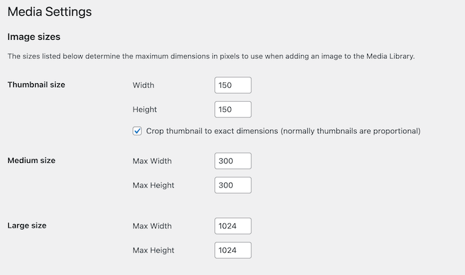
Here is where many site owners get surprised: WordPress itself does not force one universal featured image size across all websites. A featured image, also known as a post thumbnail, is displayed according to your theme, template, block settings, and custom image sizes registered by your site.
One theme may show the featured image as a wide banner at the top of the article. Another may crop it into a rectangle for blog archives. A magazine-style theme may use it in multiple places: a large homepage hero, a small sidebar card, a square “related post” tile, and a mobile carousel. Your innocent 1200x628px image may therefore be asked to perform like a circus acrobat.
Example: Same Image, Different Results
Imagine you upload a 1200x628px featured image for a recipe post titled “The Best Crispy Chicken Sandwich.” On the single post page, it looks delicious. On your homepage grid, the theme crops the sides. In your sidebar, it becomes a tiny thumbnail. On mobile, the top and bottom get trimmed. On Facebook, it looks great. On Pinterest, it looks like someone photographed lunch through a mail slot.
That does not mean 1200x628px is wrong. It means your image strategy must match where the image appears. A featured image is not just decoration. It is a traffic asset, a branding element, a social preview, a user-experience signal, and occasionally the reason someone clicks instead of scrolling past your masterpiece to watch a cat open a refrigerator.
When 1200x628px Works Best
A 1200x628px WordPress featured image is a strong choice when your site uses a wide blog layout, your homepage cards are horizontal, and social sharing is important. It is especially useful for news posts, tutorials, SaaS blogs, review articles, opinion pieces, and general editorial content.
This size works well when your image has a clear center focus. If the main subject is in the middle and there is safe space around the edges, the image can survive light cropping on different screens. Think of it as packing your visual suitcase carefully: important items in the center, socks near the edges.
It also works nicely when your site uses Open Graph tags through an SEO plugin. Plugins such as Yoast SEO, Rank Math, All in One SEO, and others can use your featured image as the default social preview image. If that image is already close to the preferred social-sharing shape, you reduce the risk of awkward previews.
When 1200x628px May Not Be Enough
There are situations where 1200x628px is not ideal. If your theme uses a full-width hero banner, the image may look too short or too compressed vertically. If your design favors tall editorial images, a wide rectangle may feel flat. If your site relies heavily on Pinterest, a vertical image will usually perform better than a landscape image.
Google Discover is another important consideration. Large, high-quality images can help content become more visually attractive in Discover, but the image must meet specific quality and technical requirements. A 1200px-wide image is useful here, but it also needs to be relevant, compelling, and allowed through settings such as max-image-preview:large. A technically correct image of a blurry laptop and half a coffee mug is still not exactly a traffic magnet.
Common Cases Where You Need Another Size
If your WordPress theme displays featured images as square cards, use a square crop or make sure your 1200x628px image has a centered subject. If your homepage uses large hero banners, consider uploading a larger image such as 1600x900px or 1920x1080px, depending on your performance budget. If you publish visual recipes, fashion, DIY, or travel content, you may want a separate vertical image for Pinterest and a wide image for WordPress and social previews.
Recommended Featured Image Sizes by Use Case
There is no single holy pixel tablet handed down from the mountain, but these practical sizes work well for many WordPress websites:
Best General Blog Featured Image
1200x628px or 1200x630px is a smart default for standard blog posts, tutorials, reviews, and editorial articles. It balances social sharing, WordPress display, and manageable file size.
Best Hero Header Image
1600x900px or 1920x1080px may work better for full-width headers. These 16:9 formats provide more space for large screens while staying familiar and flexible.
Best Square Thumbnail
1200x1200px is useful when your design uses square cards, author grids, product-style layouts, or social platforms that favor square previews.
Best Pinterest-Friendly Image
1000x1500px or a similar 2:3 ratio is usually better for Pinterest-style vertical discovery. This should often be a separate image, not your main WordPress featured image.
How Cropping Can Ruin a Good Featured Image
Cropping is where good images go to lose their forehead. WordPress themes often crop featured images automatically to fit a layout. If the crop is center-focused, anything important near the edges may vanish. If your image includes text, the crop may slice through words, leaving readers with a mysterious headline like “How to Build a Better Ch…” Very inspiring. Very incomplete.
To avoid this, keep the most important visual elements near the center. Avoid placing logos, text, faces, product labels, or key objects too close to the edges. Use a safe zone. For 1200x628px images, treat the middle 70 percent as your “must survive” area and the outer edges as “nice if visible.”
If your theme lets you choose focal points, use them. If it does not, test your featured image on desktop, tablet, mobile, homepage archives, category pages, and social previews. It sounds tedious, but it is less tedious than publishing 300 posts with decapitated thumbnails.
Image File Size Matters More Than People Think
Dimensions are only half the story. A 1200x628px image can still be a problem if it weighs 2.8MB and loads like it is being delivered by carrier pigeon. Large images can hurt page speed, user experience, and Core Web Vitals. Visitors are not known for their patience, especially on mobile connections.
For many blog featured images, a compressed file between roughly 100KB and 300KB is a reasonable target, though highly detailed images may need more. The goal is not to crush every image until it looks like it was printed on toast. The goal is to preserve visible quality while removing unnecessary weight.
Best Formats for WordPress Featured Images
JPEG is still practical for photographs. PNG is useful for graphics with sharp text, logos, or transparency, though it can be heavier. WebP often provides strong compression with good quality and is widely supported. AVIF can be even smaller in some cases, but workflows and compatibility should be tested carefully.
A good WordPress image workflow usually includes resizing before upload, compressing the file, using descriptive filenames, adding useful alt text, and letting WordPress generate responsive versions. That way, mobile visitors do not download a giant desktop image just to view a small thumbnail.
WordPress Responsive Images: The Quiet Hero
Modern WordPress supports responsive images through attributes such as srcset and sizes. In plain English, WordPress can generate multiple image versions and help the browser choose the most appropriate one for the visitor’s screen. This is excellent because a phone does not always need the same image file as a 27-inch monitor.
However, responsive images are only helpful when the original upload is clean and large enough. If your original featured image is tiny, WordPress cannot magically create a sharp large version. It can resize down beautifully, but resizing up usually creates blur, sadness, and possibly a small designer somewhere whispering “why.”
SEO Best Practices for WordPress Featured Images
A featured image can support SEO indirectly through better click-through rates, stronger social sharing, improved user engagement, and image search visibility. It is not just about making Google happy. It is about making humans understand the post faster.
Use Descriptive File Names
Before uploading, rename your image file from IMG_8842.jpg to something meaningful like wordpress-featured-image-size-1200x628.jpg. Search engines use surrounding context, filenames, captions, and alt text to understand images. A descriptive filename is not a magic ranking wand, but it is a clean signal.
Write Helpful Alt Text
Alt text should describe the image accurately. Do not stuff it with keywords like a Thanksgiving turkey. If the image shows a WordPress blog layout preview, say that. If it shows a laptop screen with a featured image editor, say that. Good alt text helps accessibility and can support image SEO.
Set Open Graph and Twitter Card Images
Your SEO plugin should output Open Graph and social card metadata. This helps platforms choose the correct image when someone shares your URL. If you rely on auto-selection, a platform may grab a logo, sidebar image, or random decorative graphic. Nothing says “professional article” like a link preview featuring your footer icon.
Use the Right Image Near the Right Content
Google recommends using images that are relevant to the page. That sounds obvious, but many sites use generic stock photos that could apply to anything from “business strategy” to “man disappointed by salad.” A strong featured image should visually reinforce the article topic.
Should You Use Text Inside Featured Images?
Text inside featured images can work, especially for tutorials, list posts, and branded blog graphics. But it comes with risks. Text may become unreadable on small screens, cropped in archive cards, or compressed in social previews. If you add text, keep it large, short, and centered.
A better approach is often to design the image so it works with or without visible text. The article title already appears on the page and in search snippets, so the image does not need to repeat the entire headline. Use the image to add emotion, context, or curiosity. Let the title do the heavy lifting.
A Practical Workflow for Featured Images
Here is a simple workflow that works for most WordPress publishers:
- Create a master image at 1200x628px or 1200x630px for standard blog posts.
- Keep important subjects and any text inside a central safe zone.
- Export as JPEG or WebP for photos, PNG or WebP for text-heavy graphics.
- Compress the image before uploading or use a reliable optimization plugin.
- Rename the file with descriptive keywords before upload.
- Add natural alt text in WordPress.
- Preview the post on desktop and mobile.
- Test social previews when the post is important.
This process is not glamorous, but neither is fixing 600 blurry thumbnails after a redesign. A repeatable image workflow saves time, improves consistency, and keeps your site looking like a professional publication rather than a garage sale of rectangles.
Specific Examples: What Size Should You Choose?
For a News Blog
Use 1200x628px or 1200x630px. News content often depends on social sharing, and this format works well for link previews. Keep faces and key action in the center.
For a Food Blog
Use 1200x628px for the WordPress featured image, but create a separate vertical Pinterest image. Food photos often need height to show ingredients, texture, and final presentation.
For a SaaS Blog
Use 1200x628px with branded templates. Leave safe space around UI screenshots because dashboard images can become unreadable when cropped or compressed.
For an Ecommerce Blog
Use 1200x628px for editorial posts, but consider square or 4:5 images for product-heavy content. Product images should remain clear even in smaller thumbnails.
For a Travel Website
Use larger landscape images such as 1600x900px if your theme uses immersive hero banners. For standard blog cards, 1200x628px still works well.
My Experience With 1200x628px Featured Images
After working with WordPress blogs across niches such as tech, home improvement, health, travel, and product reviews, I would describe 1200x628px as the “safe default,” not the “forever answer.” It is the image size I would choose when launching a new blog and needing a reliable system fast. It behaves well in many themes, looks clean in social previews, and is easy for designers and writers to remember. Nobody has to open a spreadsheet called “Final_Final_Image_Size_Really_Final.xlsx,” which is always a small victory.
The first lesson from real publishing workflows is that consistency matters more than chasing a perfect theoretical dimension. A site with 300 posts using consistent 1200x628px images usually looks more polished than a site where every post has a different crop, ratio, and mood. One article has a cinematic banner. The next has a square stock photo. The third has a vertical infographic squeezed into a horizontal card like a giraffe in a sports car. Readers may not know the technical reason, but they feel the mess.
The second lesson is that theme testing is non-negotiable. I have seen 1200x628px images look flawless in one WordPress theme and awkward in another because the homepage card expected a 4:3 crop. In those cases, the solution was not to blame the image size. The solution was to adjust the design system: define safe zones, create alternate crops, or register custom image sizes. A featured image should be designed for the actual layout, not for a blog post someone read three years ago and saved in a notes app.
The third lesson is that image weight quietly steals performance. Many publishers obsess over dimensions but upload huge files. A 1200x628px image exported carelessly can still be far too heavy. Compressing images, using modern formats, and checking mobile performance often produces a bigger improvement than changing the height by two pixels. Page speed is not glamorous, but it is the polite bouncer standing between your visitor and the back button.
The fourth lesson is about text overlays. They can look fantastic in a brand template, but they must be treated carefully. Short text works. Large text works. Centered text works. Tiny subtitle text placed near the edge does not work. Once the image appears in a mobile card or social preview, that tiny text becomes decorative lint. When in doubt, use the featured image to create visual interest and let the post title handle the reading part.
The fifth lesson is to create separate images for separate goals. Your WordPress featured image, Open Graph image, Pinterest pin, newsletter header, and homepage hero do not always need to be the same file. Trying to make one image serve every platform can lead to average results everywhere. For important posts, create a wide 1200x628px image for WordPress and social previews, a vertical image for Pinterest, and a larger hero image if the article layout needs it. Yes, it takes more time. So does explaining to your editor why the CEO’s face got cropped into a mysterious left ear.
In practice, 1200x628px is one of the best starting points for WordPress featured images because it is practical, memorable, and broadly compatible. But the best publishers treat it as part of a system. They test layouts, protect safe zones, compress files, write useful alt text, and preview posts before publishing. That is how a featured image stops being “just a picture” and starts becoming a click-worthy asset.
Conclusion: 1200x628px Is Good, But Strategy Is Better
So, 1200x628px is good for WordPress featured image size, but it should not be treated as a universal law carved into a stone tablet guarded by SEO monks. It is a strong default for many WordPress blogs because it works well with common social preview ratios, fits many modern themes, and keeps images large enough for sharp display.
But your real best size depends on your theme, layout, social sharing goals, image subject, performance standards, and content strategy. If your site uses wide blog cards, 1200x628px may be perfect. If your homepage uses tall cards, square thumbnails, or full-screen hero images, you may need alternate sizes. The smartest approach is to choose a default, test it everywhere, and create additional crops when your content deserves them.
In other words, 1200x628px is a great hammer. Just make sure every image problem is actually a nail.