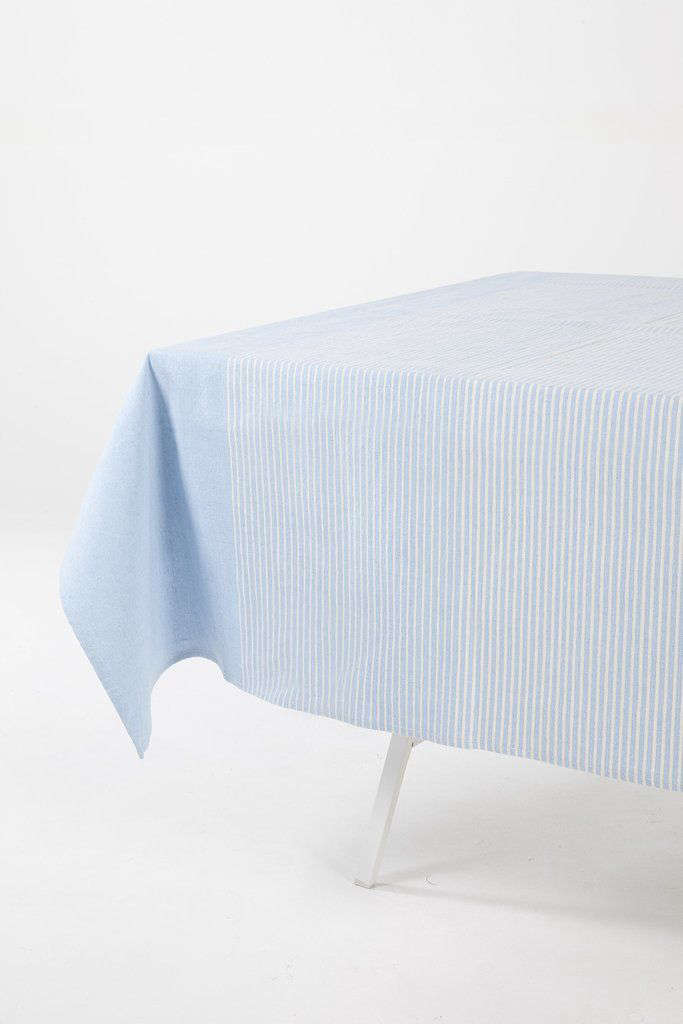
A tablecloth can protect a dining table, hide a few mysterious scratches, and politely pretend that Tuesday-night takeout is a catered event. A gradient blue tablecloth, however, does something more interesting: it turns the table itself into a visual centerpiece.
Moving gradually from pale sky blue to ocean teal, cobalt, indigo, or navy, this style adds color without the visual commotion of a complicated print. It can feel breezy and coastal, sleek and modern, dreamy and romantic, or dramatic enough for a formal dinner. The result depends on the fabric, shade progression, tableware, lighting, and how confidently you resist adding seventeen more decorative ideas.
This guide explains how to choose, size, style, make, and maintain a blue ombré tablecloth for everyday dining, weddings, birthdays, outdoor gatherings, holiday meals, and special events.
What Is a Gradient Blue Tablecloth?
A gradient blue tablecloth features a gradual transition between different blue tones. It may begin with white or powder blue at one end and deepen into sapphire or navy at the other. Some designs move horizontally across the table, while others darken from the center toward the edges.
The word ombré comes from a French term associated with shading. In textile design, it commonly describes a hand-dyed or printed effect in which one color changes progressively from light to dark. Hand-dyed versions often contain small variations, which are part of their character rather than evidence that the fabric had a disagreement with the dye bucket.
Common gradient arrangements
End-to-end gradient: One short end is light, while the opposite end is dark. This arrangement works especially well on long rectangular tables.
Center-out gradient: The center remains pale and gradually darkens toward the perimeter. Plates and centerpieces stand out clearly against the lighter middle.
Vertical stripe gradient: Bands of blue run down the table, producing a more structured and contemporary appearance.
Watercolor gradient: The color transitions irregularly, with soft edges, overlapping tones, and cloudlike variations. This is ideal for artistic, coastal, and garden-party themes.
Dip-dyed border: Most of the cloth stays white or pale blue, while the lower edge becomes noticeably darker. It offers an ombré effect without dominating the place settings.
Why Gradient Blue Works So Well on a Table
It creates movement without a busy pattern
A solid tablecloth can look elegant but predictable. A detailed print can become difficult to coordinate with patterned plates, flowers, napkins, and serving pieces. A gradient sits comfortably between those two extremes. It gives the eye something to follow while leaving enough visual space for the food and dinnerware.
It supports several decorating styles
Pale blue and white suggest a relaxed coastal atmosphere. Teal and turquoise feel lively and tropical. Navy and indigo create depth for evening dinners, winter celebrations, and formal events. Because blue can be paired with white, metallics, natural wood, woven fibers, coral, yellow, pink, or green, the same cloth can appear completely different from one occasion to another.
Decorating publications frequently use blue-and-white linens with woven chargers, natural textures, warm metals, greenery, or contrasting flowers. The shared color family makes the setting cohesive, while variations in texture keep it from feeling flat.
It can guide the table’s visual direction
On a rectangular table, a lengthwise gradient can make the surface appear longer. A darker center creates a strong focal point, while darker ends can visually frame the guests seated at the head of the table. This makes the cloth useful not only as a color choice but also as a simple composition tool.
Choosing the Right Blue Gradient
Soft sky blue to white
This is the safest choice for brunches, baby showers, spring celebrations, and bright dining rooms. Pair it with white dishes, clear glassware, pale flowers, and light wood. The combination feels airy without looking sterile.
Aqua to turquoise
An aqua gradient is cheerful and casual. It works well for poolside meals, tropical parties, beach-themed birthdays, and outdoor lunches. Add citrus-colored flowers, bamboo flatware, woven placemats, or coral napkins.
Cobalt to navy
Deep blue gradients feel more formal. They look especially attractive under warm candlelight and pair well with brass, gold, silver, crystal, or crisp white porcelain. For a modern look, use matte black flatware and simple white plates.
Indigo watercolor
An irregular indigo pattern suits artistic interiors, bohemian gatherings, and casual dinner parties. It can be paired with handmade ceramics, linen napkins, mismatched glassware, and wildflowers. Keep the remaining palette limited so the table looks curated rather than as though the linen closet exploded.
How to Select the Best Fabric
Linen
Linen creates a relaxed but sophisticated surface. Its natural texture complements watercolor and hand-dyed gradients particularly well. It wrinkles easily, but those soft wrinkles are often considered part of its informal elegance. Prewashed linen generally feels softer and is easier to use for casual settings.
Cotton
Cotton is practical, absorbent, and widely available. It accepts many textile dyes well and is a sensible choice for DIY projects. A medium-weight cotton cloth usually stays in place better than an extremely thin fabric while remaining easy to fold and wash.
Polyester
Polyester tablecloths tend to resist wrinkles and are useful for large events where dozens of tables must look consistent. They are often more stain-resistant than untreated natural fibers. However, polyester requires a dye and heating method designed for synthetic material, so it is not interchangeable with cotton during a DIY project.
Cotton-linen blends
A blended fabric offers some of linen’s texture with some of cotton’s easier handling. It is a versatile option for homeowners who want a natural appearance without spending quality time negotiating with an iron.
Sheer overlays
Organza, gauze, or chiffon overlays can create an ethereal gradient effect when placed over a solid white or blue base cloth. They are popular for weddings and formal events but provide little protection on their own.
Finding the Correct Tablecloth Size
Measure the table rather than relying on labels such as “six-person table.” Furniture manufacturers and dining-room owners sometimes have very different opinions about how much space six people require.
Rectangular and square tables
Measure the table’s length and width. Decide how far the tablecloth should hang over each edge, then add twice that drop measurement to both dimensions.
Formula: Table length + twice the desired drop = cloth length.
Table width + twice the desired drop = cloth width.
For example, a table measuring 72 by 40 inches with an 8-inch drop requires a tablecloth measuring approximately 88 by 56 inches.
Round tables
Measure the tabletop’s diameter and add twice the desired drop. A 48-inch round table with a 10-inch drop needs a cloth approximately 68 inches in diameter.
How much drop should you choose?
A drop of roughly 6 to 10 inches usually suits casual dining. A longer drop creates a dressier appearance, while floor-length cloths are commonly reserved for formal events, display tables, cake tables, or spaces where guests will not be repeatedly sliding chairs underneath the fabric. Whatever length you choose, it should not bunch awkwardly in seated guests’ laps.
How to Style a Gradient Blue Tablecloth
Begin with simple dinnerware
White plates are nearly foolproof because they remain visible across both light and dark areas. Cream stoneware produces a warmer effect, while blue-and-white patterned china can create a collected, traditional setting.
When using patterned plates, repeat at least one shade from the cloth. This establishes a visual connection even when the patterns are different.
Choose napkins that provide contrast
White, ivory, gray, and natural linen napkins keep the table quiet. Yellow, coral, blush, or terracotta napkins create an energetic contrast. Navy napkins can work on a pale section of the cloth but may disappear against the darkest area.
Layering linens adds depth, but restraint is useful. One practical styling rule is to limit the table to one or two prominent patterns, allowing texture and color variation to do the remaining work.
Add warmth with natural materials
Rattan chargers, bamboo utensils, wood bowls, jute runners, and woven baskets prevent blue from feeling cold. These materials are especially effective for coastal, farmhouse, outdoor, and casual summer tables.
Use metallic accents carefully
Gold and brass make navy or indigo feel luxurious. Silver supports a cooler winter palette. Copper works surprisingly well with turquoise and teal. Metallic finishes are strongest when repeated in two or three small places, such as flatware, candleholders, and napkin rings.
Keep centerpieces conversational
Low arrangements allow guests to see one another. Try a line of bud vases, a shallow bowl of citrus, small potted herbs, floating candles, or clusters of flowers in short containers. A tall centerpiece can still work when it is narrow enough not to block sightlines.
Gradient Blue Tablecloth Ideas for Different Occasions
Coastal dinner
Use a sky-to-navy tablecloth with white plates, woven chargers, clear glasses, striped napkins, and a centerpiece of greenery or white flowers. Avoid covering the table with seashells unless you enjoy moving tiny decorative objects every time someone asks for the salt.
Modern dinner party
Select a sharply defined cobalt gradient. Add matte white dishes, black flatware, smoked glassware, and one sculptural centerpiece. The simplicity lets the color transition become the main decorative feature.
Wedding reception
A pale blue gradient looks romantic under soft lighting. Combine it with white flowers, silver details, clear candleholders, and handwritten place cards. For evening receptions, allow the gradient to deepen toward the floor for additional drama.
Birthday or baby shower
Pair powder blue with peach, pale yellow, mint, or blush. Small floral arrangements and colorful desserts can supply the brighter accents. This avoids the overly literal approach of making every item exactly the same blue.
Holiday table
Navy, white, silver, and evergreen create a polished winter setting. Blue can also be warmed with gold flatware, red berries, candles, or natural wood. Blue-and-white linens are flexible enough to work beyond one holiday when seasonal details are changed.
Outdoor gathering
Choose a washable cloth with enough weight to remain stable. Tablecloth clips can help in breezy conditions. Use durable dishes, low centerpieces, and lighting that will remain practical after sunset.
How to Make a DIY Blue Ombré Tablecloth
A plain white cotton or linen tablecloth can be transformed with fabric dye. Always check whether the dye is intended for natural fibers or synthetics before beginning.
Supplies
- A clean white or light-colored tablecloth
- Fabric-appropriate blue dye
- A large stainless-steel sink or plastic container
- Rubber gloves
- A dowel, rod, or sturdy hanger
- Plastic sheeting and paper towels
- Mild detergent
Basic dyeing process
- Prewash the tablecloth to remove dirt, finishes, or fabric softener that may interfere with dye absorption.
- Protect the work surface and prepare the dye bath according to the product instructions.
- Wet the cloth evenly and remove excess water.
- Immerse the section intended to be darkest and move it gently through the dye.
- Gradually lower additional fabric into the bath for shorter periods, creating progressively lighter sections.
- Briefly dip the palest area or leave it undyed.
- Rinse according to the dye manufacturer’s directions until excess color is removed.
- Wash the finished cloth separately with mild detergent.
Do not expect mechanical perfection. Slightly uneven transitions make a hand-dyed cloth look organic. Test the method on a scrap of similar fabric before committing the full tablecloth to its blue destiny. Rit’s ombré instructions likewise recommend prewashing, wetting the fabric, and varying immersion times to produce different color depths.
Cleaning and Caring for Blue Table Linens
Read the care label before washing. Fabric type, dye method, decorative trim, and protective coatings can all change the correct procedure.
Blot spills instead of rubbing them, because rubbing may spread the stain or damage fibers. Treat food, oil, and beverage marks promptly. Test stain removers on an inconspicuous area, particularly on dark blue sections where fading would be obvious.
Many modern cotton and linen tablecloths can be machine-washed, but cold water, a gentle cycle, low heat, and non-chlorine products are commonly recommended for dyed linens. Product instructions still take priority. Remove the cloth while slightly damp if you plan to iron it, and avoid prolonged direct sunlight during storage because strong light can gradually affect color.
Common Styling Mistakes to Avoid
Adding too many competing blue patterns
A gradient already contains several shades. Combining it with striped plates, floral napkins, patterned glasses, printed runners, and decorative chargers can make the table feel restless. Choose one supporting pattern and let the remaining elements stay simple.
Ignoring the darkest section
Dark plates or napkins may disappear against navy fabric. Before the event, place every item on its intended section of the cloth and check the contrast from a standing and seated position.
Using an inconvenient drop
A beautiful cloth becomes less charming when guests repeatedly trap it beneath their knees. Test the drop with the chairs in place rather than judging it on an empty table.
Overfilling the centerpiece
The gradient should remain visible. A massive centerpiece, oversized runner, and full collection of decorative objects can cover the feature that made the tablecloth special in the first place.
Forgetting the room around the table
Consider wall color, chair upholstery, flooring, and lighting. A cool blue cloth in a cool gray room may benefit from wood, candlelight, cream linens, or warm metal accents.
Buying Checklist
- Confirm the exact table dimensions and desired drop.
- Check whether the gradient direction suits the table shape.
- Review the fabric composition and care instructions.
- Look closely at product images for abrupt color bands or uneven printing.
- Confirm that the darkest shade coordinates with existing dinnerware.
- Choose washable material for frequent use or outdoor dining.
- Order early when buying linens for a wedding or large event.
- Inspect return conditions before purchasing custom-sized fabric.
Practical Experience: What Hosts Commonly Notice
Consider a representative dinner setup using a rectangular cotton tablecloth that moves from nearly white at one end to deep navy at the other. The first lesson usually appears before a single plate reaches the table: the direction of the gradient matters more than expected.
When the dark end is positioned near a bright window, daylight softens the navy and makes the transition look balanced. When the same end sits in a shadowy corner, it can appear much heavier. Rotating the cloth may solve the problem faster than changing the entire centerpiece. This is why testing the table in its actual lighting is more useful than evaluating the cloth while holding it under a ceiling fixture.
The next discovery involves dinnerware. White plates look crisp across the complete gradient, but dark blue napkins lose definition near the navy end. Moving those napkins to the lighter place settings and using ivory napkins on the darker side produces a more intentional arrangement. The napkins do not need to match perfectly; they need to remain visible.
Centerpiece experiments often lead to another practical lesson. A large arrangement of blue hydrangeas may sound ideal, but blue flowers on blue fabric can merge into one substantial blue cloud. Dividing the flowers among several short white vases creates breathing room and leaves more of the ombré pattern visible. It also prevents guests from leaning sideways to speak to the person across from them.
Warm accents can make the biggest difference. Wooden chargers, small brass candleholders, and cream-colored dishes prevent the blue palette from feeling chilly. In daylight, the arrangement feels coastal. After sunset, candles bring out the indigo tones and make the same table feel more formal. No emergency redesign is required between appetizers and dessert.
Spills provide the least glamorous but most useful experience. On a multitone cloth, a clear beverage spill may be difficult to see, while creamy sauces and oil marks become very noticeable on the dark section. Keeping a clean white towel nearby allows spills to be blotted quickly. Rubbing is tempting, particularly when a guest begins apologizing as though the tablecloth were a priceless museum artifact, but blotting is safer for both the fabric and the host’s blood pressure.
After washing, cotton may emerge with more wrinkles than expected. Shaking the cloth out promptly, drying it gently, and removing it before it becomes completely crisp can reduce ironing time. Folding it along different lines during storage also helps prevent one permanent-looking crease from cutting dramatically across the gradient.
The broader lesson is that a gradient blue tablecloth does not require elaborate accessories. Its color transition already provides movement, contrast, and atmosphere. The most successful settings usually use fewer objects than initially planned: simple plates, comfortable napkins, low flowers, practical glassware, and just enough warm texture to balance the blue.
Guests are more likely to remember the overall feeling of the table than whether every shade matched precisely. A relaxed, functional arrangement almost always performs better than a technically perfect display that leaves no room for serving dishes, elbows, or the bread basket. The cloth should help create the occasion, not become an additional guest requiring constant supervision.
Conclusion
A tablecloth gradient blue design can transform an ordinary dining surface into a complete decorating foundation. Pale gradients create an airy mood, while indigo and navy introduce drama. Linen provides texture, cotton offers practicality, and polyester supports wrinkle-resistant event setups.
For the best result, measure the table carefully, choose a gradient direction that complements its shape, limit competing patterns, and use contrasting dinnerware. Add warmth through wood, woven fibers, flowers, candles, or metallic accents. Whether purchased ready-made or dyed at home, a blue ombré tablecloth should remain functional enough for real meals, real guests, and the occasional real-life gravy incident.
Note: Fabric composition, dye stability, and finishing treatments vary by manufacturer. Always follow the product’s care label and test cleaning or dyeing products on an inconspicuous area first.