Every year, Pantone announces a Color of the Year and the design world reacts with the kind of passion usually reserved for celebrity breakups, playoff losses, and whether pineapple belongs on pizza. Sometimes the pick feels obvious. Sometimes it feels deliciously dramatic. And sometimes, as with Pantone’s 2026 Color of the Year, the surprise is not that the color is loud, flashy, or impossible to ignore. The surprise is that it is almost the exact opposite.
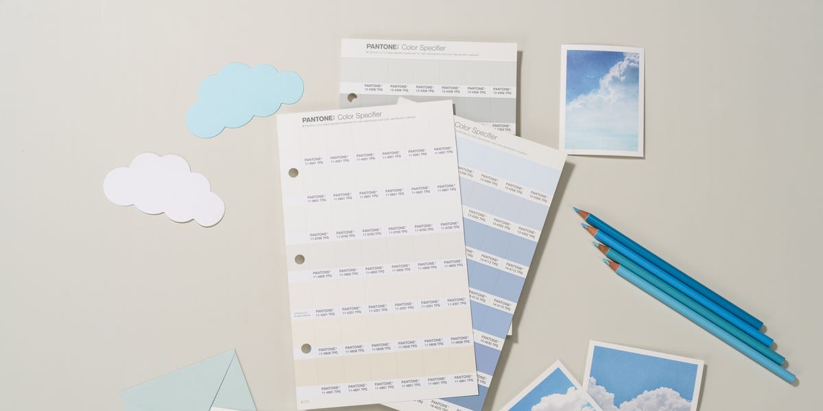
Pantone chose Cloud Dancer, a soft, airy off-white that feels more like an exhale than an announcement. After 2025’s cozy, chocolatey Mocha Mousse, many people expected the trend cycle to keep charging toward richer browns, moody reds, earthy greens, and bold saturated hues. Instead, Pantone handed the room a whisper and somehow made it the loudest statement of all.
That is why this might be Pantone’s most shocking choice yet. Not because Cloud Dancer is outrageous, but because it is restrained in a cultural moment that often rewards more, louder, brighter, faster, and busier. In a year packed with expressive color forecasts, Pantone went with calm. In an era obsessed with visual stimulation, it chose breathing room. In a season of dramatic greens, espresso browns, teal jewels, khakis, and aged reds, it picked a white that asks everyone to settle down for a second and maybe unclench.
The Shock Factor Is All About Timing
If Cloud Dancer had arrived a decade ago, it might have felt merely tasteful. In 2026, it feels oddly rebellious. That is because the broader 2026 color trends conversation has been moving in two directions at once. On one side, there is a continued love affair with warm neutrals, nostalgic browns, and grounded greens. On the other, there is a visible appetite for bolder, more expressive accents like plum, persimmon, teal, and sophisticated reds.
Other color leaders have not exactly been shy this season. Sherwin-Williams and HGTV Home landed on Universal Khaki, a warm grounded neutral. Benjamin Moore picked Silhouette, an espresso brown with charcoal undertones. Behr went with Hidden Gem, a smoky blue-green. Valspar selected Warm Eucalyptus, a soft sage-leaning green. Dutch Boy embraced Melodious Ivory, a creamy neutral. Veranda even planted its flag in a rich vermilion with Silk Road Red. In other words, the room was already full of grown-up, emotionally loaded, highly styled colors.
Then Pantone walked in and said, essentially, “What if the color of the year is peace and quiet?” That is the kind of move that makes design people drop their coffee.
Why Cloud Dancer Feels So Different
It Is a White, But Not a Clinical White
Let’s be clear: Cloud Dancer is not the kind of stark, blinding white that makes a room feel like a dentist’s office with better lighting. This is not “freshly unboxed appliance” white. It is a softer, warmer, more atmospheric white. It has a lived-in, breathable quality that makes it feel human instead of sterile.
That distinction matters. Designers and home editors have been talking for months about the move away from icy, overly crisp whites and toward warm whites, mineral whites, creamy off-whites, and complex neutrals. In other words, Pantone did not choose white in a vacuum. It chose a very particular kind of white: one that aligns with wellness-driven design, emotional comfort, and spaces that feel restorative rather than severe.
It Turns Restraint Into Luxury
For a while, luxury in interiors often leaned moody: dark woods, saturated paint, dramatic stone, lots of visual richness. That look is still very much alive. But Cloud Dancer suggests another version of luxury, one built on calm, space, softness, and clarity. It says luxury does not always have to arrive wearing velvet and heavy jewelry. Sometimes it shows up in a perfectly tailored white shirt, great lighting, and the confidence to leave a little empty space on the table.
That is one reason this Pantone pick lands so well in conversations about interior design trends 2026. It fits a desire for simpler, more intentional rooms without becoming boring. White is easy to underestimate, but a nuanced off-white can do what louder colors cannot: make texture matter more, materials feel richer, and accent shades look smarter.
It Makes Color Look Better, Not Smaller
One of the cleverest things about Cloud Dancer is that it is not anti-color. In fact, it may be one of the most color-friendly choices Pantone has made in years. Pantone and design coverage around the announcement emphasized how flexible the shade is, and that flexibility is the real power move here.
Cloud Dancer can sit beside buttery yellows, pale lavenders, blue-greens, tropical brights, dessert-like pinks, caramel tones, metallic finishes, or shadowy deeper hues. It is the kind of foundational color that does not compete for attention. It gives the rest of the palette somewhere to perform. That makes it highly usable in homes, product design, packaging, fashion basics, branding systems, and digital environments where too much saturation can start to feel like visual caffeine at 10 p.m.
Pantone Is Basically Reading the Room
Color forecasting is never just about aesthetics. It is also about mood, behavior, commerce, and what people wish their lives felt like. Pantone’s language around Cloud Dancer leans into clarity, simplification, creativity, and relief from distraction. That makes perfect sense in a culture where people are tired of constant input but still want beautiful things.
Look around and the pattern is obvious. People want homes that feel restful, but not bland. They want neutrals, but not dead ones. They want personality, but not visual chaos. They want rooms that work hard yet still feel emotionally gentle. Cloud Dancer fits that brief like it was written by someone who has opened one too many browser tabs and finally said, “Nope, I need less.”
That is also why the choice feels smarter the longer you sit with it. A loud color would have been expected. A calming off-white with real warmth and versatility feels more psychologically tuned in. It acknowledges that trend fatigue is real. Not every consumer wants to paint a whole room oxblood, teal, or plum, no matter how stunning those shades look in a magazine spread with perfect millwork and no visible charging cables.
How Cloud Dancer Compares With the Other Big 2026 Color Stories
To understand why this Pantone choice feels so bold, it helps to see it in context.
Moody browns remain huge. Benjamin Moore’s Silhouette and the continued popularity of rich brown interiors suggest the color family still has serious momentum. Brown feels grounded, nostalgic, and mature. It is the design equivalent of a good leather chair and a very convincing opinion.
Earthy greens are also everywhere. Behr’s Hidden Gem and Valspar’s Warm Eucalyptus tap into biophilic design, comfort, and a craving for nature-based calm. Green has become a modern emotional neutral, especially when softened with gray or warmed with brown undertones.
Aged reds and plums are gaining sophistication. From Veranda’s Silk Road Red to other deep burgundy and vermilion conversations, red in 2026 is less “look at me” and more “I own a very expensive candle.”
Bold data-driven colors are still in play too. Forecasts tied to consumer behavior, including Pinterest’s 2026 palette, show continued interest in wasabi green, plum noir, cool blue, jade, and persimmon. That tells us color culture is not becoming timid. If anything, it is splitting between expressive statement tones and emotionally soothing foundations.
Cloud Dancer wins because it can work with all of them. It does not fight espresso brown. It does not flatten eucalyptus green. It does not panic next to plum. It does not get weird around terracotta, brass, walnut, marble, or aged linen. That versatility is not boring. It is strategic.
How to Use Pantone’s 2026 Color of the Year Without Making Your Home Feel Like a Blank Spreadsheet
Use it on walls when you want softness, not sharpness
Cloud Dancer makes sense in living rooms, bedrooms, hallways, and offices where you want light and openness but still crave warmth. Pair it with plaster, oak, boucle, linen, travertine, and unlacquered brass for a layered look that feels expensive without trying too hard.
Let it calm down stronger accents
If you love dramatic colors but do not want your home to feel like every object is trying to win a talent show, Cloud Dancer is your moderator. Use it with olive green cabinetry, a teal front door, a plum dining room, or terracotta textiles. It keeps everything coherent.
Think ceilings, trim, and cabinetry
This color does not have to take over a whole room to work. On trim, built-ins, kitchen cabinetry, or even ceilings, it can deliver quiet refinement. It is especially useful in spaces where bright white would feel too cold and beige would feel too heavy.
Use texture to keep it alive
The fastest way to ruin a subtle white is to pair it with flat, lifeless materials. Cloud Dancer needs friends with personality: woven shades, vintage rugs, nubby upholstery, handmade pottery, warm woods, brushed metal, soft matte finishes, and fabrics that look even better when slightly rumpled.
Real-World Experiences With a Cloud Dancer-Like White
One of the most interesting things about a color like Cloud Dancer is how differently people experience it in daily life compared with how they first react to it online. On a screen, a warm off-white can look almost too quiet. It risks being dismissed as safe, forgettable, or not really a color at all. But in real rooms, the experience is very different.
In small apartments, colors like this tend to make mornings feel better almost immediately. Early light bounces more gently, and the room appears calmer before you have even had coffee. That sounds a little dramatic, but anyone who has lived with a harsh cool white knows the difference. A colder white can amplify shadows and make clutter feel sharper. A nuanced white softens the whole atmosphere. The room still looks bright, but it also feels forgiving.
People also tend to notice how flexible a shade like this becomes throughout the day. In the morning it can read clean and airy. By late afternoon, especially with warm natural light, it starts to feel creamier and more cocooning. At night, under lamps instead of overhead lighting, it often takes on an almost hotel-like softness. That day-to-night adaptability is a huge reason warm off-whites remain so popular in actual homes instead of just designer mood boards.
There is also the practical side. A Cloud Dancer-style white often works beautifully for people who redecorate in stages. Maybe you are not replacing every piece of furniture this year. Maybe your sofa is beige, your rug is vintage, your dining chairs are walnut, and your throw pillows somehow became a mixed family of rust, olive, and faded blue. A color like this can hold all of that together without making the room feel accidental. It acts like a peacemaker. No drama, just diplomacy.
In work-from-home spaces, this kind of white can be especially effective. Strong colors can be inspiring, but they can also feel noisy after eight hours of emails, tabs, deadlines, and video calls. A softer white creates visual rest. Many people find it helps them think more clearly because the room is not constantly demanding attention. It becomes background in the best possible way, which is exactly what many home offices need.
Families and renters often appreciate these shades for a different reason: they make spaces feel cleaner and more intentional without forcing a major style commitment. A teenager’s room can still handle posters and bold bedding. A family room can survive toys, books, baskets, and the occasional mystery sock. A rental kitchen can look more elevated with creamy accessories and warm wood than it ever would under a bluer, colder white. The color quietly upgrades whatever is happening around it.
Another real-world advantage is photography. Whether you are posting your home online, listing a property, or just taking a casual photo of your new side table, a warmer white tends to read better in pictures than a bright technical white. It creates depth instead of glare. Objects look richer against it. Skin tones usually look healthier too, which is great news for anyone who has ever tried to take a selfie in a room painted the visual equivalent of a refrigerator.
That is the secret of Cloud Dancer-style whites. They are not exciting in the instant, attention-grabbing way a jewel tone is. Their charm builds through use. They make other colors look smarter, light look softer, and everyday life look a little more composed. That may not sound shocking at first glance, but after living with it for a while, many people realize the real surprise is how much better the room feels.
Final Verdict: Why This Might Really Be Pantone’s Most Shocking Choice
Cloud Dancer is shocking because it breaks the usual rules of trend drama. It is not the darkest, brightest, richest, or most controversial color in the 2026 conversation. It is the one that steps back and still manages to dominate the mood. That takes nerve.
Pantone could have chosen another earth tone, another cozy brown, another heritage red, or another nature-soaked green and nobody would have blinked. Instead, it chose an off-white that feels like clarity in color form. And somehow that feels bolder than choosing a shade that shouts.
So yes, Pantone’s 2026 Color of the Year might be its most shocking choice. Not because Cloud Dancer is wild, but because it understands something many trend forecasts miss: in a world exhausted by noise, calm can be the most radical color in the room.