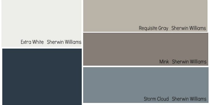
Fall decorating does not have to involve covering every available surface with pumpkins available surface with pumpkins. Sometimes the most convincing seasonal transformation begins with a paintbrush, a thoughtfully chosen color, and the courage to admit that the icy gray walls you loved ten years ago now make the living room feel like a very stylish refrigerator.
The Fall Pottery Barn Paint Collection, developed through Pottery Barn’s partnership with Sherwin-Williams, combines versatile neutrals with earthy browns, muted reds, deep blues, and dramatic charcoal tones. The officially documented Fall/Winter palette includes dependable shades such as Alabaster, Modern Gray, Balanced Beige, Downing Earth, Naval, Foxy, Realist Beige, and Iron Ore. Together, they offer a practical route to the comfortable, layered look associated with Pottery Barn interiors.
Official paletturn154513view1turn154513view2
What Makes the Pottery Barn Fall Paint Palette Special?
Many autumn color schemes rely heavily on bright orange, mustard yellow, and cranberry red. Those colors can be beautiful, but using all three at once may leave a room looking less like an elegant retreat and more like a Thanksgiving centerpiece that gained consciousness.
Pottery Barn’s approach is quieter. The collection uses softened, livable versions of familiar fall colors: clay instead of pumpkin orange, taupe instead of plain brown, charcoal instead of absolute black, and creamy white instead of stark white. These colors create warmth without making a home feel permanently trapped in October.
A Palette Designed Around Furnishings
The collection is particularly useful because the colors were selected to coordinate with furniture, textiles, rugs, wood finishes, and decorative accessories. That matters in real homes, where wall paint does not exist in a perfectly empty showroom. It must get along with the walnut dining table, the oatmeal sofa, the brass lamp, the family photographs, and the rug purchased during a brief but memorable geometric-pattern phase.
Warm whites and greiges give larger pieces room to breathe. Earthy midtones complement leather, linen, jute, wool, and unfinished wood. Dark shades provide definition around fireplaces, built-ins, cabinetry, and architectural details.
Fall Character Without a Seasonal Expiration Date
The best colors in the collection feel appropriate during autumn but remain attractive throughout the year. A rich beige can support rust-colored pillows in October, evergreen branches in December, pale blue linens in spring, and woven coastal accessories in summer. That flexibility makes repainting unnecessary every time the weather app changes.
Our Favorite Colors from the Fall Pottery Barn Collection
1. Alabaster SW 7008: The Soft White That Warms Everything
Alabaster is an excellent choice for homeowners who want white walls without the clinical sharpness of a brilliant white. Its gentle warmth makes a room feel welcoming while maintaining the clean, bright character people expect from a light neutral.
Use Alabaster in a living room with natural oak, cream upholstery, antique brass, and brown leather. It is also a strong candidate for bedrooms, hallways, open-concept interiors, and kitchens where the cabinetry or countertops already contain warm undertones.
For a layered Pottery Barn-inspired scheme, pair Alabaster walls with Iron Ore on built-ins or doors. Add flax-colored curtains, a faded vintage-style rug, and a few black accents. The result feels finished without appearing as though every item arrived in the same delivery truck.
2. Modern Gray SW 7632: An Easygoing Greige
Despite its name, Modern Gray is not a cold industrial gray. It sits comfortably between beige and gray, giving it enough warmth to work with wood furniture and enough restraint to complement contemporary décor.
This shade performs especially well in transitional spaces, including family rooms, dining rooms, and open floor plans that connect several decorating styles. It can soften dark furniture, balance honey-toned flooring, and create a calm background for textured fabrics.
Pair it with creamy white trim, navy accents, aged bronze hardware, and muted terracotta accessories. If your decorating style frequently changes its mind, Modern Gray is patient enough to keep up.
3. Balanced Beige SW 7037: A Classic Neutral with Substance
Balanced Beige provides more body than a pale greige while remaining subtle enough for full-room use. It works well when white feels too plain and gray feels too cool. The color creates a grounded backdrop that looks particularly inviting beside warm wood, stone, and woven materials.
Consider Balanced Beige for a dining room with a substantial wood table, upholstered chairs, linen curtains, and iron lighting. It also suits a comfortable den where layered books, pottery, baskets, and framed artwork provide most of the visual interest.
For contrast, combine it with Alabaster trim and Naval accents. For a softer tonal room, add camel, oatmeal, cream, and chocolate brown. Beige may have spent years being accused of boring behavior, but this version has clearly hired a better publicist.
4. Windsor Greige SW 7528: A Polished Background Color
Windsor Greige has a refined, slightly deeper appearance that can make a room feel composed and intentional. It supports both traditional and modern furnishings, particularly when accompanied by warm whites, dark woods, and muted metals.
This is a useful shade for formal living rooms, home offices, guest rooms, and dining spaces. In a bright room, it can appear soft and elegant. In lower light, it may become moodier and more enveloping, so sampling it on several walls is essential.
Try it with ivory upholstery, espresso furniture, warm brass, and olive-green textiles. The combination has an autumnal quality without depending on obvious seasonal decorations.
5. Downing Earth SW 2820: The Rich, Historic Brown
Downing Earth is one of the collection’s most distinctive colors. It has the grounded character of soil, aged wood, and weathered pottery. Unlike a flat brown, it carries enough complexity to look sophisticated in changing light.
Use it in a library, office, dining room, powder room, or paneled den. It can also create a handsome accent on cabinetry, an island, a fireplace surround, or the back wall of built-in shelving.
Downing Earth pairs naturally with linen, cognac leather, antique brass, creamy ceramics, and vintage artwork. Add warm lamplight and the room may suddenly suggest that everyone living there reads hardcover books and knows how to decant wineeven when neither is technically true.
6. Foxy SW 6333: A Sophisticated Clay Red
Foxy brings the warmth of terracotta and sunbaked clay without becoming aggressively orange. It is one of the best choices for homeowners who want unmistakable color while preserving a mature, collected atmosphere.
A dining room painted Foxy can feel intimate and energetic, particularly at night. The shade also works on a kitchen island, a small entry console, the interior of a bookcase, or a single architectural feature.
Balance Foxy with Alabaster, warm beige, charcoal, and natural wood. Indigo textiles provide a complementary contrast, while olive green adds an earthy, organic quality. Because the color is substantial, begin with a sample rather than introducing it to all four walls without so much as a handshake.
7. Naval SW 6244: The Dependable Deep Blue
Naval gives the collection a cooler counterpoint to its many warm neutrals. It is dark, confident, and versatile enough to function almost like a neutral. Navy can introduce contrast without the severity of black, making it useful in traditional, coastal, transitional, and modern rooms.
Use Naval on lower kitchen cabinets, a bathroom vanity, a media console, an accent wall, or built-ins. It also creates an elegant bedroom when combined with crisp bedding, warm wood, and soft brass lighting.
Pair Naval with Pure White for sharper contrast or Alabaster for a warmer look. Add camel leather, rust, natural linen, and medium-toned wood to connect the blue to an autumn-inspired palette.
8. Iron Ore SW 7069: Drama Without Harshness
Iron Ore is a deep charcoal that provides the impact of black while retaining a softer, slightly more forgiving appearance. It can anchor a pale room, emphasize millwork, or give ordinary doors and cabinets a custom look.
This shade is particularly effective on fireplace surrounds, interior doors, bookcases, mudroom cabinetry, bathroom vanities, and kitchen islands. In a compact powder room, using Iron Ore across the walls and trim can create an enveloping jewel-box effect.
Combine it with Alabaster, warm oak, veined stone, woven baskets, and unlacquered brass. The contrast looks architectural and intentional, even when the room’s most complicated architectural feature is an aggressively placed air vent.
Exact colors are included in the official Sherwin-Williams Po palette: citeturn154513view0
How to Build a Cohesive Pottery Barn Fall Color Scheme
Start with the Largest Fixed Elements
Before choosing paint, examine the elements that are difficult or expensive to replace: flooring, countertops, tile, stone, cabinetry, and major furniture. Their undertones should guide the wall color.
Honey oak and warm stone generally cooperate with Alabaster, Balanced Beige, Realist Beige, and Downing Earth. Cooler marble, brushed nickel, or gray flooring may look more balanced with Modern Gray, Repose Gray, Jubilee, or Naval.
Use a Simple Three-Part Formula
A practical Pottery Barn-style palette can be built with three roles:
- A light foundation: Alabaster, Pure White, Snowbound, or Modern Gray.
- A warm supporting color: Balanced Beige, Windsor Greige, Realist Beige, Downing Earth, or Foxy.
- A dark anchor: Naval, Pewter Cast, or Iron Ore.
For example, choose Alabaster walls, Realist Beige upholstery, and Iron Ore doors. Another combination might feature Modern Gray walls, Foxy accessories, and Naval cabinetry.
Let Texture Carry Part of the Design
Pottery Barn interiors rarely depend on color alone. Their warmth comes from layered materials: linen, leather, wool, wood, ceramic, metal, rattan, and stone. A restrained wall color gives these textures enough room to register.
If a neutral room feels flat, the solution may not be another paint color. It may need a chunky throw, a weathered table, a ribbed ceramic lamp, a woven shade, or a rug with faded pattern. Sometimes beige is innocent; the real culprit is a shortage of texture.
Broader fall-col283516search9turn230397search4
Choosing the Right Color for Each Room
Living Room
For a flexible family living room, begin with Alabaster, Modern Gray, or Balanced Beige. These colors support seasonal pillow and throw changes without requiring a complete redesign. Introduce Naval or Iron Ore through a media cabinet, fireplace, or built-ins.
Dining Room
A dining room can handle more saturation because it is often used during evening hours. Downing Earth, Foxy, Windsor Greige, and even Iron Ore can create intimacy under warm artificial light. Cream trim and reflective metal accents prevent the space from feeling too heavy.
Bedroom
Choose Alabaster, Moderne White, Jubilee, or Repose Gray for a restful bedroom. Naval can work beautifully behind a headboard, especially with white bedding, camel-colored accents, and medium wood tones.
Kitchen
In kitchens, coordinate the paint with countertops and backsplash materials before considering trends. Alabaster and Pure White can refresh walls, while Naval and Iron Ore work well on islands or lower cabinetry. Balanced Beige and Realist Beige can soften kitchens containing warm stone or wood.
Entryway or Powder Room
Small transitional rooms are ideal places to experiment. Foxy can create a memorable entry, while Iron Ore or Naval can transform a powder room into a dramatic destination. These spaces require less paint, reducing both financial commitment and emotional fallout.
Always Test Paint Before Committing
Paint colors change throughout the day because natural light, artificial bulbs, flooring, furniture, and nearby colors influence how the eye perceives them. A beige that looks calm in a store may appear yellow beside a warm oak floor. A charcoal that seems balanced online may turn nearly black in a north-facing room.
Paint large sample areas or movable sample boards, then examine them in morning light, afternoon light, and at night. Place samples beside trim, flooring, curtains, countertops, and upholstery. A large test area provides far more useful information than a tiny paper chip viewed beneath store lighting.
Also consider sheen. Flat and matte finishes create a soft look but are less reflective. Eggshell and satin finishes reflect more light and are easier to clean, making them practical in active living spaces, hallways, kitchens, and bathrooms. Trim, doors, and cabinetry typically benefit from more durable finishes.
Sampling, lighting, 83516search1turn230397search11
Experience Notes: What Living with These Colors Can Teach You
The most important experience in choosing from the Fall Pottery Barn Paint Collection usually happens after the sample is on the wall. Before that moment, every swatch is full of possibility. Once the paint meets your actual room, it begins negotiating with the windows, floors, lamps, and furnitureand some negotiations are friendlier than others.
A common first lesson is that warm whites are not interchangeable. Alabaster may look gently creamy in one room and almost neutral in another. Next to bright white trim, its warmth becomes clearer. Beside golden wood flooring, it can appear lighter and quieter. This is why a homeowner may love a white seen in a friend’s house but feel puzzled when the same color behaves differently at home. Paint has no respect for recommendations unless the lighting agrees.
Greiges such as Modern Gray and Windsor Greige provide another useful experience. During the day, they can look subtle and airy. In evening light, their warmer side may become more noticeable. This shift is often exactly what makes them comfortable: they remain restrained in sunlight but become cozier when lamps are turned on. However, the temperature of the light bulbs matters. Very cool bulbs can flatten warm neutrals, while softer warm-white bulbs tend to reinforce their inviting character.
Darker shades create a more dramatic learning curve. Iron Ore or Naval may initially seem risky, particularly when the first coat goes up and the room resembles a storm cloud. Once the second coat dries, the trim is refreshed, and furniture returns, the shade usually feels more intentional. Dark paint often needs the surrounding room to be completed before it makes sense. Judging it halfway through the project is like reviewing a cake while it is still a bowl of batter.
Foxy and Downing Earth demonstrate how color can change the emotional role of a room. A rarely used dining space may feel more inviting after gaining a warm, enveloping shade. A home office painted in earthy brown can seem quieter and more focused. These colors are not merely decorative; they help separate one area’s mood from another, especially in homes where every room had previously been painted the same builder-grade beige.
Another practical lesson is that restraint creates flexibility. Using a bold shade on cabinetry, a fireplace wall, or the back of shelving can provide enough character without dominating the entire room. This approach is particularly helpful for anyone who loves deep color but also changes accessories frequently. Naval cabinetry can coordinate with rust and plaid in fall, evergreen and brass during the holidays, pale blue in spring, and woven neutrals in summer.
The final experience is realizing that a successful Pottery Barn-inspired room is rarely about copying a catalog image. Catalog rooms are useful for studying proportion, contrast, and texture, but a real home becomes more convincing when it includes personal artwork, inherited furniture, travel finds, family photographs, and objects that were not selected by an entire styling department. The paint should connect those pieces rather than compete with them.
When the color is right, you notice the room before you notice the paint. The sofa appears richer, the wood feels warmer, the artwork stands out, and the lighting becomes softer. That is the strongest quality of this fall palette: its best shades do not simply decorate the walls. They make everything already in the room look as though it belongs there.
Conclusion
The Fall Pottery Barn Paint Collection succeeds because it offers more than predictable seasonal color. Alabaster and Modern Gray create flexible foundations; Balanced Beige and Windsor Greige add warmth; Downing Earth and Foxy introduce earthy character; and Naval and Iron Ore provide architectural contrast.
For the safest whole-room choices, start with Alabaster, Modern Gray, or Balanced Beige. For a richer statement, sample Downing Earth, Foxy, Naval, or Iron Ore. Whichever shade earns a place on your wall, test it in the actual room and allow it to interact with the light, furniture, and finishes before making the final decision.
The goal is not to make your home look like autumn exploded inside it. The goal is to create a comfortable, grounded interior that feels especially wonderful in falland remains beautiful long after the last decorative pumpkin has returned to storage.