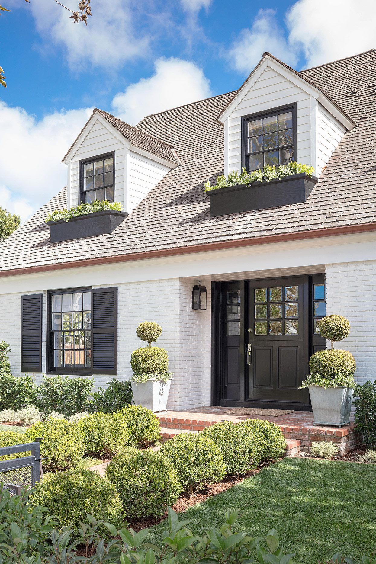
Choosing Craftsman house colors is not the same as picking a cute paint chip under fluorescent store lighting and hoping the porch gods approve. A Craftsman home has opinions. It has broad eaves, proud trim, tapered columns, earthy materials, and the quiet confidence of someone who owns at least one very serious rocking chair. The right color palette makes those details sing. The wrong one can make a century-old bungalow look like it wandered into the wrong subdivision.
The best Craftsman color schemes usually come from nature: mossy greens, warm browns, clay reds, muted golds, deep blues, charcoal grays, creamy whites, and wood-stain tones. These colors work because Craftsman architecture grew from the Arts and Crafts movement, which celebrated honest materials, visible craftsmanship, and homes that felt connected to their landscape. In plain English: your house wants to look like it belongs near trees, stone, brick, sunlight, and soilnot like a plastic cooler at a tailgate.
This guide explains how to choose exterior and interior Craftsman colors, how to combine body, trim, sash, porch, and front door colors, and how to avoid the most common paint mistakes. Whether your home is a historic bungalow, a modern Craftsman-inspired build, or a “Craftsman-ish” house with good bones and one suspicious vinyl window, the right palette can boost curb appeal while respecting the style’s roots.
What Makes a Color “Craftsman”?
A Craftsman color is less about one exact shade and more about a relationship between architecture and materials. The style commonly includes low-pitched roofs, wide overhanging eaves, exposed rafters or brackets, generous porches, tapered columns, wood siding, shingles, stucco, brick, and stone. Color should help those details stand out instead of flattening them into one big painted pancake.
Traditional Craftsman palettes often use three to five related colors. The body color covers the siding or stucco. The trim color outlines windows, fascia, brackets, porch beams, and columns. A sash color may define window frames. Accent colors appear on doors, railings, gable details, or shutters if the house has them. Compared with many modern exteriors, Craftsman homes can handle richer contrast because the architecture has enough depth to carry it.
Best Exterior Craftsman House Color Families
1. Earthy Greens
Green is one of the most classic Craftsman exterior colors because it feels rooted, calm, and slightly forest-dwelling in the best possible way. Sage, olive, moss, eucalyptus, and deep forest green pair beautifully with cream trim, brown rafters, brick steps, stone columns, and stained wood doors.
For a traditional look, try olive-green siding with warm ivory trim and dark bronze window sash. For a fresher version, use pale sage on the body, soft white trim, and a deep reddish-brown door. The key is to avoid greens that are too neon, too minty, or too cold. A Craftsman green should look like it could have been discovered on a leaf, not squeezed from a tube of cartoon frosting.
2. Warm Browns and Taupes
Brown is not boring on a Craftsman house. It is dependable, handsome, and very good at making stone, brick, and wood look intentional. Warm brown siding, tan shingles, cocoa trim, and coppery accents create a grounded palette that feels historically appropriate without looking dusty.
Light taupe, mushroom, cedar, coffee, and tobacco tones work especially well on bungalows with big porches. If the roof is brown, bronze, weathered wood, or dark gray, a brown-based palette can make the entire exterior feel cohesive. Add a cream trim to brighten the face of the house, or choose dark trim for a moodier lodge-style effect.
3. Muted Golds and Ochres
Craftsman homes often look fantastic in golden earth tones: ochre, wheat, straw, muted mustard, and warm beige. These shades catch sunlight beautifully and feel cheerful without turning into “banana house,” which is a technical design term meaning “please sample before committing.”
A golden body color pairs well with olive trim, dark brown accents, and a brick-red or deep green door. This palette is especially useful for shaded lots because it adds warmth where gray or dark green might feel heavy. It also complements natural wood porch ceilings, bronze hardware, and terracotta planters.
4. Brick Reds and Clay Accents
Red is powerful on a Craftsman home, but it usually works best as an accent rather than the entire body color. Brick red, barn red, oxblood, terra-cotta, and rusty clay can highlight a front door, window sash, porch railing, or gable detail. These shades echo brick chimneys, clay roof tiles, and autumn leaves.
For example, a moss-green house with cream trim and a brick-red door feels classic and welcoming. A warm taupe house with dark brown trim and terra-cotta accents feels subtle but still memorable. Red should look aged and earthy, not fire-engine bright. Your front door can have personality without yelling at the mail carrier.
5. Deep Blues and Blue-Grays
Blue is not the most traditional Craftsman color, but muted navy, slate blue, denim, and blue-gray can work beautifully when balanced with warm trim and natural materials. A deep blue body color with cream trim and stained wood details creates a handsome, slightly coastal Craftsman palette.
The trick is warmth. Cool blue-gray next to warm stone can sometimes feel disconnected, while a softened navy or smoky blue with a hint of green can harmonize better. If your home has white vinyl windows that cannot be painted, blue can also help those windows look crisp rather than accidental.
6. Charcoal, Pewter, and Soft Black
Modern Craftsman homes often use charcoal, pewter, and soft black. These colors can look sophisticated, especially with natural cedar, stone, black-framed windows, and warm lighting. On a historic bungalow, however, very dark colors need careful handling because they can hide delicate trim lines if there is not enough contrast.
A safer approach is charcoal siding with cream trim, stained wood porch details, and a muted green or red door. Another option is a medium pewter body color with dark brown trim and warm white window frames. Dark colors add drama, but the Craftsman style still needs layers. Otherwise, the house can become one big shadow wearing a porch.
Classic Craftsman Exterior Color Combinations
Green, Cream, and Brick Red
This is one of the most beloved Craftsman house color schemes. Use olive or sage green for the siding, cream for trim, dark brown for beams or brackets, and brick red for the front door. It feels timeless, friendly, and connected to the landscape.
Taupe, Chocolate, and Warm White
Choose warm taupe for the body, chocolate brown for rafters and trim, and warm white for window accents. This palette is understated but rich. It is ideal for homes with stone porch piers, brown roofs, or wood doors.
Ochre, Olive, and Deep Brown
Muted golden siding with olive trim and deep brown accents gives a Craftsman house a sunny but grounded appearance. It works well in neighborhoods with mature trees because the warm body color prevents the house from disappearing into shade.
Navy, Ivory, and Natural Wood
Deep navy or smoky blue siding can modernize a Craftsman exterior while still respecting its architecture. Add ivory trim and a stained wood door to bring back warmth. This combination looks especially strong on homes with clean lines and generous porch details.
Charcoal, Cream, and Copper
For a more contemporary Craftsman palette, use charcoal siding, cream trim, and coppery brown accents. A wood door or bronze hardware keeps the look from becoming too stark. This is a good choice for homeowners who want drama without abandoning the style’s earthy foundation.
How to Choose Trim Colors for a Craftsman House
Trim is where many Craftsman homes either become stunning or quietly lose the plot. Because the style is full of visible structure, trim color should define the architecture. Fascia boards, window casings, porch columns, brackets, knee braces, and railings deserve attention.
Warm white and cream are safe choices when the body color is dark or medium. They brighten the exterior and emphasize the horizontal lines that make Craftsman homes feel sturdy. Dark trim, such as espresso, bronze, deep green, or charcoal, can also work beautifully, especially when the body color is lighter. Unlike some other house styles, Craftsman architecture can handle darker trim because its details are bold and dimensional.
For the most authentic look, avoid harsh, icy white unless the rest of the palette is intentionally crisp and modern. Cream, linen, ivory, almond, and warm off-white usually feel more natural with stone, wood, and brick. Pure white can work, but it needs the right roof, windows, and landscaping to avoid looking pasted on.
Front Door Colors That Work Beautifully
The front door is the handshake of the house. On a Craftsman home, it should feel warm, substantial, and maybe a little charmingly old-soul. Stained wood is often the best choice if the door is attractive and in good condition. Oak, mahogany, walnut, and fir tones all pair naturally with Craftsman architecture.
If painting the door, consider deep red, muted teal, forest green, black-brown, copper, mustard, or navy. The door can be the strongest color in the palette, but it should still relate to the rest of the house. A brick-red door on a green bungalow looks classic. A mustard door on a charcoal house feels stylish. A teal door on a warm taupe house adds personality without turning the home into a beach cabana by accident.
Interior Craftsman Colors
Inside, Craftsman colors should support woodwork, built-ins, fireplaces, beams, and cozy room proportions. Popular interior choices include warm white, clay, sage, olive, golden beige, tobacco brown, muted blue, and soft gray-green. If the home has original stained wood trim, let that wood lead the palette. Paint should complement it, not compete with it.
Living rooms often look great in warm neutrals, mossy greens, or muted golds. Dining rooms can handle deeper shades such as olive, russet, or smoky blue. Bedrooms may feel restful in sage, warm gray, cream, or dusty blue. Kitchens can be updated with creamy cabinets, soapstone-like counters, brass hardware, and earthy wall colors. The goal is comfort with character, not a museum exhibit where everyone whispers around the sideboard.
How Roof, Stone, Brick, and Landscaping Affect Color
Before choosing paint, look at the fixed elements: roof color, brick, stone, chimney, walkway, porch flooring, window color, gutters, and landscaping. These features are already part of the palette whether you invited them or not.
If the roof is warm brown, choose body colors with warm undertones such as taupe, olive, ochre, or cedar. If the roof is charcoal or black, you can use cooler greens, blue-grays, navy, or warm whites. If the home has red brick, avoid body colors that clash with orange or pink undertones. Olive, cream, warm gray, and deep blue often pair well with brick. If the stone has multiple colors, pull one subtle tone from the stone for the siding or trim.
Landscaping matters too. A Craftsman house surrounded by evergreens may need a warmer or lighter body color for contrast. A sunny lot can handle deeper greens and browns. A home in a dry climate may look better in sand, clay, sage, and muted gold. The best palette looks like it grew from the property instead of arriving in a bucket with no social skills.
Common Craftsman Color Mistakes to Avoid
Using Too Few Colors
A one-color Craftsman exterior can look flat because the style depends on visible structure. Even a simple palette should have a body color, trim color, and at least one accent.
Choosing Trendy Colors That Ignore the Architecture
Trendy black-and-white exteriors can look sharp on modern farmhouses, but they may feel too stark on a historic Craftsman. If you love high contrast, soften it with cream instead of bright white and add wood or earthy accents.
Painting Natural Materials Without a Good Reason
Original stone, brick, and quality woodwork are valuable visual assets. Painting them can sometimes be necessary, but it should not be the first move. Often, the better strategy is to choose paint colors that make those materials look intentional again.
Skipping Large Paint Samples
Exterior paint changes dramatically in sunlight, shade, rain, and evening light. Always test large samples on different sides of the house. A color that looks calm on a tiny chip may become surprisingly loud on 1,200 square feet of siding. Paint chips are tiny liars. Charming, but still liars.
Practical Step-by-Step Color Selection Process
Start with the fixed elements: roof, masonry, windows, and porch materials. Next, choose the body color. Then pick trim that either softly contrasts or boldly defines the architecture. After that, choose accent colors for the door, sash, brackets, or railings. Finally, test everything together in natural light.
A reliable formula is the 60-30-10 approach. Use about 60 percent body color, 30 percent trim or secondary color, and 10 percent accent. Craftsman homes may bend this rule because they have more architectural detail, but the concept helps keep the palette balanced.
For historic homes, research similar houses from the same period and region. Local preservation groups, old neighborhood photos, paint manufacturer historic collections, and nearby restored bungalows can provide useful clues. For newer Craftsman-inspired homes, you have more flexibility, but the same principles apply: warmth, texture, contrast, and respect for the lines of the house.
of Real-World Experience With Craftsman House Colors
After looking at many Craftsman homes, one lesson becomes obvious: the best color is rarely the most exciting chip in the store. It is usually the color that makes the porch columns, window trim, roofline, brick, and landscaping feel like they all attended the same family reunion. A Craftsman house is not trying to win a paint-swatch talent show. It is trying to look settled, handsome, and confident.
One common experience homeowners have is falling in love with a dark green or charcoal online, painting a sample, and realizing the shaded side of the house now looks like a cave with gutters. Dark colors can be gorgeous, but Craftsman homes often have deep porches and wide eaves that already create shadow. In that case, a medium olive, sage, warm taupe, or muted gold may show the architecture better than a dramatic near-black shade.
Another lesson is that trim color does more work than people expect. On a Craftsman bungalow, trim is not just decorative frosting. It outlines the bones of the house. A warm cream trim can make dark siding feel inviting. A brown or bronze trim can make a light body color feel richer. Two trim colors can be even better: one for broad boards and porch structure, another for window sash or small details. This layered look is often what makes a Craftsman exterior feel authentic.
Front doors are where homeowners can safely have fun. If the main palette is quiet, the door can carry a stronger personality. Brick red, deep teal, golden ochre, forest green, and stained wood all work well. The secret is choosing a color that appears somewhere else nearby, even subtly. A red door may connect to brick steps. A green door may echo landscaping. A wood door may tie into porch beams. When the accent color has a friend, it looks designed rather than random.
Paint sampling is another real-world hero. Small chips are useful for narrowing choices, but large samples are nonnegotiable. Put them on the front, side, and shaded areas of the house. Look at them in morning light, afternoon sun, and cloudy weather. Also view them from the sidewalk, not just from three inches away while holding coffee and questioning every decision you have ever made.
Homeowners with white vinyl windows or gutters often worry that historic Craftsman colors will not work. They still can. The trick is to repeat white or off-white intentionally in trim, fascia, or porch details so the windows look planned. If the white elements remain isolated, they may look like replacements. If they are echoed, they become part of the palette.
Finally, the most successful Craftsman color projects respect the house but do not become trapped by fear. Historical inspiration is valuable, but your home also has a real roof, real neighbors, real light, and real maintenance needs. The sweet spot is a palette that honors the Craftsman spiritnatural, layered, warm, and handcraftedwhile still feeling livable today. When the colors are right, the house does not look newly painted in a flashy way. It looks like it has finally remembered who it is.
Conclusion
Craftsman house colors work best when they celebrate the architecture’s natural materials, layered details, and connection to the landscape. Earthy greens, warm browns, muted golds, clay reds, deep blues, charcoal tones, and creamy whites can all be excellent choices when used with balance. The strongest palettes usually include a body color, trim color, sash or secondary trim color, and a carefully chosen accent for the front door or architectural details.
Instead of chasing a trend, study the home’s roof, masonry, porch, windows, and surroundings. Then test generous samples before making the final decision. A Craftsman home rewards patience. Give it color with depth, warmth, and purpose, and it will return the favor with curb appeal that feels timeless rather than trendy.