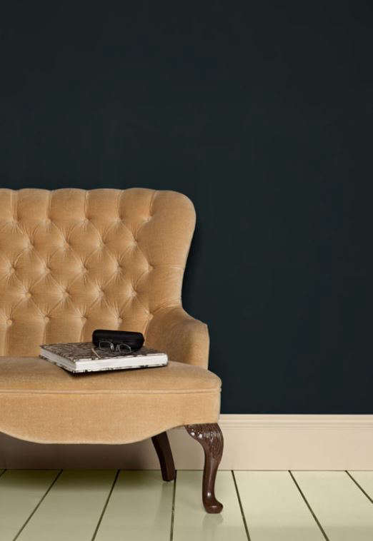
Some paint colors whisper. Some politely clear their throat. And then there is Black Blue No. 95 by Farrow & Ball, a shade that walks into the room wearing a velvet dinner jacket and somehow convinces your hallway it has ancestral portraits. This sophisticated black-blue paint is dark, dramatic, and surprisingly versatile, offering the kind of depth that makes walls, doors, cabinets, and trim feel designed rather than merely painted.
Black Blue No. 95 is exactly what its name promises: a rich color built around black and blue pigments. In small doses, it can read almost black. Across a larger surface, especially in a glossy finish or strong natural light, the blue steps forward with confidence. That shift is the magic. It is not a flat navy, not a harsh black, and not one of those “almost blue, maybe gray, possibly moody” colors that sends homeowners into a three-week sample-card spiral. Black Blue is decisive, but it still has nuance.
For anyone searching for Farrow & Ball Black Blue paint ideas, this guide covers undertones, best rooms, finish choices, color pairings, front door inspiration, cabinet uses, and practical decorating lessons. Think of it as your calm friend in the paint aislethe one who says, “Yes, go dark,” but also reminds you to tape up a sample first.
What Is Black Blue No. 95?
Black Blue No. 95 is a deep, saturated Farrow & Ball shade from the brand’s Archive collection. Although archive colors may not always appear on the standard color card, they remain available for decorators who want something a little less expected than the greatest-hits palette. In other words, it is not gone; it is just enjoying a quieter, moodier life off the main stage.
The color gets its character from the relationship between two dominant ideas: the grounding seriousness of black and the cool elegance of blue. The result is a shade that can look nearly black on a front door, built-in cabinet, stair rail, or narrow trim detail, while appearing more clearly blue when used on larger walls or in a reflective finish. It is a smart choice for homeowners who like dark interiors but want more personality than basic black.
The Personality of the Color
Black Blue No. 95 has a formal side, but it is not stiff. It can feel traditional in a paneled dining room, crisp on a glossy front door, cozy in a reading nook, and daring on kitchen cabinets. Its elegance comes from restraint. It does not shout “look at me,” though everyone will, in fact, look at it.
Unlike brighter navy paints, Black Blue has a shadowed quality. It is less nautical and more architectural. Imagine midnight blue after it has read a few design magazines, learned excellent posture, and decided it prefers brass hardware.
Undertones: Is Black Blue More Black or More Blue?
The honest answer is: it depends on where you put it. Farrow & Ball Black Blue No. 95 is a color that reacts strongly to surface area, lighting, sheen, and surrounding colors. On a tiny sample chip, it may look almost black. On a wall, particularly in a room with daylight, the blue becomes more obvious. In Full Gloss, the blue can appear richer and more luminous because the sheen reflects light back into the room.
When paired with bright white trim, Black Blue often reads darker and sharper. The contrast makes its black side more noticeable. When paired with warm neutrals, aged wood, natural stone, or muted brass, the color feels softer and more layered. This is why sampling matters. A paint chip is a suggestion; your wall is the courtroom.
How Light Changes Black Blue
In a north-facing room, Black Blue may feel cool, inky, and intimate. That can be beautiful in a study, media room, powder room, or bedroom where atmosphere is the goal. In a south-facing room, warmer daylight can reveal more blue and keep the color from feeling too heavy. In artificial evening light, it becomes moody and cocooning, which is design-speak for “you may suddenly want to light a candle and cancel your plans.”
If you are using Black Blue in a room with limited natural light, do not automatically panic and paint everything white. Dark colors can actually make dim spaces feel intentional. A pale color in a dark room can look flat and tired, while a deep shade can turn the same space into a jewel box.
Best Places to Use Black Blue No. 95
Black Blue is not a one-room wonder. It works beautifully in interiors and on selected exterior details, provided you choose the correct finish for the surface. Here are some of the strongest uses.
1. Front Doors
A Black Blue Farrow & Ball front door is a stylish alternative to classic black. It gives the same polished curb appeal but adds a deep blue undertone that feels richer and more personal. On white, cream, brick, stone, or cedar-shake exteriors, Black Blue can create a memorable entrance without behaving like a neon sign. Your mail carrier may not applaud, but they will know your house has taste.
For front doors, consider a durable exterior finish suitable for wood or metal. A subtle sheen can highlight the blue undertone, while a glossier finish creates a more dramatic, lacquered effect. Pair it with brass, aged bronze, black iron, or polished nickel hardware depending on the style of the home.
2. Kitchen Cabinets
Black Blue cabinets can transform a kitchen from “nice enough” to “did a boutique hotel move in?” The color works especially well on lower cabinets, islands, pantry doors, or full cabinetry in larger kitchens. It pairs beautifully with marble, soapstone, butcher block, unlacquered brass, warm oak, creamy walls, and handmade tile.
If painting kitchen cabinets, finish choice is everything. Cabinets need a tougher surface than standard wall paint. Look for a durable eggshell or specialty wood-and-metal finish that can handle fingerprints, cleaning, and the occasional dramatic spaghetti incident.
3. Dining Rooms
Black Blue is a natural fit for dining rooms because it flatters evening light. Used on all four walls, it creates intimacy and depth. Add warm bulbs, linen curtains, dark wood furniture, and a mirror or artwork with a metallic frame. Suddenly, dinner feels less like reheated leftovers and more like a reservation you somehow got without calling three weeks ahead.
For a more traditional look, combine Black Blue walls with off-white trim. For a modern approach, consider color drenching: walls, trim, doors, and even radiators painted in the same shade. This reduces visual breaks and makes the room feel calm, enveloping, and deliberately designed.
4. Powder Rooms
Small rooms are perfect places to take bigger design risks. A powder room painted in Black Blue can feel glamorous, especially with a stone sink, antique mirror, brass sconces, or patterned floor tile. Because guests spend only a short time there, you can be bolder than you might be in a main living space.
In small areas, Black Blue may read closer to black, which can be a feature rather than a flaw. Add warm lighting and reflective surfaces to prevent the room from feeling too cave-like, unless “elegant cave” is the goal. No judgment. Some caves have excellent sconces.
5. Built-Ins and Bookcases
For bookcases, media walls, alcove shelving, and library cabinets, Black Blue brings structure and sophistication. Books, ceramics, framed photos, and warm wood accents stand out beautifully against its dark background. It also hides visual clutter better than pale shelving. This is helpful if your book collection is 30 percent literature and 70 percent objects you bought because they looked “interesting.”
6. Bedrooms and Studies
Black Blue can create a restful, enveloping mood in bedrooms and studies. It is particularly effective behind a headboard, on paneled walls, or across an entire room where comfort and concentration matter. Pair it with ivory bedding, tobacco leather, walnut, olive, rust, camel, or soft gray textiles for a grounded palette.
Best Finishes for Black Blue No. 95
Farrow & Ball offers different finishes for different surfaces, and the finish will dramatically affect how Black Blue appears. A flat finish absorbs light and makes the color feel velvety. A glossier finish reflects light and reveals more blue.
Dead Flat
Dead Flat is ideal when you want a very matte, elegant look across walls, woodwork, and metal. It is especially useful for color drenching because it can help different surfaces share the same soft visual finish. In Black Blue, Dead Flat feels plush and understated, like a tailored suit that refuses to brag.
Modern Emulsion
Modern Emulsion is a practical choice for interior walls and ceilings in busier areas, including kitchens, bathrooms, hallways, and family spaces. It offers a washable, more durable surface while keeping a relatively low-sheen appearance. If you want Black Blue in a moisture-prone or high-traffic room, this finish deserves serious consideration.
Estate Emulsion
Estate Emulsion gives a classic chalky matte look. It is beautiful in lower-traffic rooms where atmosphere matters more than scrub resistance. In Black Blue, it creates a soft, traditional depth that works well in bedrooms, dining rooms, and formal living spaces.
Eggshell Finishes
Eggshell finishes are typically better suited for woodwork, trim, cabinets, doors, and furniture. They add durability and a gentle sheen. With Black Blue, eggshell can make cabinetry and doors look refined without going full mirror-shine.
Full Gloss
Full Gloss is where Black Blue shows its theatrical side. It can look more obviously blue, more reflective, and more glamorous. This is a powerful option for front doors, statement furniture, or architectural details. It is not shy, but it is extremely handsome.
Colors That Pair Well With Black Blue
The best pairings for Black Blue No. 95 depend on whether you want contrast, warmth, softness, or drama.
Warm Whites and Soft Neutrals
Creamy whites, chalky off-whites, and warm stone colors soften Black Blue and keep it from feeling severe. This pairing works well for trim, ceilings, adjacent rooms, and exterior siding. Avoid icy whites unless you want a sharper, more graphic contrast.
Natural Wood
Oak, walnut, mahogany, and reclaimed wood all look excellent with Black Blue. Wood brings warmth and texture, balancing the cool depth of the paint. This is especially effective in kitchens, studies, and dining rooms.
Metallic Accents
Brass and bronze are classic partners. They add warmth and a little sparkle without making the room feel flashy. Polished nickel creates a cleaner, more contemporary effect, while black hardware creates a quiet, tonal look.
Earthy Accent Colors
Rust, ochre, olive, terracotta, camel, and tobacco tones work beautifully with Black Blue. These colors prevent the palette from feeling too cold and add a collected, layered quality. A rust velvet pillow against a Black Blue wall is basically interior design flirting.
Other Blues and Greens
For a tonal scheme, pair Black Blue with softer blue-gray, muted teal, or deep green accents. The result feels sophisticated and cohesive. Keep the undertones slightly muted rather than bright, or the palette can start arguing with itself.
Black Blue vs. Other Dark Farrow & Ball Shades
Black Blue is often compared with other dark Farrow & Ball colors, but each has its own personality. Hague Blue is a famous deep blue with a greener character and a more recognizable navy presence. Railings is a softer black with blue undertones and a very contemporary feel. Studio Green reads nearly black but carries deep green undertones. Black Blue sits in its own lane: darker and more blackened than many navies, but bluer and more nuanced than a standard black.
If you want a dark color that clearly reads blue, Hague Blue or Stiffkey Blue may be easier choices. If you want a blackened blue that changes subtly with light and looks elegant on doors, trim, cabinets, or dramatic rooms, Black Blue No. 95 is the more mysterious option. It is the paint equivalent of someone who answers “it’s complicated” and is actually right.
Decorating Tips Before You Commit
Always Sample the Paint
Dark paint colors are sensitive to light. Test Black Blue on more than one wall and observe it in morning, afternoon, and evening light. Better yet, paint a large sample board and move it around the room. This prevents the classic mistake of judging a deep shade from a tiny square while standing under hardware-store lighting, which is where color confidence goes to cry.
Choose Lighting Carefully
Warm lighting brings out richness. Cool lighting can make the color feel sharper and colder. In rooms painted Black Blue, use layered lighting: ceiling lights, sconces, table lamps, and perhaps picture lights. A dark room with one lonely overhead bulb can feel unfinished. A dark room with layered light feels expensive.
Do Not Forget the Ceiling
A white ceiling can create crisp contrast, especially in traditional rooms. But in smaller spaces, painting the ceiling in the same color or a related tone can make the room feel taller and more cohesive. This is especially effective in powder rooms, dens, and cozy bedrooms.
Prep Work Matters
Dark colors reveal poor preparation. Fill holes, sand rough patches, clean surfaces, and use the recommended primer or undercoat. With a shade this deep, the right base coat helps achieve the intended color depth and coverage. Skipping prep is like wearing a tuxedo over pajamas: technically possible, spiritually questionable.
Is Black Blue No. 95 Right for Your Home?
Black Blue is right for you if you want depth, drama, and sophistication without choosing plain black. It suits traditional homes, historic properties, modern apartments, cottage interiors, and transitional spaces. It works best when treated as an intentional design element rather than a random accent.
It may not be the best choice if you want a bright, airy, Scandinavian-white look or if your room already lacks lighting and you are unwilling to add lamps, mirrors, or contrast. But for homeowners who love moody interiors, bold front doors, statement cabinetry, and colors with emotional range, Black Blue is a strong contender.
Real-World Experience: Living With Black Blue No. 95
Using Black Blue No. 95 in a real home is less about chasing a perfect magazine image and more about understanding how the color behaves during daily life. The first experience many homeowners notice is the surprise factor. On the sample card, it may seem almost black. Once painted across a wall or door, the blue begins to appear, especially in daylight. That moment can feel like discovering the paint has a secret personality. Fortunately, it is a good secret, not the kind that involves plumbing repairs.
On a front door, Black Blue tends to feel polished and timeless. It gives guests the impression that someone inside owns cloth napkins, even if the kitchen drawer tells a different story. The shade looks especially handsome with brass door hardware, a simple wreath, stone steps, or white trim. It also has the practical benefit of being dark enough to disguise minor dust and scuffs better than pale colors, though glossy finishes will show fingerprints more readily.
Inside the home, the experience depends heavily on lighting. In a small powder room, Black Blue can feel dramatic and jewel-like. Add a warm bulb, a mirror, and a small piece of art, and the room suddenly has character. Without good lighting, however, the same space can feel too shadowy. The lesson is simple: dark paint is not the villain; bad lighting is usually the culprit standing in the corner looking suspicious.
On cabinets or built-ins, Black Blue feels tailored. It makes open shelves look more curated, even when the objects on them are not exactly museum-grade. White dishes, old books, woven baskets, brass picture frames, and small ceramics all pop against the dark background. In kitchens, it works beautifully on an island because the color creates a focal point without overwhelming the entire room. If you are nervous, starting with an island, pantry door, or lower cabinets is a smart way to enjoy the color before committing to a full kitchen transformation.
One of the most useful lessons from working with a shade like Black Blue is that contrast must be managed. Bright white trim creates a crisp, formal look, but it can also make the paint read closer to black. Warmer whites and soft neutrals create a gentler transition. Natural wood adds warmth immediately, while brass or bronze hardware keeps the palette from feeling too cool. Textiles matter as well. Linen, velvet, wool, leather, and jute all help the room feel layered instead of flat.
Maintenance is another real-world consideration. Matte finishes look luxurious, but high-touch areas need the right durable formula. If the paint is going on a hallway, bathroom, cabinet, or door, choose a finish designed for that use. A beautiful color in the wrong finish can become a very elegant headache. The good news is that Black Blue is forgiving visually because of its depth, but proper surface preparation and finish selection still make the difference between “designer detail” and “weekend project that fought back.”
The biggest experience-based recommendation is to use Black Blue with confidence. Half-measures can make dark paint feel accidental. A tiny accent wall may work, but this shade often looks best when allowed to make a clear statement: a full door, a complete bookcase, an entire powder room, a paneled dining room, or a color-drenched study. Black Blue No. 95 rewards commitment. It is not needy, exactly, but it does appreciate being taken seriously.
Conclusion
Black Blue No. 95 Farrow & Ball Paint is a sophisticated black-blue shade for homeowners who want color with depth, atmosphere, and architectural presence. It can read nearly black in small areas or against crisp white, yet reveal more blue across larger surfaces and glossier finishes. That shifting quality is what makes it so compelling.
Use it on front doors for curb appeal, cabinets for drama, dining rooms for evening elegance, powder rooms for jewel-box impact, and built-ins for instant polish. Pair it with warm whites, natural wood, brass, rust, olive, stone, and textured fabrics. Most importantly, test it in your own light and choose the right finish for the surface.
Black Blue is not just a paint color; it is a design decision. And like the best design decisions, it makes a home feel more intentional, more personal, and just a little more interesting than beige ever promised to be.
Note: This original article is based on publicly available product information, current paint-finish guidance, and practical interior decorating principles. Always sample paint in your own room before making a final decision.