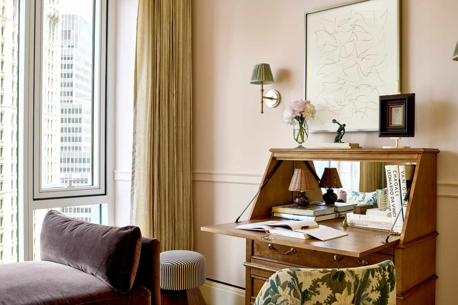
Some paint colors never really disappear. They simply go into the attic of design history, take a nap next to the brass candlesticks, and wait for homeowners to miss them. Right now, that nap is over. Old-school paint colors are back, and they are not tiptoeing in politely. They are arriving with personality, warmth, and the kind of nostalgic confidence that makes a room feel collected rather than copied.
For years, many interiors were ruled by cool gray, stark white, and “safe” neutrals that looked clean but sometimes felt a little too quiet. Today, homeowners are craving rooms with emotion. They want color palettes that feel comforting, layered, and personal. That shift explains why vintage paint colors from the 1950s, 1970s, 1980s, and 1990s are making a stylish return. Think butter yellow, dusty rose, olive green, terracotta, burgundy, navy, brown, and khaki. These shades are familiar, but their modern versions are softer, deeper, and easier to live with.
The best part? You do not need to turn your house into a time capsule. The new way to use old-school paint colors is all about balance. Pair a nostalgic wall color with clean-lined furniture. Use a retro shade on trim instead of every wall. Color-drench a powder room but keep the hallway calm. In other words, let the color have a little fun without letting it steal your house keys.
Why Old-School Paint Colors Are Trending Again
Paint trends often follow lifestyle trends. When people want calm, they reach for soft neutrals and nature-inspired greens. When they want character, they bring back saturated colors with a story. The renewed interest in old-school paint colors reflects a bigger design movement toward homes that feel warm, grounded, and lived-in.
These returning shades also work beautifully with materials that are popular now: natural wood, stone, unlacquered brass, linen, cane, ceramic tile, vintage art, and handmade accents. A muddy olive wall looks intentional beside walnut furniture. A buttery yellow kitchen feels charming with white oak shelves. A burgundy den suddenly makes movie night feel like an event, not just a sofa and a remote.
Another reason for the comeback is fatigue. After years of ultra-minimal interiors, many homeowners are ready for color that says something. Old-school paint colors provide that personality without feeling random. They come with memory. They remind us of grandparents’ kitchens, boutique hotels, classic libraries, old movie sets, cheerful cottages, and the golden age of “yes, we did paint the entire room that color.”
1. Butter Yellow: The Soft Sunshine Shade
Butter yellow is one of the happiest vintage paint colors returning to interiors. Unlike neon yellow or lemon yellow, butter yellow is creamy, gentle, and surprisingly elegant. It has the warmth of morning light without the visual volume of a highlighter. That is why it works so well in kitchens, breakfast rooms, nurseries, laundry spaces, and small bathrooms.
This shade feels old-school because it calls back to cheerful midcentury kitchens and sunny cottage walls. The modern version, however, is less sugary. Today’s butter yellow looks best when slightly muted, with a hint of cream or beige. It should feel like melted butter on toast, not a warning sign at a construction site.
How to use butter yellow today
Use butter yellow on kitchen walls with white cabinets and natural wood accents for a fresh but nostalgic look. In a bedroom, pair it with ivory bedding, pale blue textiles, and antique brass lighting. If you are nervous about yellow, start with a powder room or painted ceiling. A butter yellow ceiling can make a room feel taller, warmer, and more welcoming without overwhelming the walls.
2. Dusty Pink: The Grown-Up Rose
Dusty pink has traveled a long way from frilly childhood bedrooms. The new version is earthy, chalky, and refined. It can lean beige, mauve, clay, or rose depending on the undertone. That flexibility makes it one of the easiest old-school paint colors to reintroduce into a modern home.
This color has roots in 1950s pastels and vintage bathrooms, but today it feels more European apartment than candy shop. Dusty pink is especially beautiful in bedrooms, dressing rooms, dining rooms, and bathrooms. It flatters warm lighting, softens hard edges, and gives a space a quiet glow.
How to use dusty pink today
Pair dusty pink walls with deep brown trim for a sophisticated vintage mood. For a softer look, combine it with cream, warm white, and pale oak. If you want contrast, add olive green, charcoal, or burgundy accents. Dusty pink also works beautifully with marble, unlacquered brass, rattan, and dark wood. The trick is to avoid overly sweet accessories. Let the color be romantic, then keep the furniture tailored.
3. Terracotta: The Earthy 1970s Favorite
Terracotta is back because homes are getting warmer, richer, and more tactile. This old-school paint color brings the feeling of sunbaked clay, desert landscapes, and handmade pottery. It was a major player in 1970s interiors, and its comeback makes perfect sense in rooms filled with natural textures.
Modern terracotta is more nuanced than the orange-brown shades many people remember. It can lean peach, rust, cinnamon, coral, or muted red. The best versions have enough brown to feel grounded and enough orange to feel alive. In the right room, terracotta makes everything look more intentional, including that chair you bought because it was “too good to leave behind.”
How to use terracotta today
Terracotta is excellent in dining rooms, entries, offices, and bedrooms. It pairs well with cream, warm white, tobacco brown, black, olive green, and natural stone. For a bold look, paint walls and trim the same terracotta shade. For a lighter approach, use it on built-ins, an accent wall, or a fireplace surround. Terracotta also loves plants, woven baskets, linen curtains, and vintage rugs.
4. Olive Green: The Cool Grandparent of Modern Sage
Olive green is the shade that proves retro can be calm. It was everywhere in 1970s interiors, often alongside harvest gold, brown, and orange. Today, olive green is returning in a more sophisticated way. It feels organic, moody, and quietly confident.
Unlike brighter greens, olive has a muted quality that makes it easier to live with. It works as both a color and a neutral, especially when paired with wood, leather, linen, and stone. In a world where many people want homes that feel connected to nature, olive green fits perfectly.
How to use olive green today
Use olive green on kitchen cabinets for a classic but current look. In a living room, pair olive walls with cream upholstery, walnut furniture, and black metal accents. In a bedroom, olive green creates a cocooning effect without feeling too dark. If you want a softer version, choose a gray-green or sage-olive blend. If you want drama, go deeper and use it on walls, trim, and doors.
5. Smoky Eucalyptus: The Vintage Green With a Spa Day
Smoky eucalyptus is a modern update on old-school green. It has the spirit of vintage sage but with more gray, softness, and restraint. This is the kind of color that looks peaceful in the morning, elegant in the afternoon, and cozy at night. Basically, it has better work-life balance than most people.
This shade is popular because it bridges several design desires at once. It feels natural, but not rustic. It feels nostalgic, but not dated. It has enough color to matter, but enough gray to behave. That makes it a smart choice for laundry rooms, bedrooms, bathrooms, home offices, and kitchens.
How to use smoky eucalyptus today
Try smoky eucalyptus on cabinetry with creamy walls and warm stone countertops. In a bathroom, pair it with white tile, aged brass fixtures, and natural wood. In a home office, it can reduce visual noise while still giving the space personality. For a more layered palette, combine smoky eucalyptus with deep brown, soft blue-gray, mushroom beige, and warm white.
6. Burgundy: The Moody 1990s Comeback Color
Burgundy is having a major return, and this time it looks expensive. The old version may remind some people of formal dining rooms, lipstick, velvet dresses, or dramatic 1990s interiors. The new version feels richer, earthier, and more architectural.
Deep red shades are popular because they add instant atmosphere. Burgundy can make a den feel intimate, a dining room feel luxurious, and a powder room feel like a tiny jewel box. It is bold, yes, but it is not reckless. A well-chosen burgundy has brown, plum, or wine undertones that give it depth.
How to use burgundy today
Use burgundy where you want mood and focus. It is beautiful on built-ins, fireplace walls, library shelves, or trim. For a dramatic room, paint the walls, ceiling, and trim in the same burgundy shade. Then add warm lighting, framed art, dark wood, and cream textiles. If that feels like too much commitment, paint an interior door or a small bar cabinet. Burgundy knows how to make even a modest corner feel glamorous.
7. Deep Navy: The Classic That Refuses to Retire
Deep navy is one of those old-school paint colors that never fully left, but it is enjoying a fresh wave of popularity. Navy has long been associated with tradition, tailored style, and quiet confidence. In the 1990s, moody blues were often used in bedrooms, dens, and formal spaces. Today, deep navy feels just as relevant in modern kitchens, bathrooms, offices, and exteriors.
The reason navy works so well is simple: it gives you drama without chaos. It is bold but familiar. It pairs with almost everything, from crisp white and brass to camel leather and pale oak. Navy also makes art, mirrors, and architectural trim stand out beautifully.
How to use deep navy today
For a polished look, use navy on lower kitchen cabinets with white uppers. In a bedroom, paint the walls navy and keep bedding light. In a powder room, use deep navy with patterned wallpaper or a statement mirror. Navy also works wonderfully on front doors, shutters, and built-ins. To keep it modern, choose a navy with slight gray or green undertones rather than a flat primary blue.
8. Warm Brown and Khaki: The New Old Neutral
Warm brown and khaki are returning because homeowners are rediscovering the power of grounded neutrals. For a long time, brown was unfairly treated like the boring cousin at the color family reunion. Now it is back, wearing a tailored jacket and looking suspiciously chic.
Chocolate brown, mushroom brown, taupe, camel, and khaki all bring warmth without shouting. These colors feel connected to wood, soil, leather, coffee, and stone. They also make a room feel layered and mature. Instead of the chilly neutrals that dominated previous years, warm brown and khaki create comfort.
How to use warm brown and khaki today
Use khaki in living rooms, hallways, and bedrooms where you want a neutral that still has presence. Chocolate brown is wonderful for trim, doors, libraries, dining rooms, and cozy bedrooms. Pair these shades with cream, black, olive, dusty blue, burgundy, or terracotta. Add texture through linen, wool, wood, and ceramics so the palette feels rich rather than flat.
How to Choose the Right Old-School Paint Color for Your Home
The best old-school paint color is not always the trendiest one. It is the one that makes sense with your light, architecture, furniture, and daily life. A butter yellow room can look magical in natural light but overly creamy under warm bulbs. Burgundy can feel luxurious in a den but heavy in a room with little lighting. Olive green can look refined with wood floors but muddy beside the wrong gray tile.
Before painting, test large samples on more than one wall. Look at them in the morning, afternoon, and evening. Place the sample near your flooring, furniture, curtains, and trim. Paint is never alone; it is always in conversation with the rest of the room. Sometimes it whispers. Sometimes it argues. Testing helps you avoid a full-room disagreement.
Also consider finish. Matte and eggshell finishes make vintage colors feel soft and velvety. Satin and semi-gloss are useful for trim, doors, cabinetry, and high-traffic areas. A deep color in a low-sheen finish can look rich and modern, while the same shade in a glossy finish may feel more dramatic and traditional.
Best Pairings for Retro Paint Colors
Old-school paint colors look freshest when paired with modern materials. This is the secret to avoiding a dated room. If you paint a room olive green and fill it with heavy 1970s furniture, you may end up with a movie set. But if you pair olive walls with clean furniture, natural linen, and sculptural lighting, the result feels current.
Butter yellow pairs beautifully with white oak, blue-gray, cream, and brass. Dusty pink works with chocolate brown, burgundy, warm white, and stone. Terracotta loves black, olive, ivory, and walnut. Burgundy looks refined with camel, cream, charcoal, and aged metal. Navy pairs with almost everything, but it especially shines with white, brass, pale wood, and leather. Warm brown and khaki are natural partners for cream, rust, muted green, and soft black.
The goal is not to recreate the past exactly. The goal is to borrow its charm and edit it for modern life. Think of these colors as vintage records played on a sleek new speaker. The soul is old-school; the sound is fresh.
Common Mistakes to Avoid
Choosing a color that is too bright
Most successful retro paint colors are slightly muted. A dusty pink is easier to live with than bubblegum pink. A softened butter yellow is more elegant than a sharp lemon. A muddy olive feels more timeless than a loud avocado.
Ignoring undertones
Undertones can make or break a room. Burgundy may lean purple, brown, or red. Khaki may lean green or gold. Navy may lean black, gray, or teal. Always compare samples before committing.
Using too many nostalgic elements at once
A retro paint color is often enough. You do not need matching vintage wallpaper, shag carpet, and a rotary phone unless you are opening a museum of brave decisions. One strong color plus modern styling usually creates the best result.
Real-Life Experience Notes: What These Comeback Colors Teach You
One of the most useful lessons from working with old-school paint colors is that they rarely behave the way you expect from a tiny paint chip. A dusty rose sample may look shy at the store, then become warm and atmospheric once it covers four walls. A deep navy may look almost black at night but reveal beautiful blue depth in daylight. Butter yellow may appear pale on paper, yet fill a room with a sunny glow once the light hits it. This is why large sample boards are not optional; they are your emotional support rectangles.
Another experience many homeowners discover is that nostalgic colors make a home feel more personal almost immediately. A room painted warm brown or smoky green often feels finished even before the artwork goes up. These colors create a background with mood, so furniture does not have to work as hard. A simple cream sofa looks more intentional against olive walls. A basic wood table feels richer in a terracotta dining room. Even a hallway can feel designed when painted khaki with crisp trim.
Old-school colors also teach patience. The first coat can look alarming. Burgundy may look patchy. Terracotta may seem too orange. Navy may feel intense. Then the second coat goes on, the trim gets cleaned up, the furniture returns, and suddenly the room makes sense. Paint has a dramatic middle phase. Do not judge the entire story by chapter one.
Lighting is another big lesson. Warm bulbs can make butter yellow and terracotta feel cozy, but they may push dusty pink too peachy. Cool bulbs can sharpen navy and green, but they may make khaki feel flat. Before repainting a room you think failed, try changing the light bulbs. It is cheaper, easier, and much less likely to involve painter’s tape stuck to your socks.
Finally, these comeback colors prove that confidence matters. A half-hearted accent wall sometimes feels more awkward than a fully committed room. If you love burgundy, consider painting the trim too. If you choose olive green cabinets, let them be the star. If khaki feels too plain, layer it with texture instead of abandoning it. The most successful rooms do not follow every trend perfectly. They make thoughtful choices, repeat colors in small ways, and feel like real people live there. That is the true triumph of old-school paint colors: they bring back warmth, memory, and personality without asking your home to dress up like a decade-themed party.
Conclusion: Vintage Color Is Back, But It Grew Up
Old-school paint colors are making a triumphant return because they offer what many modern homes need: warmth, depth, comfort, and character. Butter yellow brings cheer. Dusty pink adds softness. Terracotta grounds a room with earthy energy. Olive green and smoky eucalyptus connect interiors to nature. Burgundy and navy create drama with polish. Warm brown and khaki prove that neutrals can be soulful instead of sleepy.
The comeback is not about copying the past. It is about reinterpreting it. Today’s retro paint colors are more muted, more flexible, and easier to pair with contemporary design. They work with clean furniture, natural materials, modern lighting, vintage finds, and personal collections. In the right shade and finish, an old-school color can make a room feel fresh, stylish, and deeply welcoming.
So if your walls have been whispering in plain white for years, maybe it is time to let them speak in a richer voice. Start with a sample, trust your eye, and remember: paint is one of the easiest ways to give a home a new mood. And if that mood happens to include a little 1950s sunshine, a little 1970s earthiness, or a little 1990s drama, all the better.