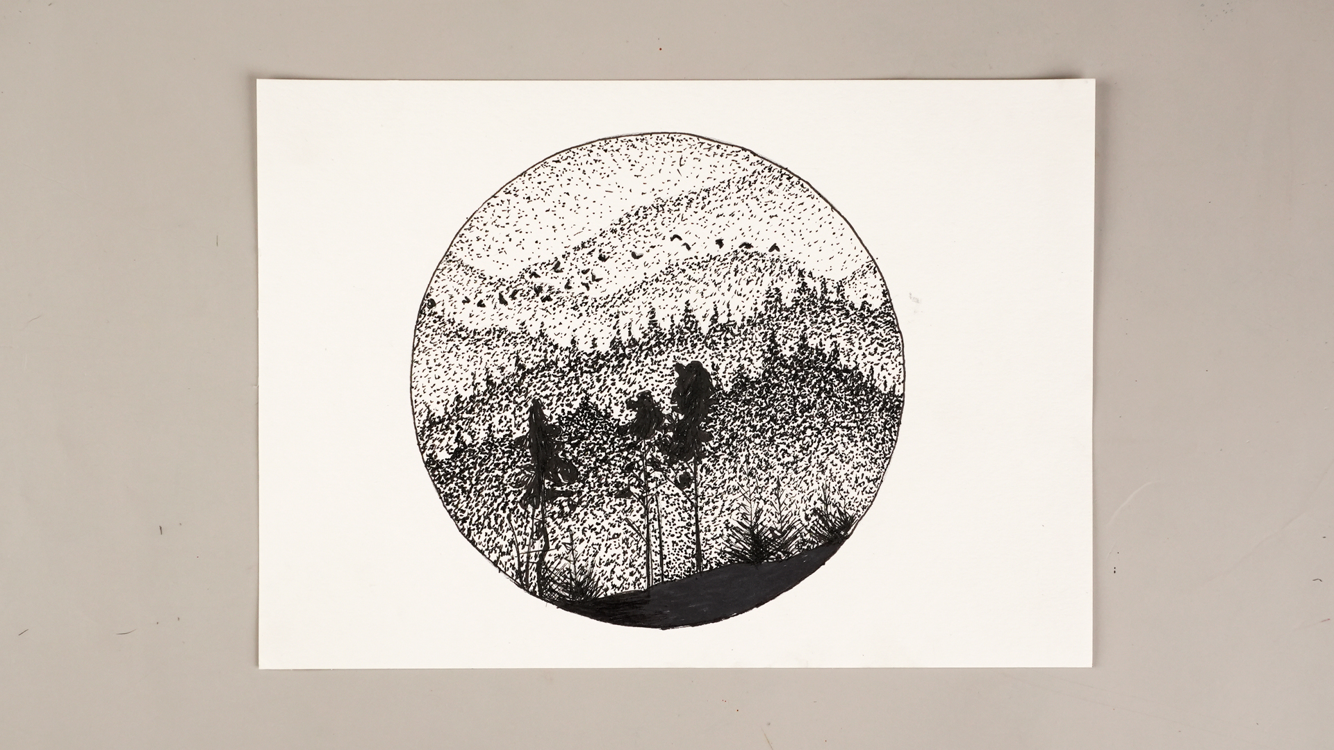
Stippling is the art technique that proves one tiny dot can be harmless, but ten thousand tiny dots can build a dramatic portrait, a glowing apple, a moody landscape, or a dragonfly wing delicate enough to make your sketchbook feel fancy. At its simplest, stippling means creating images, shadows, textures, and tones with small dots. At its best, it feels like controlled magic: no smearing, no blending stump, no heroic brushstrokejust patience, rhythm, and a pen that is about to earn its retirement plan.
For beginners, stippling is exciting because it is easy to understand and surprisingly powerful. You do not need a studio full of expensive supplies. You need paper, a pencil, an eraser, a fine-tip pen, decent lighting, and enough patience to avoid turning your dots into panicked mosquito bites. This beginner’s guide explains how to stipple step by step, what tools to use, how to create value, how to avoid common mistakes, and how to practice without losing your mind somewhere around dot number 4,372.
What Is Stippling?
Stippling is a drawing and painting method that uses dots or small marks to create the illusion of light, shadow, texture, form, and depth. The basic rule is beautifully simple: dots placed close together look darker, while dots spaced farther apart look lighter. By changing the density of your marks, you can create smooth transitions from highlight to shadow.
Think of stippling as shading in slow motion. Instead of dragging a pencil across the page to make a gray area, you build that gray area dot by dot. A few scattered marks suggest pale value. A thick cluster of marks creates a deep shadow. Medium spacing creates middle tones. Your hand becomes a tiny printing press, except the machine is you, and the maintenance department recommends stretching your wrist.
Stippling vs. Pointillism: What’s the Difference?
Stippling and pointillism are cousins, not twins. Stippling is usually focused on value, texture, and form. It is often done in black ink or a single color, especially in pen-and-ink illustration. Pointillism, made famous by artists such as Georges Seurat and Paul Signac, uses small dots or touches of color that visually blend when seen from a distance.
In plain English: stippling often asks, “How can dots make this sphere look round?” Pointillism asks, “How can colored dots make this sunny park scene shimmer like the air itself is wearing glitter?” Both techniques rely on optical effects, but stippling is generally the better starting point for beginners because it teaches value control before introducing complex color relationships.
Why Learn Stippling?
Stippling is not just a cool party trick for people who enjoy pens a little too much. It teaches essential drawing skills that improve your overall art practice.
1. It Builds Patience and Observation
Stippling slows you down. That might sound like bad news if you prefer instant results, but it is excellent training. Because you cannot shade an entire area in one quick swipe, you are forced to observe where the light falls, where the shadows deepen, and where the texture changes. Your drawing becomes more intentional.
2. It Creates Beautiful Texture
Stippling is excellent for surfaces such as skin, stone, sand, fruit, clouds, leaves, animal fur, insect wings, and old wooden objects. It can create soft transitions or gritty detail depending on how you space the dots.
3. It Works Well with Simple Supplies
You can start with a basic fine liner, smooth paper, and a pencil sketch. No expensive tablet, no giant easel, no dramatic beret required. The technique rewards careful practice more than fancy equipment.
Best Supplies for Beginner Stippling
You do not need many tools to learn how to stipple, but the right tools make the process cleaner and less frustrating.
Fine-Tip Pens
Fine liners, technical pens, and archival ink pens are popular for stippling because they create consistent marks. Look for pens labeled 0.05, 0.1, 0.2, or 0.3 mm. Smaller tips are great for delicate detail; slightly larger tips are useful for bigger drawings or darker areas.
Smooth Drawing Paper or Bristol Board
Smooth paper helps your pen tip touch the surface cleanly. Rough paper can make dots look fuzzy or uneven. Bristol board is a favorite for ink work because it is sturdy and usually handles repeated dotting well.
Hard Pencil and Eraser
Use an HB, H, or 2H pencil for a light sketch. Avoid pressing hard. Your pencil outline should be a quiet suggestion, not a legal contract carved into the page. A kneaded eraser is helpful because it can lighten lines without damaging the paper.
Reference Image
Choose a simple object with clear light and shadow. An apple, egg, shell, leaf, mushroom, coffee mug, or small stone is ideal. Beginners should avoid complicated faces at first unless they enjoy emotional plot twists.
How to Stipple Step by Step
Step 1: Choose a Simple Subject
Start with something basic and three-dimensional. A sphere-like object, such as an apple or orange, is perfect because it teaches you how dots can create roundness. Place your object under one strong light source so the highlight, middle tone, core shadow, and cast shadow are easy to see.
Step 2: Make a Light Pencil Sketch
Draw the outline lightly. Mark the main shadow shapes, but do not overdraw details. Stippling works best when the foundation is clear but not cluttered. Think of your sketch as a map. It tells you where to go, but it should not shout over the finished ink drawing.
Step 3: Create a Value Scale
Before touching your final drawing, make a small practice strip with five boxes. Leave the first box almost white. Add a few scattered dots to the second. Use medium spacing in the third. Put dots closer together in the fourth. Make the fifth box very dense. This value scale becomes your cheat sheet for light, midtone, and shadow.
Step 4: Begin with the Lightest Areas
Start gently. Place a few dots in the lighter zones, leaving the brightest highlight mostly blank. It is easier to add more dots later than to remove dots that have already marched onto the page like permanent little soldiers.
Step 5: Build the Midtones
Move into the middle-value areas by increasing dot density. Keep your dots irregular enough to look natural but controlled enough to avoid messy clumps. Try not to make rows unless you deliberately want a pattern. Organic spacing usually looks more realistic.
Step 6: Deepen the Shadows
In the darkest areas, place dots closer together. You can layer dots gradually instead of trying to create the final shadow immediately. This prevents the dreaded “ink blob swamp,” a region of the drawing where all subtlety goes to retire.
Step 7: Step Back Often
Stippling looks different up close than it does from a normal viewing distance. Every few minutes, lean back or stand up. The dots should visually merge into tones. If an area looks too pale, add more dots. If an area looks too dark, soften surrounding transitions so the contrast feels intentional.
Essential Stippling Techniques
Dot Density
Dot density is the heart of stippling. More dots create darker values. Fewer dots create lighter values. Smooth shading depends on gradual changes in density. Avoid jumping suddenly from sparse dots to heavy clusters unless you want a sharp edge.
Layering
Instead of finishing one area completely, build the whole drawing in layers. Add a first pass of light dots, then return for midtones, then deepen shadows. Layering gives you more control and reduces mistakes.
Edge Control
Hard edges need a clear change in dot placement. Soft edges need a gradual fade. For example, the cast shadow under an apple may have a darker center and softer outer edge. Use dot spacing to create that fade.
Texture Variation
Not all dots need to behave the same way. Tiny, even dots can suggest smooth skin or polished ceramic. Slightly varied dots can suggest stone, bark, or fabric. Larger dots can add graphic style, especially in posters, comics, or decorative illustrations.
Common Beginner Mistakes and How to Fix Them
Mistake 1: Pressing Too Hard
Hard pressure can damage paper and make dots look heavy. Use a light tapping motion. Let the pen do the work. You are drawing, not trying to convince the desk to confess.
Mistake 2: Making Dots Too Uniform
Perfect rows of dots can look mechanical. Unless that is your style, vary the placement slightly. Nature is organized, but it rarely looks like graph paper.
Mistake 3: Rushing the Dark Areas
Beginners often panic when a shadow is not dark enough and start stabbing the page with dots. Build darkness slowly. Dense areas should still feel controlled.
Mistake 4: Ignoring the Light Source
If you do not know where the light is coming from, your shadows will wander around like confused tourists. Decide on the light direction before you start and stick with it.
Mistake 5: Choosing a Huge First Project
A full-page portrait in stippling is brave, but for a first attempt it may also be a ticket to wrist regret. Start small. A two-inch object can teach you a lot without consuming your weekend.
Beginner Stippling Exercises
Exercise 1: The Dot Gradient
Draw a rectangle and fill it from dark to light using only dots. This teaches control and spacing. Try to make the transition as smooth as possible.
Exercise 2: The Stippled Sphere
Draw a circle and turn it into a sphere with dot density. Leave a highlight, build the midtone, deepen the core shadow, and add a cast shadow underneath.
Exercise 3: Texture Sampler
Create six small squares and use stippling to suggest different textures: sand, stone, orange peel, fur, fog, and metal. This helps you understand how dot size, spacing, and grouping affect surface quality.
Exercise 4: One Object, Three Styles
Draw the same simple leaf three times. Make one realistic, one graphic and high-contrast, and one loose and decorative. You will discover how flexible stippling can be.
How Long Does Stippling Take?
Stippling takes time. A small drawing may take one to three hours. A detailed piece may take many evenings. This is normal. The technique is slow because the image is built mark by mark. The good news is that stippling can be relaxing once you find a rhythm. It is almost meditative, assuming your pen does not dry out halfway through a shadow.
If your hand gets tired, stop. Stretch your fingers, roll your shoulders, and rest your eyes. Better breaks create better dots. Tired stippling often leads to uneven marks and accidental ink drama.
Creative Ideas for Stippling Art
Once you understand the basics, try applying stippling to different subjects. Botanical drawings are excellent because leaves, seed pods, mushrooms, and flowers offer rich textures. Insects are also perfect, especially beetles, butterflies, and dragonflies. For a dramatic challenge, try skulls, shells, old keys, or architectural details.
You can also combine stippling with other pen-and-ink techniques. Some artists use pure dots only, while others mix stippling with hatching, cross-hatching, contour lines, or washes. There is no art police hiding behind your sketchbook. The key is to make the combination look intentional.
My Practical Experience With Stippling: What Beginners Should Really Know
The first thing beginners should know about stippling is that it looks easier from the outside. You see a finished drawing and think, “That’s just dots. I know dots. I have been accidentally making dots in notebook margins since middle school.” Then you sit down, make fifty dots, and realize the real challenge is not understanding the technique. The challenge is staying consistent long enough for the magic to appear.
In my experience, the best stippling sessions begin with a small subject and a clear value plan. The drawings that go wrong usually fail before the first dot, because the artist starts without knowing where the darkest darks and lightest lights will be. A simple thumbnail sketch saves enormous frustration. Before starting a final piece, I like to squint at the reference image and divide it into four value groups: white, light gray, dark gray, and black. That simple map keeps the drawing from becoming a flat field of “medium everything.” Medium everything is where excitement goes to take a nap.
Another lesson: the pen matters, but not as much as beginners think. A good fine liner helps, especially one that produces clean, consistent ink marks. However, no pen will rescue rushed dot placement or weak observation. Start with one reliable black pen and learn how it behaves. Does it make crisp dots? Does it bleed on your paper? Does the tip flatten if you press too hard? After you understand one pen, experimenting with different sizes becomes much more useful.
Paper choice can surprise beginners too. Smooth paper usually makes stippling cleaner because the pen tip does not catch on heavy texture. On rough paper, dots may look broken or fuzzy. That can be beautiful for certain subjects, like stone or bark, but frustrating when you are trying to create a smooth cheek, shiny apple, or polished shell. Test your pen on a scrap of paper before beginning the final drawing. This tiny habit prevents large sadness.
The biggest mental trick is learning to stop judging the drawing too early. Stippling often looks awkward in the first stage. The dots seem lonely. The form looks pale. The shadow does not yet feel convincing. That is normal. Stippling develops gradually, like a photo appearing in a tray of developer or a soup becoming interesting after you finally add salt. Give the piece time. Build values slowly and keep checking the whole image instead of obsessing over one square inch.
I also recommend working from general to specific. Beginners often dive into detail immediately, carefully dotting one tiny corner until it looks finished. The problem is that the finished corner may not match the rest of the drawing later. Instead, create a light dot layer across the whole subject, then strengthen the midtones, then darken the shadows, then add final texture accents. This keeps the entire drawing unified.
Hand fatigue is real. Stippling uses repeated small motions, so your wrist, fingers, and shoulders can get tired. A relaxed grip helps. So does keeping your paper at a comfortable angle. If your hand starts cramping, take a break instead of pushing through. Your future dots will thank you, probably in very small handwriting.
Finally, stippling teaches humility in the nicest way. It rewards patience, but it also rewards curiosity. Each drawing teaches you something about light, rhythm, texture, and restraint. You learn that art does not always need dramatic gestures. Sometimes it grows from tiny decisions repeated with care. One dot is almost nothing. Thousands of dots become an image. That is the quiet thrill of stippling: it turns patience into visible texture.
Conclusion
Learning how to stipple is one of the most rewarding ways to improve your drawing skills. The technique is simple enough for beginners, yet deep enough to keep experienced artists interested for years. By controlling dot density, spacing, layering, and edges, you can create realistic shadows, delicate textures, and striking illustrations with only a pen and paper.
Start small, practice value scales, choose simple subjects, and give yourself permission to work slowly. Stippling is not a race. It is a conversation between your eye, your hand, and a growing constellation of dots. Keep going, and soon those tiny marks will become form, light, texture, and art.