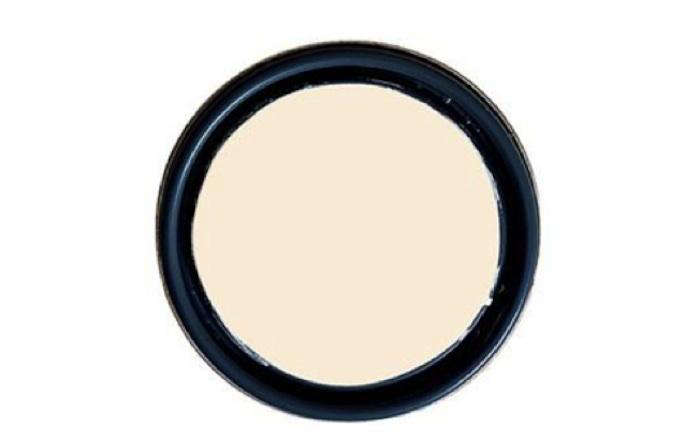
White Chocolate Paint sounds like something you should drizzle over strawberries, but in the world of interiors, it is much more useful on walls than on dessert. This soft, creamy off-white brings warmth, light, and a gentle sense of comfort to a room without shouting, “I painted everything beige in 1998 and never recovered.” It sits in that sweet spot between clean white and cozy cream, making it a favorite for homeowners who want brightness without the cold, hospital-hallway effect.
In paint language, “White Chocolate” usually refers to a warm off-white shade with subtle cream, ivory, or yellow-based undertones. Benjamin Moore’s White Chocolate OC-127, also known as 2149-70, is one of the most recognized examples. It has a high light reflectance value, giving it the ability to bounce plenty of light around a room while still looking soft and layered. That balance is exactly why white chocolate paint colors are so appealing: they make a space feel open, but they do not feel icy, flat, or overly modern.
Whether you are refreshing a living room, warming up a north-facing bedroom, painting kitchen cabinets, or trying to choose a trim color that does not fight with your floors, white chocolate paint deserves a serious look. It is quiet, elegant, flexible, andunlike actual white chocolateunlikely to disappear mysteriously from the pantry at midnight.
What Is White Chocolate Paint?
White Chocolate Paint is best understood as a creamy white paint color. It is not pure white, stark white, or bright builder-grade white. Instead, it carries soft warm undertones that can appear creamy, buttery, ivory, or lightly vanilla depending on the lighting and surrounding materials.
The appeal of this color family is subtlety. White chocolate paint gives you the freshness of white with the friendliness of cream. It works especially well in homes where pure white feels too sharp against wood floors, brass hardware, woven textures, stone fireplaces, or traditional furnishings. Think of it as white paint wearing a cashmere sweater.
Main Characteristics of White Chocolate Paint
A good white chocolate paint color usually has several recognizable qualities:
- Warm off-white appearance
- Soft cream or ivory undertones
- High light reflection without harsh brightness
- Compatibility with natural wood, beige, taupe, brass, and earthy accents
- A cozy, relaxed look in bedrooms, living rooms, kitchens, and hallways
Unlike cool whites, which may lean blue, gray, green, or violet, white chocolate paint leans warm. That makes it especially useful when you want a room to feel inviting instead of clinical. It is the paint equivalent of offering guests coffee before they even ask.
Why White Chocolate Paint Is So Popular
White paint never really goes out of style, but homeowners are becoming more thoughtful about which white they choose. For years, bright whites dominated social media interiors. They looked stunning in edited photos, but in real homes, especially homes with limited natural light, they could feel cold or unfinished. White chocolate paint offers a softer alternative.
Its popularity comes from three major strengths: warmth, versatility, and livability. It can create a clean backdrop without making a space feel empty. It also pairs beautifully with popular design styles, from modern farmhouse and transitional interiors to cottage, coastal, traditional, and organic modern spaces.
It Makes Rooms Feel Warm Without Looking Yellow
The best warm white paint colors walk a fine line. Too little warmth, and the room feels sterile. Too much warmth, and suddenly the walls look like old vanilla pudding. White chocolate paint typically avoids both problems when chosen carefully. It provides just enough creaminess to soften a room while still reading as an elegant off-white.
It Works With Many Materials
White chocolate paint pairs especially well with natural finishes. Oak floors, walnut furniture, rattan chairs, linen curtains, clay pottery, stone counters, and aged brass lighting all look comfortable beside it. The color does not compete with these materials; it lets them relax and look expensive, which is the kind of teamwork every room needs.
It Feels Timeless
Trendy paint colors can be fun, but repainting a whole house every time the internet changes its mind is not exactly a casual hobby. White chocolate paint has staying power because it is neutral, warm, and adaptable. It can support changing furniture, seasonal decor, new artwork, and different accent colors without demanding a dramatic redesign.
Best Rooms for White Chocolate Paint
White chocolate paint can work in many areas of the home, but it shines brightest in spaces where comfort and softness matter. Because it is warm and reflective, it can help rooms feel airy while still maintaining a sense of coziness.
Living Rooms
In a living room, white chocolate paint creates a calm background for daily life. It works with neutral sofas, leather chairs, wood coffee tables, patterned rugs, and colorful artwork. If your living room gets plenty of daylight, the color may appear brighter and cleaner. If the room has softer or indirect light, the creamy undertones become more noticeable.
For a polished look, pair white chocolate walls with warm white trim in a slightly glossier finish. Add texture through woven baskets, natural fiber rugs, linen pillows, and wood accents. The result feels relaxed but intentionalnot like you forgot to choose a color.
Bedrooms
Bedrooms benefit from paint colors that calm the nervous system instead of poking it with a neon stick. White chocolate paint is excellent for this purpose. It can make a bedroom feel restful, warm, and gently lit, especially when paired with soft bedding, warm lamps, and muted accent colors such as sage green, dusty blue, mushroom, taupe, or terracotta.
Kitchens
White chocolate paint can be beautiful in kitchens, especially on walls or cabinets. On cabinets, it gives a warmer alternative to pure white, which can sometimes look too sharp against stone countertops or wood floors. It pairs nicely with butcher block, marble-look quartz, brushed brass, black hardware, and natural wood shelves.
One important tip: test it beside your countertop and backsplash before committing. Creamy whites can look perfect next to warm stone but may appear yellow beside cool gray marble or blue-toned tile.
Bathrooms
In bathrooms, white chocolate paint can soften hard surfaces like tile, glass, mirrors, and metal fixtures. It is especially successful with warm stone, beige tile, champagne bronze fixtures, and wood vanities. For bathrooms with heavy moisture, choose a durable paint finish such as satin or semi-gloss, depending on the surface and ventilation.
Hallways and Entryways
Hallways often suffer from low natural light, awkward shadows, and fingerprints from people who apparently use walls as handrails. White chocolate paint can brighten these transitional spaces while hiding the harshness that comes with cooler whites. Use an eggshell or satin finish for better cleanability in high-traffic areas.
How Lighting Changes White Chocolate Paint
Lighting is the grand magician of paint color. It can make the same white chocolate paint look creamy in the morning, clean at noon, and slightly golden at night. This is why paint samples are not optional. They are the difference between “designer-approved neutral” and “why does my wall look like melted butter?”
North-Facing Rooms
North-facing rooms often receive cooler, bluish light. A warm off-white like white chocolate paint can help counterbalance that coolness. This makes the room feel less shadowy and more welcoming. However, if the space is very dark, test a large sample because cream undertones can become more noticeable in low light.
South-Facing Rooms
South-facing rooms usually get warm, bright light throughout the day. White chocolate paint may look creamier or brighter in these spaces. If you love warmth, this can be beautiful. If you want a cleaner look, compare it with a more neutral white before making a final choice.
East- and West-Facing Rooms
East-facing rooms tend to feel brighter and warmer in the morning, then cooler later in the day. West-facing rooms do the opposite, often glowing warmly in the afternoon and evening. White chocolate paint can shift with these changes, so view your sample at several times of day.
Artificial Lighting
Light bulbs matter too. Warm bulbs around 2700K can enhance the creamy undertones of white chocolate paint, making it feel cozy and soft. Cooler daylight bulbs around 5000K can make the color appear crisper but may also expose undertones in unexpected ways. Before blaming the paint, check the bulbs. Sometimes the wall is innocent.
White Chocolate Paint Undertones: What to Watch For
The most common undertone in white chocolate paint is warm cream, usually connected to yellow, beige, or ivory notes. These undertones are what make the color inviting. Still, undertones can become tricky when placed next to fixed elements in your home.
If your floors, counters, tile, or furniture lean cool gray, blue, or icy white, a creamy paint may look more yellow by comparison. If your finishes are warmsuch as honey oak, tan stone, beige carpet, or brasswhite chocolate paint often feels harmonious.
Good Pairings
- Natural oak and walnut wood
- Warm beige, tan, taupe, and greige
- Muted greens such as sage and olive
- Soft blues with warm gray undertones
- Brass, bronze, and black metal accents
- Cream, camel, linen, and clay-colored textiles
Pairings to Test Carefully
- Cool gray tile
- Blue-white quartz or marble
- Stark white trim
- Very cool LED lighting
- Bright blue or purple accent colors
This does not mean those combinations can never work. It simply means the sample board should be invited to the party before the gallon cans arrive.
Best Finishes for White Chocolate Paint
The finish you choose affects both appearance and durability. White chocolate paint in a matte finish will look soft and velvety, while the same color in satin or semi-gloss may appear slightly brighter because it reflects more light.
Flat or Matte
Flat and matte finishes reduce glare and help hide wall imperfections. They are ideal for adult bedrooms, ceilings, and lower-traffic spaces. The downside is that they are usually less washable than higher-sheen finishes.
Eggshell
Eggshell is often a smart choice for living rooms, dining rooms, bedrooms, and hallways. It has a low sheen, offers better cleanability than flat paint, and still keeps the creamy color looking soft.
Satin
Satin works well in busy areas such as kitchens, bathrooms, laundry rooms, and kids’ rooms. It is more washable but may reveal wall flaws more than eggshell.
Semi-Gloss
Semi-gloss is usually best for trim, doors, cabinets, and built-ins. If you use white chocolate paint on cabinetry, a semi-gloss or durable enamel finish can help the surface resist fingerprints, scuffs, and the mysterious sticky spots that appear in every kitchen.
How to Use White Chocolate Paint Like a Designer
White chocolate paint may be subtle, but using it well requires strategy. The goal is to make the color look intentional, not like you almost chose white and then got distracted.
Use It With Layered Neutrals
Layer white chocolate paint with shades of cream, oatmeal, mushroom, warm gray, camel, and soft brown. This creates depth without relying on bold color. Add texture through wood, wool, linen, ceramic, and woven materials.
Pair It With Earthy Accent Colors
Because white chocolate paint is warm, it looks beautiful beside earthy colors. Try sage green curtains, terracotta pillows, olive cabinets, navy accents, or a muted clay front door. These colors add personality while allowing the walls to stay calm.
Repeat the Warmth
A room feels more cohesive when the warmth of the wall color appears elsewhere. Use warm metals, natural woods, cream textiles, or tan leather to repeat the undertone. Repetition makes the space feel designed instead of accidentally assembled during three separate online sales.
Choose Trim Thoughtfully
Trim can make or break a warm white wall. If the trim is too stark, white chocolate walls may look yellow. If the trim is too creamy, the whole room may feel flat. One option is to use the same color on walls and trim but change the finish: eggshell on walls and semi-gloss on trim. This creates subtle contrast without undertone drama.
White Chocolate Paint for Exteriors
White chocolate paint can also work on home exteriors, especially for homeowners who want a soft white house that does not look blinding in direct sunlight. Exterior light is much stronger than interior light, so warm whites often appear lighter outside. A creamy off-white can give siding, brick, stucco, or trim a welcoming look.
For exteriors, test large samples on different sides of the house. A color may look perfect on the shaded porch but too bright on the sunny front elevation. Pair white chocolate exterior paint with black shutters, bronze lanterns, natural wood doors, stone accents, or muted green trim for a timeless effect.
How to Sample White Chocolate Paint Correctly
Sampling is the least glamorous part of painting, but it saves money, time, and emotional speeches in the paint aisle. Do not rely on a tiny paper chip alone. Paint a large sample board or use a peel-and-stick sample. Move it around the room and view it next to floors, furniture, cabinets, counters, and trim.
Check the sample in morning light, afternoon light, evening light, and artificial light. Look at it on sunny days and cloudy days if possible. White paint changes more than people expect because it reflects the colors around it. A green lawn outside the window, red brick fireplace, or dark wood floor can all influence how the color reads.
Common Mistakes to Avoid
Mistake 1: Assuming All Whites Are the Same
White paint colors can have yellow, pink, beige, blue, gray, green, or violet undertones. White chocolate paint is warm, so compare it with your existing finishes before painting an entire room.
Mistake 2: Ignoring the Room’s Direction
A creamy white in a sunny south-facing room may feel glowing and bright, while the same color in a shadowy room may look richer and warmer. Room direction matters.
Mistake 3: Choosing the Wrong Sheen
A flat finish in a busy hallway may look lovely for about twelve minutes. Match the sheen to the room’s function. Higher-traffic spaces usually need more durability.
Mistake 4: Forgetting About Trim
Trim is not just a frame; it influences how the wall color appears. Always test white chocolate paint beside your trim color.
Mistake 5: Skipping Prep Work
Even the most beautiful paint cannot hide dust, grease, holes, peeling paint, or rough patches forever. Clean, patch, sand, and prime where needed. Paint is not a miracle blanket. It is more like makeup: it works best when the surface underneath is ready.
Real-Life Experiences With White Chocolate Paint
Using white chocolate paint in real homes often teaches lessons that color cards cannot. On a sample strip, the color may seem like “just another off-white,” but once it covers a wall, its personality becomes clearer. In one living room with medium oak floors, cream curtains, and a brown leather sofa, white chocolate paint created a soft glow that made the space feel brighter without losing warmth. The room previously had a cooler white that looked clean during the day but oddly chilly at night. After switching to a warmer white chocolate tone, the lamps looked cozier, the wood floor looked richer, and the sofa stopped looking like it had wandered into the wrong house.
In a small bedroom, the experience was slightly different. The room faced north and had limited sunlight, so the creamy undertone became more visible. At first, the color looked almost too warm on one wall. But after adding white bedding, a natural wood nightstand, and warm 2700K bulbs, the room settled into a calm, cocoon-like feeling. The lesson was simple: white chocolate paint needs context. It responds to what is around it. When the surrounding pieces support its warmth, it feels elegant. When the room is filled with cool gray furniture and blue-white lighting, it may look more yellow than expected.
A kitchen cabinet project also showed why sheen matters. White chocolate paint in a semi-gloss cabinet enamel looked brighter than the same color in eggshell on the wall. That extra reflection made the cabinets feel cleaner and more polished, while the walls stayed soft. The combination worked well because the countertop had warm beige veining. Had the counter been icy gray, the result might have been less successful. This is why testing near fixed finishes is so important. Paint does not live alone; it has roommates.
Another useful experience came from a hallway repaint. The hallway had no windows, several doors, and a talent for collecting fingerprints. A flat creamy white would have been risky, so eggshell was chosen instead. The finish reflected just enough light to brighten the narrow space and made cleaning easier. The color also looked less harsh than a bright white would have looked under ceiling lights. For busy homes, this combinationwarm off-white plus practical sheencan be a quiet victory.
The biggest takeaway from living with white chocolate paint is that it is not boring. It is subtle, yes, but subtle does not mean plain. It changes with light, softens hard edges, flatters natural materials, and gives rooms a welcoming mood. It is a color for people who want white walls but still want the house to feel like humans live there. In other words, it is practical, pretty, and forgivingthe holy trinity of paint colors.
Conclusion
White Chocolate Paint is a warm off-white color that brings softness, light, and quiet sophistication to interiors and exteriors. It is especially useful when pure white feels too stark and beige feels too heavy. With its creamy undertones, it pairs beautifully with natural wood, warm metals, soft textiles, earthy accents, and traditional or modern decor.
The key to success is testing. Look at the color in your actual room, beside your actual floors, under your actual lighting. Choose the right sheen for the space, prepare surfaces properly, and coordinate trim carefully. When used thoughtfully, white chocolate paint can turn a room into something bright, comfortable, and timelesswithout making your home look like a dessert menu.