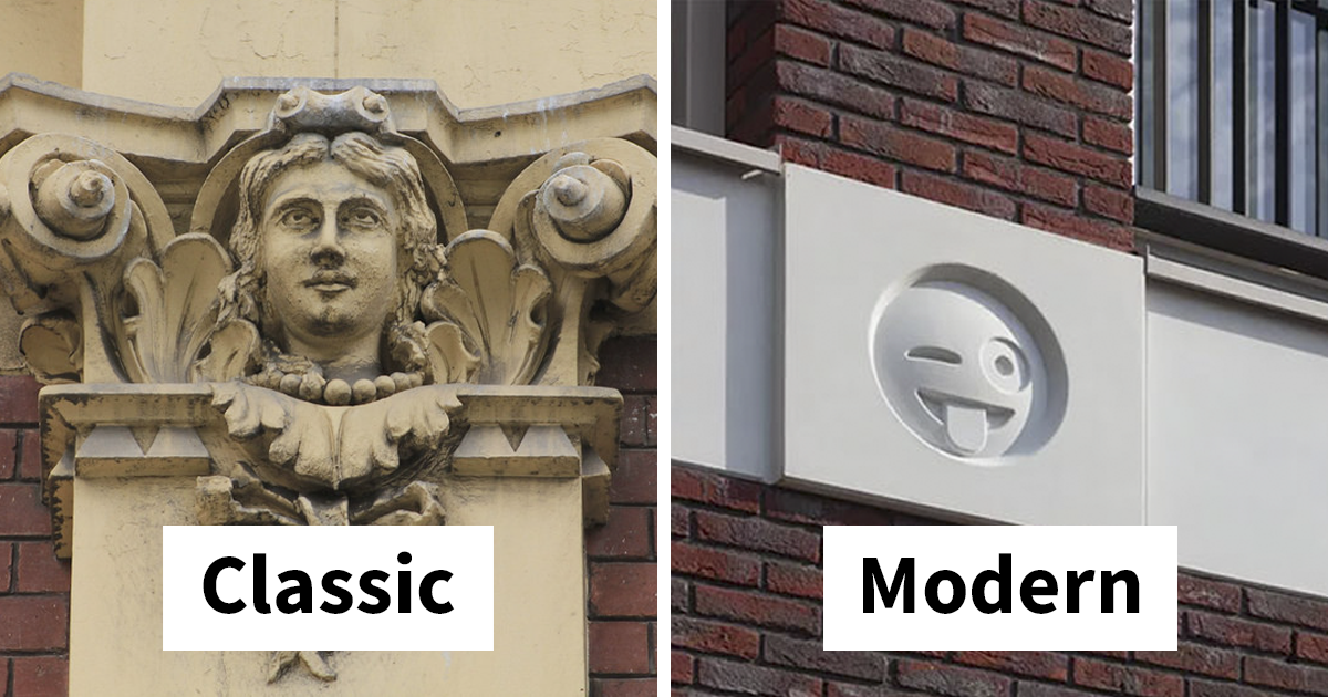
Architecture has a reputation problem. For a lot of people, it lives somewhere between “very important cultural expression” and “that expensive thing with a brochure.” It can be solemn, polished, and determined to look smarter than everyone else in the room. Then along comes a building in the Netherlands that seems to say, with perfect comic timing, “Relax, buddy.” Its facade is dotted with 22 emoji-like faces cast into the structure like modern ornaments, turning an otherwise crisp mixed-use apartment building into something far more memorable: a piece of urban design with a pulse, a grin, and possibly a mild wink.
The story behind this emoji-covered apartment building is more interesting than a quick viral headline suggests. Yes, it is funny. Yes, it looks like a building learned how to text. But it is also a sharp example of how architecture absorbs the language of its own era. Medieval builders had gargoyles and grotesques. Classical buildings had carved heads, masks, and symbolic figures. Contemporary designers now live in a world where emotion is often compressed into tiny icons sent between screens at lightning speed. So the real question is not, “Why emoji?” It is, “What else would a building from the smartphone age wear on its sleeve?”
The Building That Decided to Loosen Its Tie
The project is located in Vathorst, a neighborhood in Amersfoort, and it belongs to a town center setting rather than a stand-alone architectural fantasy. That matters. This is not a museum stunt or a temporary art prank. It is a real mixed-use building, the kind of structure people pass on errands, walk by on lunch breaks, and eventually use as a landmark when giving directions. In other words, it is everyday architecture. And everyday architecture is exactly where a little personality can do the most good.
The facade itself works through contrast. The building uses a disciplined grid of brick piers and white concrete beams, so the design language is orderly and calm. The emoji ornaments do not explode across the entire structure like a teenager discovering sticker packs for the first time. They are integrated into intersections in the facade, creating a rhythm of expression within a restrained framework. That contrast is what makes the idea work. If the whole building were loud, it would be exhausting. Because the overall composition stays controlled, the 22 faces feel like a dry joke delivered with a straight face.
That restraint is key to the project’s success. The building does not beg to go viral, even though it obviously ended up online. Instead, it behaves like a local character actor: subtle enough to belong, odd enough to be remembered. In a town square, a building like this becomes social infrastructure. People notice it, photograph it, joke about it, and use it as a reference point. Not every successful building needs to be monumental. Some just need to be the one you remember after the coffee wears off.
Why People Call Them Modern-Day Gargoyles
The comparison to gargoyles is catchy, and mostly fair in spirit, though not in technical detail. Traditional gargoyles are functional carved water spouts that throw rainwater away from a building’s walls. Their grotesque appearance came wrapped in utility. By strict architectural definition, the emoji faces on this apartment building are closer to grotesques than true gargoyles, because they are ornamental rather than drainage devices. But the headline-friendly gargoyle comparison survives because it captures the larger idea: buildings have long carried expressive faces, beasts, and symbols on their exteriors.
And let’s be honest, “22 Emoji Decorate an Apartment Building as Modern-Day Grotesques” is the kind of title that makes readers blink twice and go make tea. Gargoyles have more cultural bite. They suggest architecture with attitude, faces peering down from above, and a long tradition of ornament that is weird, theatrical, and unexpectedly playful.
That long tradition matters because it keeps this building from feeling random. Decorative figures on buildings are not some terrible breach of architectural etiquette. They are part of architectural history. Medieval cathedrals, revival structures, and even modern reinterpretations have all used visual symbols to animate stone, signal values, or simply add delight. The idea that buildings should be mute boxes is not timeless wisdom. It is one design preference among many, and not always the most human one.
Why Emoji Actually Make Sense on a Facade
Emoji are often dismissed as digital fluff, but that underestimates how powerful they are as visual shorthand. They are fast, emotional, cross-linguistic, and immediately legible. Long before someone studies a building’s detailing, material palette, or urban context, they can understand a smiling face, a wink, or heart eyes. That makes emoji unusually democratic as ornament. You do not need an architecture degree to get the joke. You just need to have existed near a phone in the last decade.
That accessibility gives the facade a rare quality: instant cultural readability. Architects often talk about context, symbolism, and communication, but many buildings still communicate like they are mumbling through a scarf. Emoji do the opposite. They announce themselves quickly, yet still invite interpretation. Are they humorous? Are they a timestamp of the digital era? Are they evidence that architecture can still be social and a little mischievous? Yes, yes, and yes again.
There is also something clever about using emoji as a time marker. Architectural ornament has always revealed the tastes, technologies, and obsessions of its period. If older buildings used kings, saints, monsters, leaves, shields, or allegorical figures, then a building from the age of smartphones and global messaging might naturally reach for icons that millions of people recognize at a glance. Emoji are not just decoration here; they are cultural sediment. They freeze a moment in communication history and bolt it onto a facade.
That idea becomes even stronger when you remember emoji did not emerge as random internet confetti. They have a design history. The original emoji set created for mobile communication was compact, highly visual, and built for instant emotional clarity. Over time, emoji moved from novelty to infrastructure. They became part of how people soften tone, signal irony, add warmth, and compress feeling into a tiny visual unit. Putting them on a building sounds absurd until you realize buildings also need tone. Some look severe, some inviting, some aloof, and some joyful. This one simply chose to stop pretending it had no feelings.
What the Design Gets Right
The most impressive thing about the project is that it avoids the trap of becoming a cartoon. That sounds easy. It is not. A concept like “emoji facade” could collapse into gimmickry in about three seconds flat. But this building stays just disciplined enough to keep the joke intelligent. The forms are cast in concrete rather than splashed in bright yellow, which makes them read as architectural reliefs rather than giant phone stickers. The choice of material is smart, because it lets the emoji live inside the building’s language instead of sitting on top of it like an afterthought.
The expressions themselves are also carefully chosen. The design uses recognizable faces rather than obscure symbols, which improves readability and keeps the composition coherent. You do not want a facade that requires a glossary. Architecture already has enough of that energy. The faces work because they are archetypes: smile, wink, heart eyes, distress, amusement. They are a mini emotional chorus cast into a structure that otherwise keeps its cool.
Another good decision is scale. The emoji do not overpower the whole block. They are noticeable, but not all-consuming. Seen from a distance, they give the building identity. Up close, they reward attention. That is a powerful combination. Good urban buildings often work in layers: one reading from across the square, another for people on foot, and maybe a third for the person who slows down, looks up, and decides this facade is having a better day than they are.
Gimmick or Smart Ornament? The Debate Was Inevitable
Anytime architecture does something funny, a debate breaks out as if someone just tried to install a roller coaster in a library. Some critics see projects like this and immediately reach for the word “gimmick.” That reaction is understandable. The design world has seen plenty of shallow spectacle dressed up as innovation. But dismissing this building too quickly misses the deeper point. Ornament is not automatically unserious. Humor is not the opposite of thoughtfulness. And memorability is not a design sin.
In fact, one of the most compelling ideas behind the project is that ornament can help a building belong to its own time. For years, some corners of architecture treated ornament like an embarrassing relative you only mention at holidays. But buildings have always communicated through surface, detail, and symbolism. Contemporary architecture is not becoming less communicative; it is simply changing dialects. This facade speaks in a language people already understand.
That does not mean every building should suddenly look like your group chat. Please, no. A courthouse covered in wink faces would be a lot. A hospital clad in crying-laughing emoji might raise follow-up questions. But on a neighborhood mixed-use building in a lively square, the idea feels appropriately tuned to place and program. Context saves the concept from becoming chaos.
What This Says About Apartment Design and Daily Life
There is something refreshing about the fact that this is an apartment building, not a flashy cultural institution trying to audition for a design award. Housing and mixed-use development shape daily life more than almost any other kind of architecture. That is where people shop, walk, wait, meet, and return home with grocery bags cutting off circulation in three fingers. When those buildings are designed with a little wit and humanity, the payoff is bigger than it looks.
Too much housing design settles for safe anonymity. Developers often aim for “inoffensive,” which is another way of saying “forgettable, but expensive.” This project suggests another path. A building can be practical, urban, and commercially viable while still giving the public something to smile at. It can contribute to a neighborhood’s identity without screaming for attention. It can be functional and culturally aware at the same time. That should not be radical, but in a lot of urban development, it kind of is.
There is also a social dimension here. Buildings with personality become shared reference points. They get nicknames. They show up in photos. Kids notice them. Visitors remember them. Residents use them in conversation. In a world where many neighborhoods are increasingly shaped by repeatable formulas and interchangeable facades, that kind of local distinctiveness is valuable. It builds attachment. And attachment is one of the quiet ingredients of good cities.
Modern Ornament Is BackIt Just Has Better Wi-Fi
If this building feels contemporary, it is because it understands that modern ornament does not have to look old to do an old job. Historically, decorative architectural elements helped structures tell stories, project power, signal beliefs, or simply catch the eye. Today, ornament can still do those things, but through different images and cultural codes. A face on a facade still works. It just might come from digital culture instead of mythology.
We have seen versions of this logic elsewhere. Washington National Cathedral is famous for its fanciful carvings and modern grotesques, including the much-discussed Darth Vader figure. That example proves the broader point: even deeply traditional architecture has room for contemporary references when craftspeople and designers allow the building to reflect lived culture rather than freeze in an imagined purity. The emoji building belongs to that lineage of serious architecture making room for a wink.
And maybe that is why the project resonates. It understands that architecture is not just about shelter or style. It is also about recognition. We notice the things that recognize us back. A blank facade may be elegant, but a facade that mirrors a culture’s symbols can feel alive. Not every city block needs a performance, but every now and then it helps when the built environment admits it knows what century it is in.
Experiences Related to a Building Like This
One of the most interesting experiences related to a building like this is how quickly it changes the mood of a place. You can walk through a square half-thinking about errands, rent, deadlines, or whether you forgot to answer a text, and then suddenly notice a row of faces staring down from the facade. It interrupts routine in the best possible way. The building does not demand a deep lecture before it gives something back. It offers a small moment of surprise, which is one of the rarest luxuries in modern city life.
Another experience tied to this kind of architecture is the way different age groups respond to it. Children usually understand it first, and often best. They look up, point, laugh, and immediately treat the building like a character rather than an object. Teenagers, naturally, tend to photograph it. Adults often do the thing adults do, which is act unimpressed for three seconds and then secretly take a photo anyway. That range of reactions tells you something important: the building is readable across generations. That is not easy to achieve in architecture. Plenty of buildings struggle to connect with anyone outside a design jury.
There is also the experience of memory. Most people do not remember every facade they pass, but they remember the unusual ones. A building with 22 emoji ornaments is the kind of place that becomes part of someone’s mental map. It becomes “the building near the clock with the faces” or “the place by the square where we met before lunch.” That kind of emotional mapping matters. Cities are not only built from streets and structures; they are built from remembered moments attached to them.
For residents, a playful facade can subtly change the feeling of home. Living above shops in a mixed-use center can sometimes feel generic, especially in newer developments where everything is tidy but a little sterile. A building with personality softens that effect. It gives people something to identify with. Even if residents barely think about the emoji after a while, visitors will. Delivery drivers will. Friends will. The building becomes socially useful, and that usefulness is emotional as much as practical.
Tourists and design lovers experience it differently. They often arrive with expectations, because the internet has already framed the building as a quirky stunt. Then many of them discover the most surprising thing of all: it is subtle. That subtlety is part of the pleasure. The faces are not giant billboards; they are integrated details. So the experience becomes less about spectacle and more about noticing. You slow down, study the grid, locate the expressions, compare them, and realize the architecture is playing a smarter game than the headline promised.
There is also a broader emotional experience here that has less to do with emoji and more to do with permission. A building like this gives cities permission to be less stiff. It suggests that design can be intelligent without being pompous, and contemporary without being cold. For anyone who has ever felt that new buildings are technically competent but spiritually asleep, this kind of facade feels like a small rebellion. Not a loud rebellion. More like a grin from across the square that says, “Yes, we can still have fun here.”
And perhaps that is the most lasting experience of all. Long after people forget the article they read or the social post they shared, they may still remember the feeling of encountering a building that seemed unexpectedly alive. In an era full of polished sameness, that is not a tiny thing. It is a public service with eyebrows.
Conclusion
The apartment building decorated with 22 emoji works because it does more than chase novelty. It translates a very old architectural impulse into a very current visual language. Instead of kings, monsters, saints, or anonymous floral patterns, it uses the emotional symbols of the digital age. Instead of pretending contemporary life stops at the property line, it folds that life directly into the facade.
That is what makes the project memorable. It is funny, yes, but it is also thoughtful. It respects context, uses restraint, and proves that ornament can still matter in modern architecture. More importantly, it reminds us that buildings do not have to choose between seriousness and delight. Sometimes the smartest thing a facade can do is smile back.