Ellen Van Dusen does not appear to believe that everyday objects should behave quietly. A towel can have a wavy optical illusion. A cabinet can carry an endless looping line. A luggage tag can become a tiny burst of graphic cheer. Even an electrical outlet, in her world, has the potential to become part of the party.
As the founder of Dusen Dusen, the Brooklyn-based textile and home goods brand known for joyful prints, Ellen Van Dusen has built a recognizable visual universe around color, movement, contrast, and a healthy disrespect for beige. Her work is playful without being childish, bold without becoming chaotic, and memorable in the way a great song gets stuck in your headexcept this song might be a squiggle, a checkerboard, or a very determined stripe.
This quick-take profile explores the creative thinking behind Ellen Van Dusen’s design approach, the growth of Dusen Dusen, and the lessons that artists, decorators, and color-curious humans can borrow from her pattern-filled world.
Who Is Ellen Van Dusen?
Ellen Van Dusen is an American textile designer and the founder of Dusen Dusen, a brand that began as a womenswear label in 2010 before expanding into home goods. Over time, the company became especially known for colorful bedding, bath towels, blankets, rugs, pillows, outdoor pieces, and collaborations that turn practical products into visual events.
Her creative origin story is refreshingly unpolished in the best possible way. Long before running a design business, Van Dusen painted clothing, altered thrift-store finds, made her own garments, and experimented with fabric. She grew up in a creative household with architect parents, where color, construction, and renovation were not distant concepts reserved for glossy magazines. They were simply part of the atmosphere.
That background matters because Van Dusen’s work often feels architectural. Her patterns are not random doodles tossed onto fabric during a caffeine emergency. They rely on rhythm, repetition, visual systems, and carefully controlled imbalance. A pattern may look spontaneous, but it often has a set of rules underneath itlike a cheerful little machine wearing a party hat.
Quick Take #1: Color Is Not DecorationIt Is Information
One of the most interesting parts of Ellen Van Dusen’s background is that she studied color through psychology, neuroscience, and visual perception rather than following a traditional fashion-school route. Her academic interest centered on why people are drawn to particular images, color combinations, and visual contrasts.
That perspective helps explain why her work rarely treats color as a final garnish. In a Dusen Dusen print, color is part of the structure. Bright red beside pale pink creates a different feeling than red beside cobalt blue. A high-contrast black-and-white pattern can feel energetic and graphic, while a soft palette of peach, olive, and cream may feel calmer even when the shapes remain active.
For homeowners and designers, this is a useful reminder: color does not need to cover every available inch to make an impact. A single bright towel, patterned tablecloth, or graphic pillow can shift the mood of an entire room. Think of color as a conversation starter, not wallpaper for your feelings.
How to Borrow This Idea at Home
Instead of buying five objects in five unrelated colors, choose one color family and add one unexpected accent. For example, a mostly blue room can come alive with a hit of tomato red, citrus yellow, or grassy green. The goal is not to make your living room look like a crayon box exploded during an earthquake. The goal is to create tension, balance, and personality.
Quick Take #2: Pattern Can Make Everyday Life Feel Less Ordinary
Dusen Dusen’s rise in home goods reflects a simple but powerful idea: people interact with textiles constantly. We sleep in bedding, dry off with towels, sit on cushions, carry bags, wear robes, and drape blankets over furniture. These are not museum objects behind velvet ropes. They are part of the daily routine.
Van Dusen’s genius is recognizing that useful objects do not have to be visually timid. A bath mat can be functional and funny. A pillow can feel like a miniature art print. A blanket can make a gray sofa look as though it has finally developed a personality.
Her approach also proves that pattern is not limited to maximalist interiors. A loud textile can work beautifully in a restrained room because it gives the eye somewhere to land. In fact, one pattern-forward piece is often more effective than dozens of competing accessories.
Design Lesson: Give Useful Things a Point of View
When choosing home decor, consider the objects you already use every day. A printed shower curtain, colorful dish towel, patterned duvet cover, or playful storage basket can have more impact than another decorative object that spends its entire life collecting dust and quietly judging you from a shelf.
The best home accessories earn their keep. They solve a practical problem while making the room feel more personal. That is where textile design becomes powerful: it turns routine into ritual.
Quick Take #3: A Good Pattern Usually Has Rules
At first glance, Ellen Van Dusen’s patterns can seem loose, playful, and instinctive. Look again, though, and you often find a system underneath. Her approach to design has included studying simple visual rules and then letting those rules generate movement across a surface.
A perfect example is the looping cabinet pattern in her Brooklyn kitchen. The design was inspired by an interest in coding and was based on a simple rule involving curved lines that connect without crossing. The result feels organic and almost hand-drawn, yet it comes from a logical structure.
This mix of freedom and discipline is a major reason her work feels alive. Without rules, a busy pattern can become visual noise. With too many rules, it can become stiff and lifeless. Van Dusen tends to operate in the sweet spot: enough order to create rhythm, enough oddness to keep things fun.
A Simple Pattern Exercise
Try creating a pattern from one shape. Draw a circle, arch, leaf, triangle, or squiggle. Repeat it across a page while changing only the rotation, size, or spacing. You may be surprised by how many visual possibilities emerge from one humble shape.
This exercise works for aspiring textile designers, scrapbook enthusiasts, children, bored adults in meetings, and anyone who has ever stared at a notebook margin and accidentally invented a small civilization of doodles.
Quick Take #4: Bold Interiors Still Need Editing
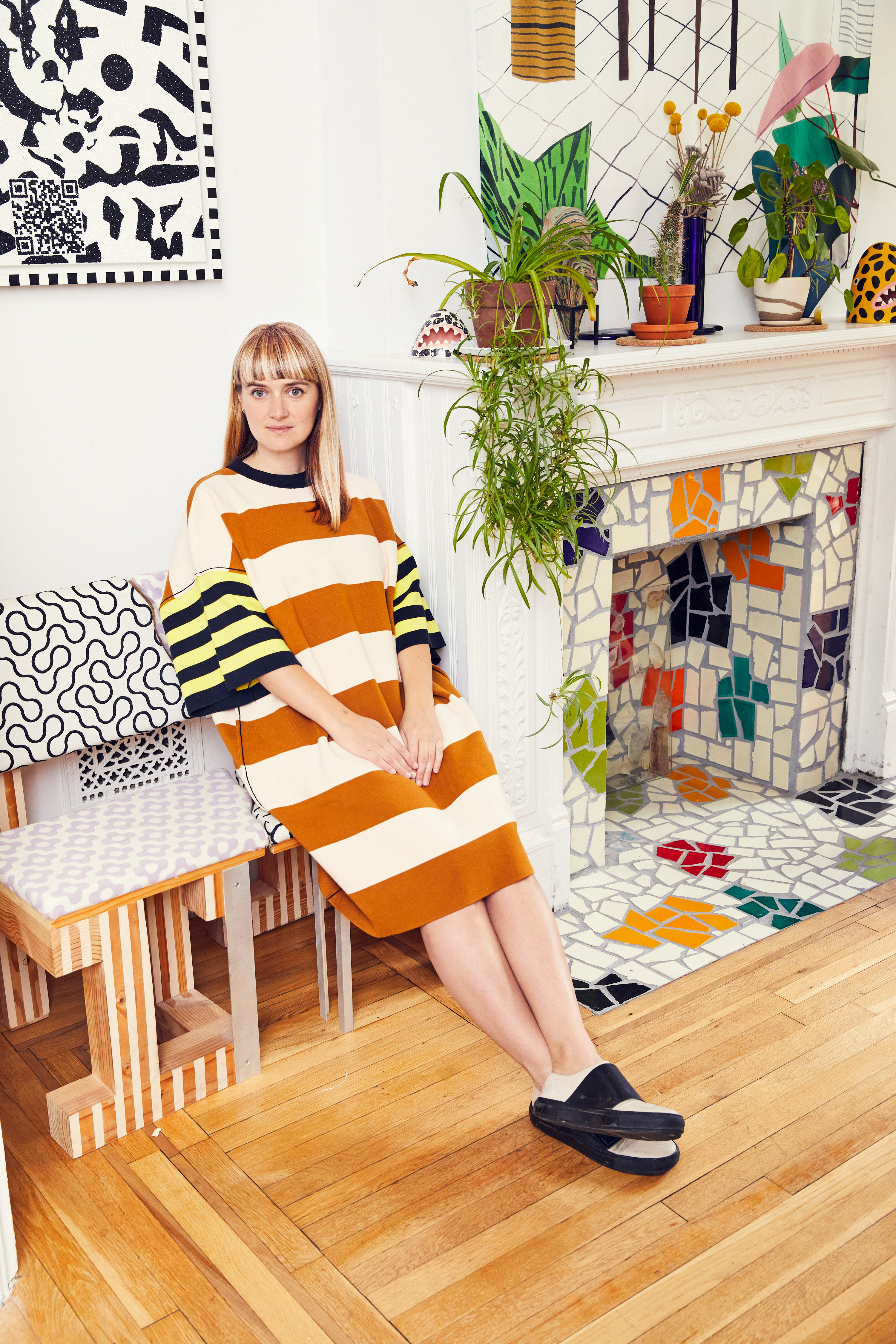
Van Dusen’s Brooklyn home has become well known for its colorful, pattern-rich personality. It includes graphic cabinetry, hand-tiled details, vintage finds, contemporary art, playful furniture, and objects that would probably feel lonely in a minimalist apartment.
Yet the space does not read as a random pile of visual sugar. One reason is restraint. Even a designer associated with bold color has spoken about avoiding the entire rainbow in one composition. That is a valuable lesson for anyone tempted to buy every cute thing they see during one particularly emotional Saturday at the flea market.
Pattern-heavy interiors need breathing room. A colorful rug might work best with quieter walls. A graphic duvet cover may need simpler nightstands. A vivid chair can shine when it is not surrounded by twelve equally loud cousins.
The “One Star, Two Supporting Actors” Rule
For a simple decorating formula, pick one major patterned piece as the star of a room. Then add two supporting accents that repeat one or two colors from that piece. Everything else can remain neutral, textured, or quietly complementary.
For example, a black-and-white printed duvet cover might pair with a mustard throw pillow and a small yellow bedside lamp. You still get energy and contrast, but the room does not begin looking like it is applying for a role in a children’s television show.
Quick Take #5: Independent Design Is Not Just Mood Boards and Pretty Swatches
The glamorous version of a creative career usually involves drawing in sunlight, drinking expensive coffee, and dramatically pinning fabric swatches to a wall while an indie playlist plays in the background. Real life is slightly less cinematic.
Van Dusen has been candid about the practical side of running an independent business. Along with creative work comes supplier communication, production decisions, sizing, sampling, shipping, schedules, invoices, quality control, and an impressive amount of email. For many small business owners, the inbox is not merely a tool. It is a tiny administrative monster that must be fed daily.
Still, this reality is part of what makes the Dusen Dusen story useful. A recognizable creative brand is not built only through inspiration. It is built by translating an aesthetic into repeatable systems: a visual language, a product strategy, relationships with manufacturers, and enough operational discipline to ensure the towels actually arrive before summer ends.
What Creative Entrepreneurs Can Learn
Creativity and business do not have to be enemies. The business side can protect the creative side by making the work sustainable. A strong visual identity helps people recognize your work, but dependable execution helps them trust it.
In other words, dream in colorbut answer your emails.
Quick Take #6: The Strongest Brands Travel Well
Dusen Dusen has extended beyond clothing and home textiles through collaborations with companies in furniture, travel, outdoor living, and design retail. This expansion makes sense because the core idea is flexible: pattern can live on many objects without losing its identity.
That is one of the clearest signs of a durable design language. A print that works only on one kind of product may be attractive, but a visual system that can move from bedding to luggage to furniture has greater depth. The product changes, but the personality remains recognizable.
For business owners, this offers a strategic lesson. Do not rush into expansion simply because another category looks profitable. Expand when your central idea has something genuine to say in a new context. The best collaborations feel like natural extensions, not a logo wandering into a room where it was never invited.
What Ellen Van Dusen’s Work Teaches About Personal Style
Personal style is often misunderstood as the ability to buy expensive things or follow trends quickly enough to make your bank account nervous. Ellen Van Dusen’s work suggests a different definition: personal style is the ability to make choices that feel connected.
You do not need a full home renovation or a warehouse of textiles to develop that connection. Start by noticing what repeatedly attracts you. Maybe it is curved lines, checkerboards, fruit motifs, dark green, painted wood, vintage glassware, or textiles with a sense of movement.
Once you notice your recurring interests, use them as a guide. Repetition creates identity. A home does not need to match perfectly, but it should feel as though the same human being made the choices. Ideally, that human being is younot a mysterious algorithm that thinks you need seventeen identical beige baskets.
Extended Experience: What It Feels Like to Live With Pattern
Living with pattern is different from merely admiring it online. On a screen, a colorful textile is a tiny square among thousands of other tiny squares. In a real room, it changes the atmosphere. A striped towel hanging in a bathroom can make an ordinary morning feel slightly more awake. A lively quilt can turn the act of making the bed into a small visual reward. A patterned cushion can rescue a chair that has been sitting quietly for years, wondering whether anyone still believes in it.
The experience begins with noticing. You might realize that your home has become overly cautious: neutral walls, neutral furniture, neutral accessories, neutral energy. Nothing is technically wrong, but nothing is especially memorable either. Introducing pattern can feel a little risky at first because it asks for a reaction. It makes the room more specific. It says that someone lives here who has opinions about color, shape, and possibly the emotional value of a good squiggle.
The trick is not to force a dramatic transformation overnight. Start with one object that makes you smile. Maybe it is a graphic tea towel, a pillow with abstract circles, a hand-painted planter, or a striped tablecloth. Use it for a while. Notice whether it energizes the room or overwhelms it. Pattern is not a personality test that you either pass or fail. It is a tool. You can use a little, use a lot, change your mind, and move things around until your home begins to feel more like a place you actively inhabit instead of a holding area for furniture.
There is also something deeply practical about colorful design. It can make ordinary routines more pleasant. Laundry still needs to be folded. Dishes still need to be washed. The dog still needs to be walked. But a cheerful robe, a patterned bath mat, or a favorite blanket can add a touch of delight to those repetitive tasks. Great design does not eliminate chores; it simply gives them better scenery.
Ellen Van Dusen’s work also encourages people to trust their instincts. You may not be able to explain why one combination of colors feels right while another feels slightly cursed. That is okay. Visual taste is often built through repetition, attention, and experimentation. The more you notice the colors and patterns that make you happy, the easier it becomes to create spaces that reflect your actual life.
Ultimately, the experience of living with pattern is about permission. Permission to choose the odd lamp. Permission to buy the bright towel. Permission to paint a chair, mix a stripe with a floral, or let your bathroom have more personality than some people’s entire apartments. A home does not need to look perfect. It needs to feel alive.
Final Take
Ellen Van Dusen has built a design career around a deceptively simple belief: everyday objects deserve joy. Her patterns are bright, but they are also thoughtful. Her spaces are playful, but they are carefully edited. Her brand is expressive, but it is supported by real systems, real materials, and real business discipline.
Whether you are a textile designer, home decor enthusiast, creative entrepreneur, or someone who simply owns a sofa that needs a little emotional support, the lesson is clear: use color with intention, embrace pattern with confidence, and let useful things be interesting.