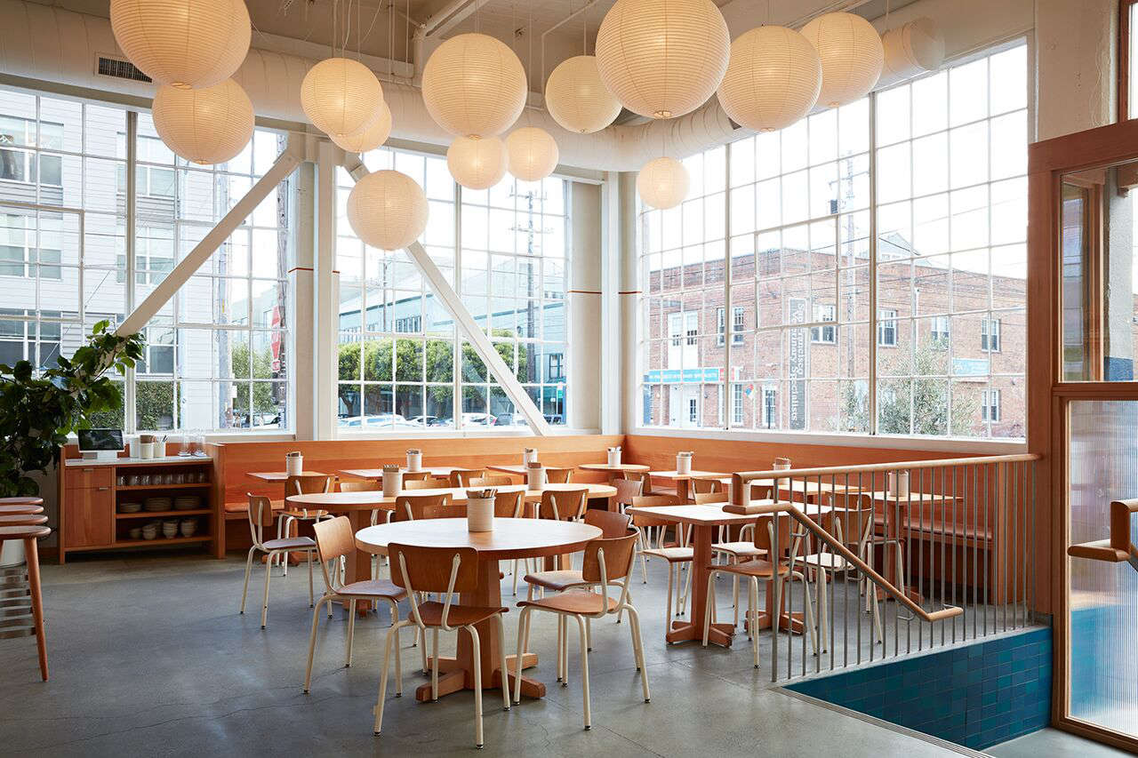
If you have ever walked into a beautifully designed restaurant and immediately started redecorating your home in your head, welcome. You are among friends. The Manufactory in San Francisco, designed by Commune Design inside Heath Ceramics’ Alabama Street building, is exactly that kind of place. It is part bakery, part restaurant, part craft manifesto, and part gentle attack on anyone who still thinks beige has to be boring.
What makes the space so memorable is not just that it looks good in photos. Plenty of places can manage that with a flattering pendant and a strategically placed loaf of bread. The Manufactory works because it turns craftsmanship into atmosphere. The design celebrates process, materials, and restraint. Instead of decorating the room within an inch of its life, Commune lets wood, leather, ceramic, plaster, and light do the talking. Happily, they have a lot to say.
The result is a distinctly Californian kind of luxury: warm, unfussy, handmade, and just polished enough to make you stand up a little straighter when you sit down. Below are seven ideas worth borrowing from the Manufactory, plus how to use them at home without making your kitchen feel like it is about to start serving naturally leavened country bread at 7 a.m.
Why the Manufactory Look Still Feels Fresh
Before we get into the seven ideas, it helps to understand why this San Francisco project still gets referenced years later. Commune Design has long built its reputation on a version of California cool that is less glossy showroom and more soulful workshop. Their interiors tend to feel collected, tactile, and grounded in natural materials. At the Manufactory, that philosophy is amplified by the setting itself: a large open space inside a building associated with ceramics, making, and visible process.
That is the magic trick. The space does not hide how things are made. It leans into it. Guests can see activity, materials, tools, tableware, ovens, and surfaces that are meant to age. There is no desperate attempt to look perfect. Instead, the room feels better because it looks useful. And that is a design lesson worth stealing before we even get to the furniture.
1. Half-Painted Walls That Do More With Less
One of the smartest ideas from the project is the half-painted wall treatment. It sounds almost too simple, which is usually how you know a design idea has real mileage. A wall painted only partway up creates instant visual structure without requiring paneling, wallpaper, or an emotional support budget.
At the Manufactory, the move gives the wraparound surfaces a graphic punch while keeping the overall palette calm. It also has a quietly practical effect: it makes a big room feel more human in scale. That matters in lofty industrial spaces, but it works just as well in a small breakfast nook, mudroom, hallway, or kid’s room.
The key is contrast without chaos. Choose a grounded color on the lower portion and keep the upper portion light and airy. Soft clay, muted green, dusty blue, warm cream, or cocoa all work beautifully. The lower band anchors the room; the upper band preserves brightness. It is architectural, but it does not scream for applause.
And unlike many trendy paint tricks, this one does not age overnight. It still looks smart once the internet moves on to its next emotional support arch.
2. Noguchi Lanterns in Multiples
If there is one lesson the Manufactory teaches with confidence, it is this: one paper lantern is charming, but several become a mood. Commune uses multiple Noguchi-style lanterns overhead to soften the industrial shell and fill the room with a cloudlike glow. They bring warmth, scale, and a sense of rhythm to a big open area that could otherwise feel too hard or too echoey.
This is a great reminder that lighting is not just about brightness. It is about texture. The lanterns diffuse light, blur harsh edges, and make exposed beams, windows, and metal details feel friendlier. In a room full of wood and ceramics, that kind of softness matters.
At home, this idea works especially well in dining rooms, breakfast corners, bedrooms, or over a long island. The trick is repetition. Instead of relying on one hero fixture that tries too hard, use two or three paper lanterns in slightly different sizes. The room will feel more intentional and a lot less showroom obvious.
It also helps that paper lanterns have an almost unfair advantage: they look expensive in spirit, even when they are not expensive in fact.
3. Pale Leather Cushions That Make Wood Feel Inviting
The Manufactory balances all that handsome wood with pale leather seat cushions on banquettes. It is a small move, but it changes the whole tone of the space. Bare wood can veer noble, spare, or just a little punishing after forty-five minutes. Add leather, and suddenly the room feels generous.
What makes this detail so effective is the color and material choice. Pale leather keeps things light, but it also introduces ageability. It will soften, mark, darken, and become more interesting with use. In other words, it behaves like a real material, not a plastic impersonation of one.
This is a signature Commune instinct: make a room better by adding something tactile rather than something flashy. For a home version, use leather or leather-like cushions on a breakfast banquette, entry bench, dining bench, or built-in window seat. Keep the palette restrained so the texture can lead.
It is also a smart way to bridge styles. Leather can connect Scandinavian simplicity, Japanese restraint, midcentury warmth, and rustic California ease in a single gesture. Few materials multitask that gracefully.
4. Tonal Ceramics That Double as Decor
Because the Manufactory sits in Heath territory, the ceramics were never going to phone it in. One of the standout ideas in the space is the use of tonal tableware, especially glazes in soft, earthy, sea-washed hues. Instead of a jumble of random plates, the ceramics feel coordinated without looking matched to death.
This matters more than people think. Tableware is often treated as a separate category from interior design, but in a kitchen or dining room, it is part of the visual landscape. Bowls on shelves, mugs near the coffee setup, plates in an open niche, and serving pieces on the table all contribute to the room’s identity.
The Manufactory gets this exactly right. The ceramics echo the space rather than compete with it. That is why the room feels complete. Nothing is shouting over anything else.
At home, try building a ceramic palette instead of buying a perfectly matching boxed set. Start with two or three related tones: maybe stone, blue-green, sand, or warm white. Mix matte and gloss finishes carefully. Let some variation show. The goal is harmony, not military alignment.
If your open shelving currently looks like a clearance aisle after a minor weather event, tonal ceramics can fix a surprising amount.
5. Braided Leather Door Handles With Personality
One of the most charming details in the Manufactory is also one of the most stealable: braided leather door handles made from leftover scraps. This is the kind of design move that separates a room with style from a room with soul.
Why does it work? First, it introduces softness in a place where hardware is usually cold. Second, it shows resourcefulness. Third, it creates a little moment of discovery. People notice handles because they touch them. That means this detail is not just visual; it is experiential.
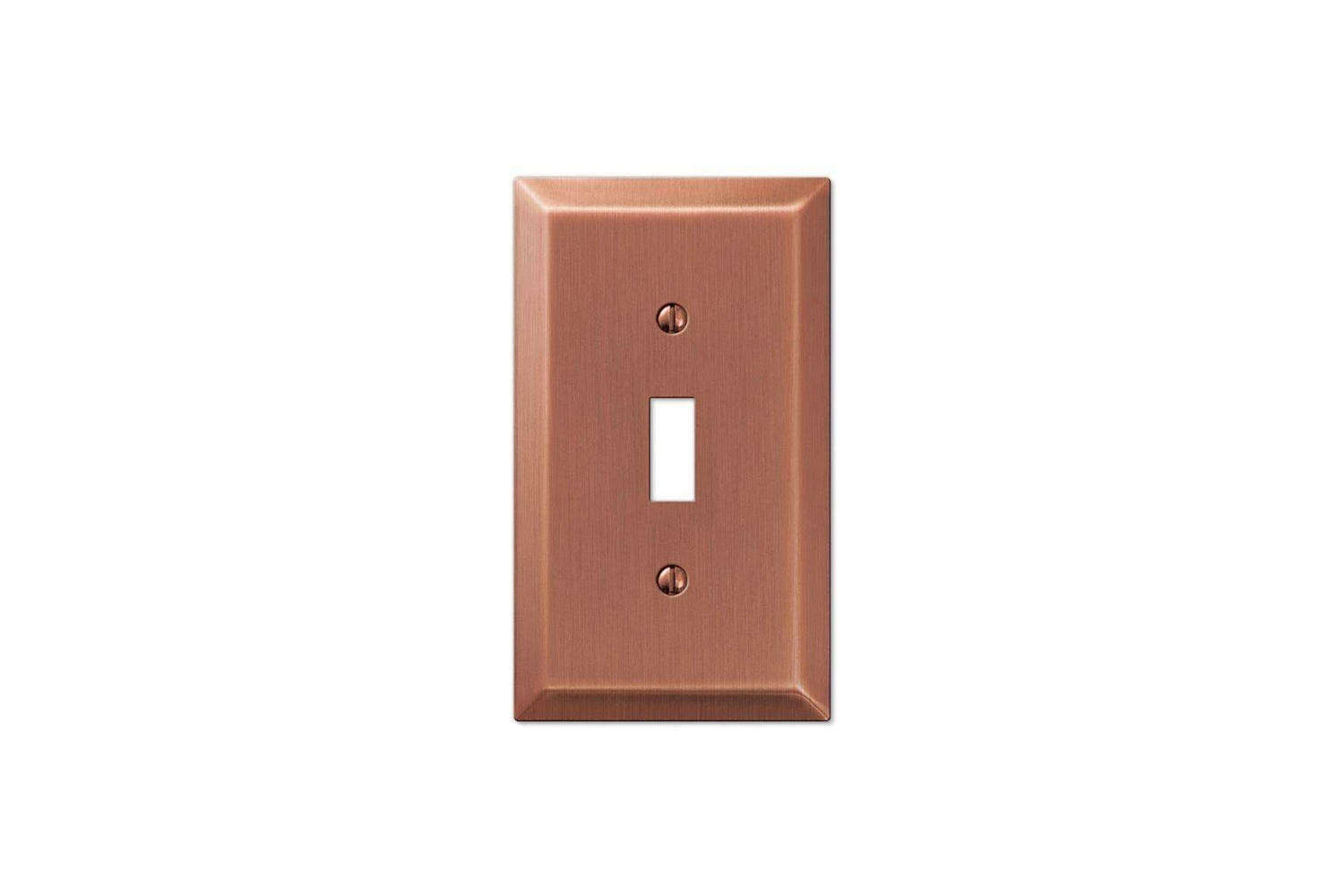
In design terms, it is a perfect example of how small elements can carry a big emotional load. You do not need to overhaul an entire kitchen to make it feel more considered. Sometimes you just need better contact points: the pull, the latch, the switch plate, the stool back, the shelf edge.
Try this idea on pantry doors, closets, built-in cabinets, or even large drawers. Leather pulls, wrapped hardware, and stitched details add warmth and craft with almost no spatial footprint. They whisper instead of shout, and that is exactly why they tend to last.
6. Schoolroom Chairs That Keep the Room Honest
In a world where every chair seems determined to become an identity, the Manufactory’s schoolroom-style seating is refreshingly grounded. Commune specified simple powder-coated steel-framed chairs with a utilitarian spirit, and the effect is excellent. They make the room feel approachable rather than precious.
This is an important balance in a richly designed interior. If everything is artisanal, custom, and deeply meaningful, people start sitting like they are afraid to disturb the concept. The schoolroom chairs cut through that. They signal everyday use. Sit down. Eat something. Relax.
That honesty is part of the appeal. The chairs nod to institutional design, but in the context of warm wood, leather, plaster, and handmade ceramics, they feel purposeful instead of cold. Good rooms usually need at least one element that resists polish. This is that element.
For a home kitchen or dining space, metal-framed chairs with plywood or wood seats can bring the same clarity. They are especially useful if your room already has a lot of texture and visual richness. Think of them as the plain-spoken friend in a group chat full of poets.
7. A Built-In Kitchen Island Display Niche
This may be the most practical idea of the bunch. The Manufactory includes a blocky kitchen island with a built-in display niche for ceramics and storage, and it is the sort of feature that makes you wonder why more islands are not pulling their weight.
Kitchen islands are often oversized boxes with a seating overhang and a dream. But adding an open niche gives the form relief, personality, and function. It creates a home for bowls, platters, cookbooks, linens, or even a rotating seasonal display if you are feeling ambitious.
More importantly, it turns storage into part of the design. That aligns with the larger Manufactory philosophy: useful things should be beautiful, and beautiful things should be used. A ceramic bowl hidden forever behind a cabinet door is basically retired too early.
At home, use a niche on the end of an island, beneath the counter on one side, or in an adjacent built-in. Keep the contents edited. A few stacks of bowls, a pitcher, a board, and a folded textile will do more than twenty-six mismatched gadgets and a rogue water bottle.
How to Borrow the Manufactory Mood Without Copying It Line for Line
Choose materials that improve with age
The big takeaway from Commune’s work is not one lantern or one chair. It is the commitment to materials that patina. Wood darkens. Leather softens. unlacquered metal changes. Handmade ceramics show variation. Plaster catches light differently across the day. These are not flaws. They are the plot.
Use local or honest materials whenever possible
The room feels rooted because it does not depend on synthetic trickery. Natural woods, ceramics, leather, metal, and simple textiles do the heavy lifting. Even if your budget is modest, choosing fewer better materials will usually get you closer to this look than adding more decorative stuff.
Let craft stay visible
The Manufactory is full of evidence that people made things. That is a huge part of its appeal. Open shelving, visible tableware, tactile finishes, and exposed structure all contribute to a room that feels alive rather than sealed in acrylic. Resist the urge to make everything disappear. A little visibility is good for the soul.
The Real-Life Experience of Living With These Ideas
What makes these seven ideas worth stealing is that they do not just photograph well. They change how a room feels when you actually live with it. A half-painted wall can make a kitchen feel calmer before the coffee even kicks in. A row of paper lanterns turns dinner into something softer and slower, even if the meal is just leftover pasta and a desperate handful of arugula. Good design does not require a grand event. It improves the ordinary.
The leather cushion idea is especially revealing in real life. Wood benches look beautiful in theory, but theory rarely has to sit through breakfast, homework, emails, and a long conversation that somehow begins with toast and ends with a debate about whether anyone remembers to water the basil. Add a padded leather seat and suddenly the room invites lingering. You stay at the table longer. The space becomes more generous. That is not a styling trick. That is a behavioral change.
The same goes for tonal ceramics. When your everyday bowls and plates share a quiet palette, the whole room feels less cluttered, even when life is not. A stack of blue-green bowls near the stove, a sandy platter on the island, a mug in a soft matte glaze by the sink, these things create visual calm in tiny increments. No single piece is dramatic, but together they make the kitchen feel coherent. You start noticing the pleasure of small routines: setting the table, clearing it, stacking dishes, reaching for the same favorite cup.
The braided leather handle is the kind of detail people tend to underestimate until they use one. Then it becomes the thing they mention first. It feels warm in the hand. It signals care. It makes even a basic cabinet or pantry door feel more personal. The schoolroom chairs work the same way in reverse: they remove unnecessary fuss. They tell everyone the room is for living, not posing. That honesty can be surprisingly liberating.
And then there is the island niche, which may be the most life-improving idea of all. Once you have a place to keep the bowls you actually use, or the serving pieces you love enough to look at every day, the kitchen starts functioning more like a studio and less like a storage unit with snacks. It encourages editing. It rewards restraint. It makes useful things feel worthy of display.
That is really the deeper lesson of the Manufactory. Commune Design did not create a memorable interior by adding more and more. They created one by choosing better, warmer, more tactile things and letting them breathe. In everyday life, that approach feels luxurious in the best possible way. Not flashy. Not precious. Just deeply satisfying. Which, honestly, is the kind of luxury most homes could use a lot more of.
Conclusion
The Manufactory in San Francisco remains a master class in design that is thoughtful without being stiff. Commune Design took an industrial shell, paired it with handmade materials and a maker-minded spirit, and created a space that still feels current because it was never chasing novelty in the first place. The seven ideas worth borrowing are deceptively simple: half-painted walls, clustered lanterns, pale leather cushions, tonal ceramics, braided leather hardware, schoolroom chairs, and a kitchen niche that turns storage into display.
Steal all seven or just one. Either way, the goal is the same: create rooms that feel grounded, useful, warm, and alive. And maybe, while you are at it, make space for one truly excellent loaf of bread.