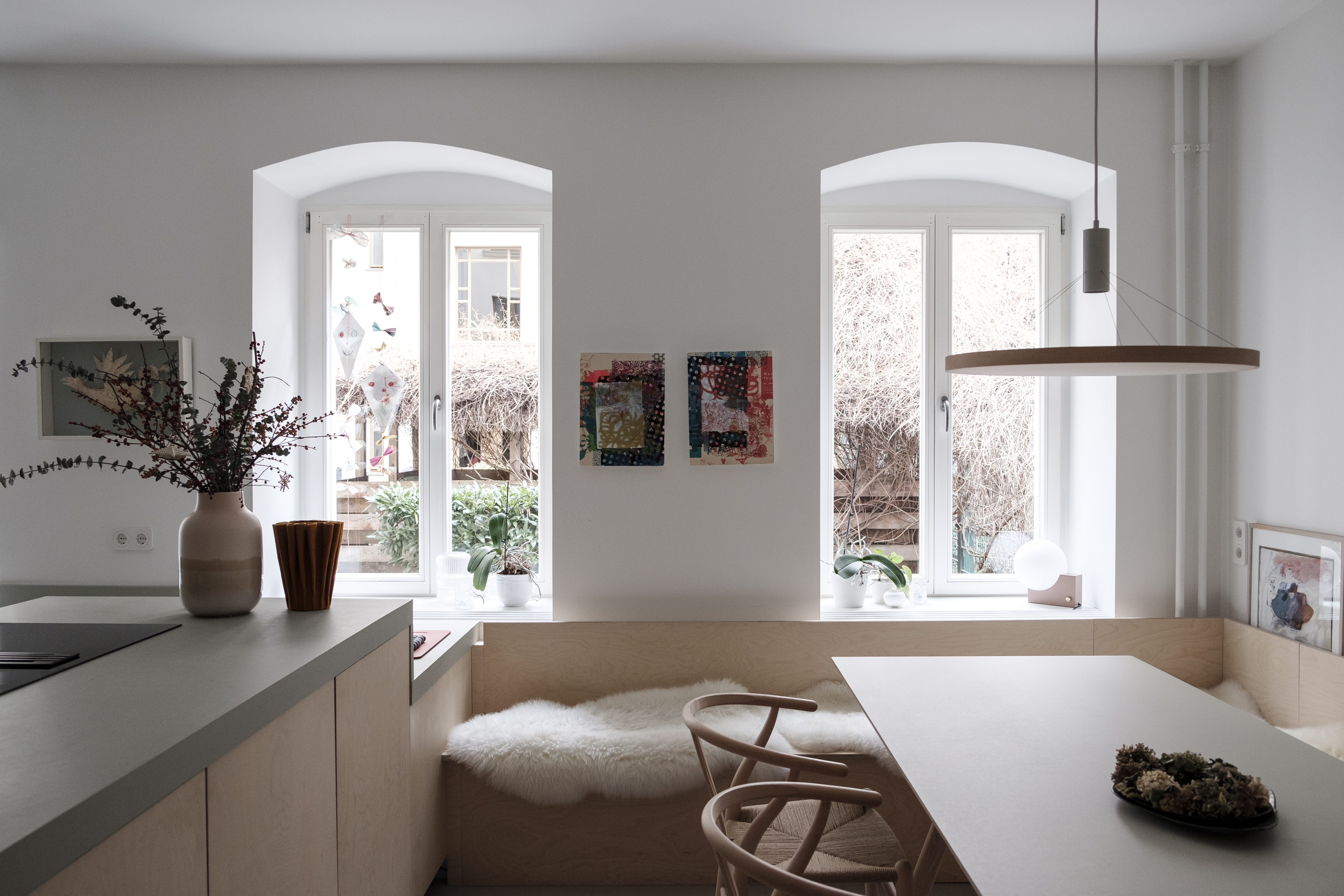
Some kitchens arrive shouting, “Look at me!” This one walks in quietly, puts fresh flowers in a small vase, makes coffee, and somehow becomes the most interesting person in the room. The bright Berlin kitchen designed by Studio Oink is a master class in restrained color, practical family living, and the kind of soft minimalism that does not feel like a museum where toast crumbs are illegal.
Set inside a Wilhelminian-style building in Berlin’s Prenzlauer Berg neighborhood, this garden apartment kitchen was created for a young family of four. The designers, Lea Korzeczek and Matthias Hiller of Studio Oink, were asked to bring lightness into a darker ground-floor space while creating a bespoke kitchen that could function beautifully every day. The result is airy but not cold, playful but not noisy, and highly designed without looking as if it needs a security guard.
What makes this kitchen memorable is not one dramatic gesture. It is the careful layering of birch cabinetry, pale walls, green linoleum countertops, colored flooring, red handles, artful storage, and built-in seating. The palette is subdued, yes, but never sleepy. It is the design equivalent of a whisper that somehow quiets the whole room.
Why This Berlin Kitchen Works So Well
The best kitchen design does more than look pretty in photographs. It solves problems. In this case, Studio Oink had to make a dark ground floor feel brighter, create a hardworking family kitchen, and connect the cooking area to everyday dining. Instead of forcing the space into a glossy, all-white formula, the studio used warm materials and gentle color to build atmosphere.
The kitchen’s U-shaped layout is especially smart. A U-shape can make cooking feel efficient because storage, prep, washing, and cooking zones can sit within easy reach. In a family home, that matters. Nobody wants to sprint across the kitchen holding a dripping colander while a child asks where socks come from. The compact, wrapped layout creates a practical work zone while still allowing the room to feel open and calm.
Studio Oink’s approach is rooted in a balance between poetry and function. That philosophy shows here. The kitchen is not just a collection of cabinets and appliances; it is an interior landscape. Every material has a job, but every job has a little grace attached to it.
The Subdued Palette: Soft Color Without the Snooze Button
The phrase “subdued palette” can sound like design code for beige, beige’s cousin, and beige’s accountant. Thankfully, this Berlin kitchen avoids that trap. Its palette includes white, gray, green, red, and birch tones, all arranged with careful restraint.
Gallery White Walls for Lightness
The walls are painted in a soft white, creating a quiet backdrop that helps bounce light around the room. In a lower-level or garden-level apartment, that move is not just aesthetic; it is strategic. Bright walls can make a space feel more open, especially when paired with pale natural wood and surfaces that do not visually weigh down the room.
But the white here is not the icy, laboratory kind. The room does not feel sterile. The warmth comes from birch cabinetry, the gentle green of the countertops, the colored flooring, and the family’s art collection. This is why the kitchen feels lived-in rather than staged for a silent Scandinavian monk.
Green Linoleum Countertops Add Personality
The light green linoleum countertops are one of the kitchen’s most charming decisions. Linoleum has a softer visual quality than stone and a warmer personality than stainless steel. It also fits beautifully with Studio Oink’s preference for natural and sustainable materials. In a kitchen, green can act like a bridge between the built interior and the natural world outside, which is especially fitting for a garden apartment.
Green is also having a long design moment, but this kitchen does not chase trends in an obvious way. There is no loud emerald wall demanding applause. Instead, green appears as a working surface, a sink color, and small accessories. That keeps the palette fresh without turning the room into a salad bar.
Red Handles Create the Perfect Small Shock
The long red cabinet pulls are a tiny rebellion against quietness. They give the birch cabinets a graphic edge and connect the kitchen to the family’s art collection. This is an important lesson: a subdued kitchen does not need to be colorless. In fact, the smaller the dose, the more powerful color can become.
Red handles are also refreshingly practical. Hardware is one of the easiest ways to introduce personality without committing to a giant visual decision. If a red cabinet wall feels too bold, red pulls offer the wink without the megaphone.
Birch Cabinets: The Warm Minimalist Hero
Solid birch cabinetry anchors the room. Birch is pale, smooth, and visually gentle, which makes it perfect for a bright kitchen with a restrained palette. Unlike glossy white cabinets, birch brings grain and warmth. It says, “I am minimal,” but also, “I know how to make soup.”
Wood cabinetry has become increasingly relevant in kitchen design because homeowners are looking for warmth, character, and longevity. Studio Oink’s birch cabinets feel current without being trendy. They support the room’s lightness, but they also prevent it from becoming flat.
The cabinetry is custom, which matters in a space like this. Bespoke design allows awkward corners, family routines, storage needs, and sightlines to be handled with precision. The built-in bottle storage under the countertop is a good example. It is not flashy, but it solves a real problem in a way that feels integrated rather than added later in panic.
Colored Linoleum Flooring: Practical, Soft, and Underappreciated
The kitchen flooring uses colored linoleum, a choice that deserves more applause. Linoleum is often overshadowed by tile, stone, and wood, but it brings a practical softness that works well in family kitchens. It is comfortable underfoot, visually quiet, and available in colors that can support a palette without overwhelming it.
In this Berlin kitchen, the flooring contributes to the overall calm. It does not fight the cabinets or countertops. Instead, it creates a smooth base layer that keeps the room unified. That is one reason the kitchen feels so composed. The surfaces talk to each other in indoor voices.
For homeowners considering a similar look, linoleum is worth revisiting. Modern linoleum is not the sad kitchen floor from a forgotten rental apartment. It can be durable, design-forward, and made with natural raw materials. When used thoughtfully, it brings a gentle matte quality that can make a kitchen feel softer and more human.
The Built-In Bench: Where the Kitchen Becomes a Room
One of the strongest moves in this project is the built-in dining bench that extends the birch language from the kitchen into the dining area. This detail makes the kitchen feel less like a standalone work zone and more like part of a larger living space.
Built-in seating is useful for family life because it saves space, creates storage opportunities, and encourages lingering. It also gives the dining area architectural presence. Instead of placing a table and chairs in a leftover corner, Studio Oink makes dining part of the design from the beginning.
The sheepskins and oak Hans Wegner Wishbone Chairs add texture and comfort. This mix is essential. Without soft elements, a pale minimalist kitchen can become too hard-edged. Here, the seating invites people to stay. Breakfast can stretch. Homework can happen. Someone can sit with tea and pretend to read while actually supervising the oven like a suspicious detective.
Lighting That Supports the Architecture
The ceiling lighting is simple and architectural, keeping the room bright without cluttering the visual field. In a kitchen with a subdued palette, lighting matters enormously. Poor lighting can make soft colors look dull, while good lighting reveals their subtle differences.
Track lighting works well in this kind of space because it can provide flexible illumination across work zones. It also keeps the ceiling clean. Rather than relying on one decorative fixture to do all the work, the lighting quietly supports the cabinets, counters, sink, and dining area.
The lesson for any kitchen remodel is clear: do not treat lighting as a final accessory. It is part of the architecture. A beautiful countertop under bad lighting is like a celebrity photographed at the DMV. Technically recognizable, but not at its best.
Appliances That Do Not Hijack the Room
The cooktop and wall oven are from Miele, which fits the European design language of the project. The appliances are integrated without becoming the visual center. This is an important point in modern kitchen design: performance matters, but the room should not feel like an appliance showroom.
In this kitchen, appliances support function while the materials carry the mood. The cabinetry, counters, sink, hardware, flooring, and art collection do the emotional work. That balance helps the kitchen feel timeless. Technology changes quickly; atmosphere lasts longer.
What Makes Studio Oink’s Design Feel Different
Studio Oink’s interiors often feel poetic because they leave room for quiet. Many kitchens are designed around spectacle: the giant island, the waterfall stone, the dramatic pendant lights, the faucet that looks like it might launch a satellite. This Berlin kitchen takes the opposite path.
Its beauty comes from proportion, texture, and restraint. The designers understand that family life already brings plenty of movement. The kitchen does not need to compete with the clatter of breakfast, the parade of school bags, or the eternal mystery of who put an empty milk carton back in the fridge.
The room also shows how minimalism can be warm. Minimalism often gets blamed for being cold, but the real issue is usually lack of material depth. Here, birch, linoleum, sheepskin, oak, painted hardware, and art create layers. The palette is quiet, but the room is not empty.
Design Ideas to Steal from This Kitchen
1. Use Wood to Warm Up White Walls
If you love bright kitchens but fear they will feel sterile, pair white walls with pale wood cabinetry. Birch, maple, ash, and light oak can all create warmth without making the space feel heavy.
2. Try Color on Functional Surfaces
Color does not have to live only on walls or cabinets. A green countertop, colored sink, painted handle, or playful dish drainer can give a kitchen personality while keeping the overall palette calm.
3. Let Art Guide the Palette
One of the smartest choices in this kitchen is that the color scheme responds to the family’s existing art collection. This makes the room feel personal rather than trend-driven. If you already own art, textiles, ceramics, or vintage pieces you love, use them as your color compass.
4. Build Seating Into the Architecture
A built-in bench can make a dining area feel intentional and cozy. It is especially effective in apartments, narrow kitchens, and open-plan spaces where every inch has to earn its rent.
5. Choose Hardware with Character
Cabinet pulls are small, but they can change the mood of an entire kitchen. Painted handles, long linear pulls, or subtly colored hardware can add detail without creating visual chaos.
How to Recreate the Look at Home
You do not need a Berlin apartment or a custom European design studio on speed dial to borrow the spirit of this kitchen. Start with a quiet base: soft white walls, pale wood, matte surfaces, and simple lines. Then introduce two or three gentle colors that can repeat in small ways.
For example, use a pale green countertop or backsplash, add red or terracotta hardware, and choose a muted floor color that connects the room. Keep the palette tight. If every object wants to be the star, the kitchen becomes a reality show reunion.
Next, prioritize built-ins where possible. Custom storage, integrated seating, and niche shelving can make even a modest kitchen feel thoughtful. If custom cabinetry is not in the budget, look for semi-custom fronts, open shelves, vintage benches, or painted hardware upgrades that create a similar layered effect.
Finally, think about touch. A kitchen is experienced through hands as much as eyes. Matte counters, wood grain, soft seating, smooth pulls, and warm lighting all affect how the room feels in daily use. The Studio Oink kitchen succeeds because it is not only photogenic; it feels habitable.
Experience Notes: Living with a Bright, Subdued Kitchen
A kitchen like this teaches a practical lesson: calm design is not about owning fewer things; it is about giving the right things a place to belong. Anyone who has lived with a busy family kitchen knows that clutter is not a moral failure. It is simply life arriving with lunch boxes, grocery bags, mismatched mugs, and one mysterious charger that nobody recognizes but everyone is afraid to throw away.
The appeal of the Studio Oink approach is that it makes everyday life easier to absorb. Pale wood hides small imperfections better than glossy lacquer. Soft colors age more gracefully than harsh contrasts. A built-in bench welcomes real behavior: children sliding in sideways, adults lingering with coffee, guests leaning back after dinner. The room feels designed for use, not just admiration.
In real homes, subdued palettes are especially helpful because they create visual recovery. Kitchens are noisy places. Water runs, pans clatter, drawers open, timers beep, and someone inevitably asks what is for dinner while standing directly in front of the full refrigerator. A quiet color scheme gives the eye somewhere to rest. It does not remove the chaos, but it frames it more kindly.
The green linoleum countertop is a particularly useful idea for anyone tired of the standard stone-or-bust conversation. It suggests that a kitchen surface can be practical and expressive without becoming luxurious in a loud way. The same goes for the red handles. They prove that a small design decision can make a room feel personal. You do not always need a grand gesture. Sometimes the smartest detail is the one that makes you smile while opening the cutlery drawer.
This kitchen also highlights the value of designing around existing belongings. Many remodels begin with the fantasy of a blank slate, but most people do not live blank-slate lives. They have art, chairs, bowls, family objects, and odd little treasures collected over time. Studio Oink’s palette, inspired by the family’s art collection, shows how a kitchen can grow from what already matters. That approach makes a remodel feel less like erasing and more like clarifying.
Another experience-based takeaway is that brightness does not have to mean whiteness alone. Light can come from reflective walls, pale wood, open sightlines, thoughtful lighting, and a limited palette. In a darker apartment, this matters. A room can feel bright because it is visually organized, not because every surface has been bleached into submission.
For anyone planning a kitchen renovation, the Berlin project offers a reassuring message: timeless design does not require blandness. A subdued palette can still have humor, warmth, and character. It can include green counters, red handles, pink accessories, soft sheepskins, and art on the wall. The trick is editing, not eliminating. Keep the room calm enough for daily life, but leave enough personality that the kitchen still feels like yours.
Conclusion
Studio Oink’s bright Berlin kitchen is a beautiful reminder that restraint can be generous. The room is not trying to impress with size, shine, or drama. Instead, it offers a thoughtful mix of birch cabinets, soft white walls, green linoleum, colored flooring, red hardware, integrated seating, and practical storage. Every detail supports family life while adding visual charm.
As a “Kitchen of the Week,” it stands out because it feels both specific and widely useful. You may not copy the kitchen exactly, but you can learn from its logic: brighten with soft surfaces, warm up minimalism with natural materials, use color in small confident doses, and design around the life that actually happens in the room. In other words, make the kitchen calm enough for Monday morning and beautiful enough for Saturday dinner. That is not easy, but this Berlin kitchen makes it look almost effortless.