An art wall is more than a collection of frames. At its best, it is a visualid something with the prints that had been leaning behind the dresser since last spring. The most memorable displays do not look as though they arrived in one enormous cardboard box labeled “instant personality.” They feel gathered, edited, and arranged with intention.
The good news is that creating a gallery wall does not require an art-history degree, a mansion, or the ability to hammer a nail correctly on the first try. It requires a clear point of view, a sensible layout, and enough patience to move one frame three inches to the left without declaring the entire project cursed. The following ten favorite approaches cover classic grids, free-form arrangements, family photographs, sculptural objects, small clusters, and dramatic floor-to-ceiling installations. Each can be adapted to a living room, hallway, bedroom, dining area, office, or staircase.
1. The Anchor-and-Orbit Art Wall
Begin with one piece that sets the mood
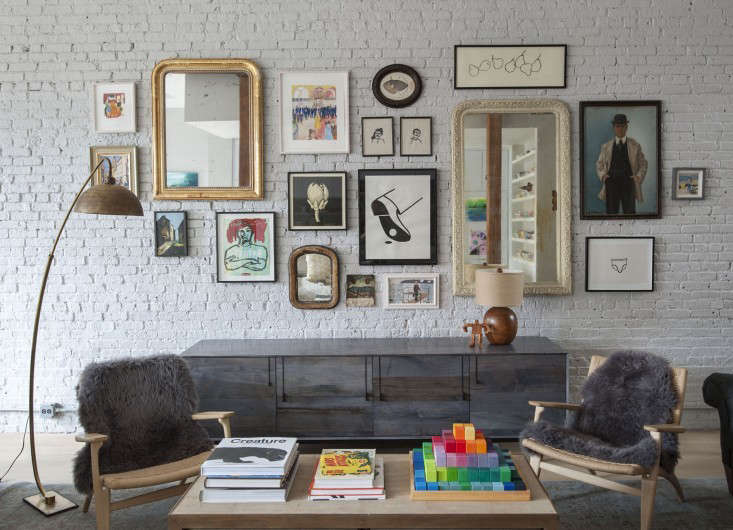
When a blank wall feels intimidating, choose one strong anchor: a large painting, vintage poster, textile, mirror, or oversized photograph. Place it near the visual center of the planned arrangement, then build outward with smaller works. The surrounding pieces become satellites, but they should not look like nervous interns waiting for instructions. Give them enough presence to hold their own.
This layout works especially well above a sofa, console, or bed because the central artwork creates an immediate relationship with the furniture. Repeat one or two colors from the anchor in nearby pieces to make the collection feel connected. Frames can vary, but a recurring finishblack, walnut, brass, or white oakhelps calm the composition.
2. The Disciplined Grid
For people who enjoy order and own a level
A grid gallery wall is clean, architectural, and wonderfully satisfying. Use frames of identical size, consistent mats, and equal spacing. The artwork may be a coordinated photo series, botanical prints, architectural sketches, record covers, or children’s drawings photographed against the same background.
The secret is precision. Even a small error becomes noticeable when every line is supposed to match. Create full-size paper templates, tape them to the wall, and check the entire arrangement before installing hardware. A grid can make inexpensive prints look polished because repetition provides structure. It also suits modern, transitional, and minimalist interiors where a free-form collage might feel too busy.
3. The Black-and-White Memory Wall
Turn personal photographs into a coherent collection
Family pictures are meaningful, but a random mixture of bright vacation photos, school portraits, and blurry pet snapshots can make a wall resemble an extremely affectionate bulletin board. Converting images to black and white creates instant unity while allowing different decades, locations, and camera styles to coexist.
Use similar frames for a tailored effect or mix vintage and contemporary frames for a more collected look. Include quiet moments as well as formal portraits: a grandparent’s hands, a child running through a sprinkler, the front porch of a first home, or a dog occupying a chair it was specifically told not to occupy. The result feels intimate without becoming visually chaotic.
4. The Collected-Over-Time Salon Wall
Let variety become the design language
The salon-style art wall embraces different sizes, media, frames, and eras. Oil paintings can sit beside photographs, sketches, maps, postcards, and small prints. The arrangement may be asymmetrical, but it still needs rhythm. Balance a dark, visually heavy piece with another strong element across the composition, and distribute bright colors rather than crowding them into one corner.
This style looks best when it reflects genuine interests. A travel lover might combine transit maps, landscape photographs, museum postcards, and a tiny framed ticket. A gardener could mix botanical studies, seed-packet art, pressed leaves, and a landscape painting. The wall becomes a conversation, not a matching set. It should look collectednot as though the frames got into a minor traffic accident.
5. The Picture-Ledge Gallery
A flexible solution for renters and chronic rearrangers
Picture ledges allow art to be leaned, layered, and changed without adding a new hole for every frame. Install one long ledge or stagger two or three shorter shelves. Place larger pieces at the back, then overlap smaller frames in front. Add a tiny vase, ceramic figure, or sculptural object to break up the rectangles.
This approach is ideal for seasonal displays, growing family-photo collections, and anyone who enjoys changing art more often than most people change passwords. Keep enough open space so the arrangement feels layered rather than crowded. For safety, secure heavy frames and avoid placing unstable objects where a curious child, cat, or enthusiastic vacuum cleaner can launch them toward the floor.
6. The Staircase Story
Use the architecture as your guide
A staircase gallery wall can turn a pass-through area into one of the most memorable spaces in the house. Rather than forcing the frames into a level rectangle, let the composition rise with the stairs. Start with a strong piece near the lower landing and create an upward visual path.
Paper templates are particularly useful here because viewing angles change as you climb. Step back from the staircase, inspect the layout from both directions, and make sure important images are not hidden behind railings. A staircase is perfect for chronological family photographs, travel memories, vintage portraits, or a sequence of drawings that becomes more colorful as the wall rises.
7. The Art-and-Object Mix
Introduce texture, shape, and a little mischief
Not every item on an art wall needs to be flat or framed. Small baskets, ceramic plates, carved masks, textile fragments, mirrors, wall sculptures, hats, and meaningful objects can create depth. A three-dimensional centerpiece often works as an anchor, with framed art arranged around it.
The challenge is secure installation. Choose hardware according to the object’s weight, the hanging mechanism, and the wall material. Decorative enthusiasm is delightful; a ceramic plate sliding down the drywall at 2 a.m. is less delightful. Limit the number of bulky objects and repeat a material or color so the collection feels intentional. A brass mirror, a gilded frame, and a small metal sculpture can form a subtle visual thread.
8. The Monochromatic Color Story
Create harmony without making every piece identical
A monochromatic art wall is built around a narrow palette rather than a single style. Blue-and-white landscapes, indigo textiles, cyanotype prints, and navy abstract art can look cohesive even when their subjects and frames differ. Earth tones, soft greens, rust, or warm neutrals work equally well.
To prevent the display from becoming flat, vary texture and value. Combine dark and pale works, crisp photography and loose brushwork, glossy glass and matte surfaces. The limited color palette acts like a host at a dinner party, introducing guests who might otherwise have nothing to say to one another. This is an effective way to bring calm to an eclectic room or add depth to a neutral wall.
9. The Small Gallery Cluster
Proof that a tiny wall can have a large personality
An art wall does not need to cover an entire room. A tight cluster of three to seven pieces can transform a narrow hallway, reading nook, powder room, kitchen corner, or the space above a small desk. Use the boundaries already provided by furniture, molding, or architecture to define the display.
Begin with the largest piece and keep the gaps fairly tight. A compact arrangement benefits from strong editing because every item is easy to see. Include one unexpected detaila miniature portrait, a funny handwritten note, a tiny landscape, or a child’s dramatic interpretation of the family cat. Small clusters are also an excellent first project for anyone who finds a full gallery wall slightly more stressful than assembling furniture with missing instructions.
10. The Floor-to-Ceiling Statement Wall
Embrace scale and let the collection become architecture
A floor-to-ceiling art wall creates drama in rooms with high ceilings, long hallways, large stairwells, or expansive living areas. The composition can begin close to the baseboard and continue toward the ceiling, wrapping around doors or architectural features when appropriate. Larger works should be distributed throughout the wall so the display does not feel bottom-heavy.
Because this approach contains many elements, cohesion matters. Repeat frame finishes, colors, subjects, or shapes at intervals. Leave some breathing room around switches, vents, and trim. The final effect should feel immersive rather than merely full. Think “private collection with excellent lighting,” not “storage unit that discovered vertical surfaces.”
How to Plan an Art Wall Without Regretting Every Nail Hole
Edit first, arrange second, install last
Gather more pieces than you expect to use, then remove anything that weakens the group. Measure the available wall area and mark the same dimensions on the floor with painter’s tape. Arrange the art inside that boundary, take a photograph, and test at least one alternative. A good layout usually has a visual center, balanced weight, and reasonably consistent negative space.
For most mixed gallery walls, a gap of roughly two to three inches is a useful starting point, although larger art may need more room. Treat the entire composition as one large artwork when deciding its height. Above furniture, the lower edge should feel related to the sofa, console, or headboardnot as though it is attempting to escape toward the ceiling.
Create paper templates for complicated arrangements and mark the exact hardware position on each template. Before drilling or hammering, identify the wall material and confirm that the hanger can support the object’s weight. Use a level, but also trust your eyes; old houses occasionally regard straight lines as optional.
Common Art Wall Mistakesand the Easy Fixes
When “eclectic” quietly becomes “everything drawer”
The first common mistake is choosing art only because it matches the sofa. Color coordination can help, but a meaningful collection has more staying power than a perfectly beige one. The second mistake is using pieces that are too small for the wall. Either enlarge the overall arrangement or create a tighter cluster within a clearly defined area.
Uneven spacing is another frequent problem. The gaps do not need to be mathematically identical in a free-form layout, but they should feel related. Also avoid placing every dark, large, or highly colorful piece on the same side. Finally, do not assume every frame must match. Matching frames create order; mixed frames create character. Both work when the decision is deliberate.
Experience Notes: What Creating an Art Wall Actually Feels Like
The practical lessons that appear after the inspiration photos disappear
The first experience many people have with an art wall begins with confidence and ends with twelve frames spread across the floor. This is normal. The floor stage often reveals that the “perfect collection” contains six medium rectangles, no strong focal point, and one tiny print everyone loves but nobody knows where to place. The useful lesson is that collecting and composing are different skills. You may adore every piece individually and still need to remove two of them for the wall to work.
The next surprise is scale. Art almost always looks larger in your hands than it does on a wall. A group that seems generous on the dining table can shrink dramatically once placed above a long sofa. Testing the full footprint with painter’s tape prevents this problem. It also helps people realize that the wall arrangement must relate to the furniture below it. When the art is too narrow, it appears timid; when it spreads far beyond the furniture, it may feel disconnected from the room.
Then comes the debate between precision and instinct. Templates, measurements, and levels reduce mistakes, but a gallery wall can still look lifeless when every decision follows a formula. The best experience usually combines both methods: measure the outer boundaries and main anchor points, then adjust smaller pieces by eye. A quarter-inch shift can improve the rhythm even when the spreadsheet insists everything is already perfect. The wall is not grading your geometry homework.
Another common lesson involves frames. Buying every frame at once is convenient, but it can make a personal collection feel newly manufactured. Mixing old and new frames often adds warmth, especially when there is a repeated finish or mat color. Thrifted frames can be painted, repaired, or fitted with new mats. However, bargain hunting has limits. A warped frame that refuses to sit flat will become the one thing you notice every time you enter the room.
Installation day teaches respect for hardware. Lightweight prints are forgiving; mirrors, ceramic pieces, and large glazed frames are not. Checking weight limits and wall types may not be glamorous, but neither is explaining why a treasured object became a floor mosaic. It is also wise to place small adhesive bumpers on lower frame corners. They help keep frames level and protect painted walls from scuffs.
The most rewarding experience arrives later, after the tools are packed away. Visitors pause, ask about a photograph, recognize a location, or laugh at a tiny unexpected object. The wall begins to function as more than decoration. It records relationships, interests, travels, experiments, and small family legends. It can also evolve. A new drawing replaces an old print; a postcard is added after a trip; a photograph changes when the family grows.
That ability to change is the real advantage of an art wall. It does not need to be finished forever. In fact, the most convincing examples rarely feel frozen. They leave room for another memory, another discovery, or another frame you buy because it is beautiful and only later remember that you have nowhere to put it.
Conclusion: Make the Wall Personal Before You Make It Perfect
The art of the art wall lies in balancing order with personality. A successful display has enough structure to look intentional and enough individuality to feel alive. Begin with pieces you genuinely want to see, choose a layout suited to the room, test the composition, and install it safely. Whether your favorite is a formal grid, a compact photo cluster, a layered ledge, or a sprawling salon wall, the best result will tell a story that could not belong to anyone else.
Perfection is optional. Meaning is not. A slightly crooked vintage landscape with a great story will usually contribute more than a flawless print chosen only because it matches the rug. Curate boldly, edit thoughtfully, and remember: the hammer is a tool, not a personality test.